Referral programs, when done right, can be a powerful user acquisition channel.
According to Friendbuy’s CEO, using referral programs can lower your Cost Per Acquisition to under $ 2 and sometimes even less than one dollar, which makes it a very desirable tactic to master.
While in theory most referral programs sound like they should work brilliantly (why shouldn’t everyone share this link in order to get a $ 10 discount on their purchase?!), for most it still hasn’t become the user acquisition channel they’ve hoped for.
But why do some companies manage to acquire hundreds (if not thousands) of users using their referral program while others don’t even receive a decent amount of shares?
A referral program is based on 3 step process:
- People sharing your link
- Visitors that click on the links
- Conversions.
In this article I want to focus on the 4 reasons people aren’t sharing your links. Which means, you fail at step one.

How to fix your under performing referral program
4 Reasons Your Referral Program Is Failing
1. Location
I’m going to ask you a quick question. Are you hiding your referral program? Before you answer that question or disqualify this first point, keep reading…
Most companies hide their referral programs. They don’t think that they do, but they do. They hide it by either placing the call to action in the footer of their website (where about 84% of your site’s visitor won’t ever see it), or they place it at the end of their purchase funnel, where it’s visible to less than 3% of their visitors, depends on your sales funnel success rate. Sometimes they do something even worse by making you sign up to participate.
In order to really let make referrals work for you, you need to make it extremely visible. If you’ll treat it as an easter egg, don’t expect it to be a successful acquisition channel.
Where should you place your referral links? Anywhere you can.
For example:
- You can put it in your site’s navigation bar (preferably at the top left)
- Use it in the exit pop-up
- Promote it as your most worthy sales promotion on your site.
- Create a dedicated landing page for your referral program.
Basically, make sure your referral offering is standing out and not hidden or blending in.
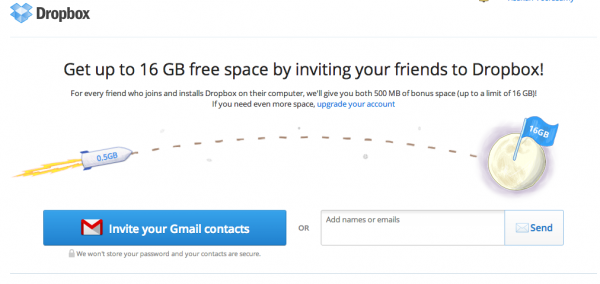
Dropbox nailed it
2. Your Call To Action isn’t clear enough
Writing a call to action for your referral program is a lot like writing the copywriting for you to click on a “sign up” or “download” button, yet most marketers don’t treat it that way.
Here’s what most startups do when introducing their referral program, they write something like: “Want to get a 10% of your next purchase? sharing this item on your Facebook profile”.
When introducing the incentive for your referral to make it into a long story that the user has to read to get why they should share your link, make it as simple and intuitive as you would do with all your call to actions.
Simply go for “Get 10% off ” or “Share for a 10% discount on ”. Sometimes just “Get $ 10 Free!” will do the trick.
Make it short as short and inviting as possible.

Save $ 10 off… simple
3. Not choosing the right incentive
Incentives weren’t all created equal and you need to accept that.
Giving $ 15 off a product doesn’t automatically make it appealing. Giving your product one month for free doesn’t promise a higher share and conversion rates.
So how do you choose the right incentive? By getting better understanding of your target audience.
Invision get it right by offering designers a free T-shirt and Uber’s double benefit referral promising both you and the other user installing the app will be rewarded with credits.
You really need to understand your customer’s needs. If you’re targeting enterprises, they wouldn’t care about that $ 10 discount. They might care more for one of you developers to help them implement your solution step by step and mentoring them on using your product. If your product costs $ 5 a month, than 20% wouldn’t impress me much, but a free month will sound far more inviting.
The better understanding you have of your target audience and the how much a customer lifetime value is worth for you, you can create better incentives for referrals.
Test your incentives according to find the right trigger for your target audience.
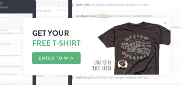
Great CTA, The right incentive
4. Forcing login
Forcing someone to login so they can refer your product makes no sense.
You might say that it’s a technological need to track referrers but both Friendybuy and Referral SaaSquatch will be happy to help you with that.
Forcing users to log in before inviting others to your platform will dramatically decrease the amount of people who would refer your product because instead of targeting a 100% of your site’s visitors, you will be targeting the second step of your conversion funnel.
Most companies are struggling to increase conversions on their landing page to more than 10%, now imagine what percent of total visitors will actually refer other using your referral program. (Guessing well under 1% of the now-registered users.)
Don’t lock the referral options behind the signup or login. They won’t add value to the sign up process and will only hurt your referral conversion rates.
It’s time to audit your referrals. Ask yourself the following: Are they visible? Is my messaging clear enough? Is my Incentive adjusted to my target audience?
What did you find? Leave your answers in the comments.
Digital & Social Articles on Business 2 Community
(301)
Report Post

