Have you ever heard of UI Design? UI stands for user interface. Designing with your users in mind is one of the best things you can do when creating a new website or application.
The World Wide Web has evolved a lot since it first made its debut in 1989. New technologies and increased demand for custom experiences have caused websites to become progressively more complex.
Practices once common for designing are not-so-common anymore. Previously, designers would make decisions based on what they thought looked cool, and what their client wanted. Nowadays, there are so many features and options to choose form that in order to create an effective design you NEED to have a good UI. The best sites are not made because something looks good and makes the client happy; the best sites are made because the designer and client worked together to find out what will work best for the site USERS.
6 best practices when designing for your users
1. Know who they are!
Who are the site users? What are their goals?
Your goals need to be the same as those of your users. If they are going to be looking for a phone number when they visit your site, make that your goal when designing. If possible, find out what sites your users enjoy and watch how they use them. You’ll be able to pick up on what works and what doesn’t.
Knowing who your users are is the most important thing to know before even THINKING about a new design. A site made for tech-savvy 20-somethings is not going to be as effective if the target market is actually their parents. If you figure out the target audience in the beginning, it will save you a lot of time in the end.
2. Keep it simple, but clear.
The best interfaces are the ones that are invisible to the user. Avoid elements that aren’t necessary for your user to reach their goal, but don’t over simplify. Icons are extremely popular and work well in most instances. However, if you’re planning to use icons, make sure that your users know what they mean. People are more likely to avoid clicking on things they don’t understand.
Related Resources from B2C
» Free Webcast: Driving a Highly Personalized Customer Experience
![]()
When gmail went through a recent redesign they hid some of their major apps like the calendar and drives behind this vague icon. It took many users, myself included, a while to figure out where these services had gone.
3. Be consistent and look for patterns.

Humans are creatures of habit. They will work best if you use similar language, layout and design throughout your entire site.
Look for patterns in other sites as well. Why reinvent the wheel when your users already know how it works? Your users will feel comfortable and get things done much quicker if they see elements they already have experience using.
One thing that drives me crazy are webforms that use the month spelled out when filling out credit card information instead of the number of the month. It ALWAYS appears as a number on our credit cards. Avoid going against the norm.
4. Have a clear hierarchy.
“Good designers can create normalcy from chaos” – Jeffrey Veen
Know what is most important to the site users. As designers it is our job to use fonts and colors to guide users along to the end goal. In order to do that well, we need to know the order of importance for the elements on each page.
5. Think of defaults.
 You might not notice it, but defaults are all around you. Defaults could be anything from default ringtone on a brand new cell phone, to today’s date being automatically selected on a webform. In many instances users won’t change defaults when they are presented. For example, did you change the default brightness setting on your tv when you bought it? Defaults exist to potentially save users a few clicks and a bit of time.
6. Make your users feel in control.
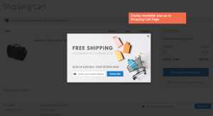
Nothing turns me away faster than videos that auto-play and pop-ups that take over the entire screen. If I’m required to sign up for your daily newsletter in order to read a blog post, I will hit that back button faster than the speed of light. And I can guarantee I’m not the only one who feels this way. People don’t like feeling forced to watch videos or submit their email address. Sure, you may be able to add a few people to your mailing list, but is it really worth losing potential customers?
Designing a website or application with a good UI is a lot like putting together a puzzle. If you force pieces together, the result will be a jumbled picture that doesn’t make sense to your users. If you’re missing pieces the picture will be incomplete and users will feel lost. But, if you put the puzzle together correctly, those separate pieces seem to disappear and your users will be left to enjoy the full image.
Do you have any more helpful tips or thoughts? Be sure to comment below and let us know!
Read more on Business 2 Community
(405)


