The holidays are approaching and ‘tis the season to send email. One essential part of your holiday email campaign should be your email design. Design is everywhere, and good design makes an impression and encourages the customer to purchase. Before jumping into your email messages this holiday season, grab some inspiration and learn how to make your emails stand out from the crowd.
Here are five great holiday email designs from a designer’s point of view (along with some tips), so you can get inspired and plan a successful holiday email campaign!
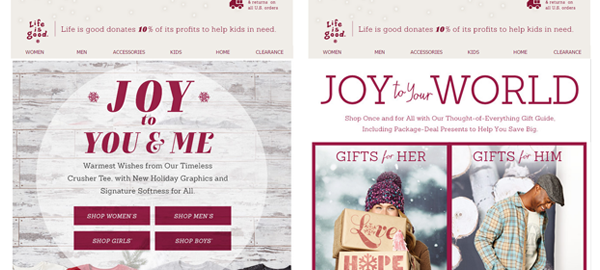
1. Life Is Good
Why I Love It:
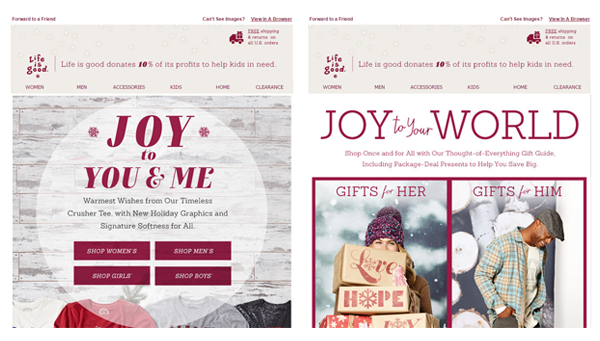
Life is good created an attractive and effective holiday email campaign. They stuck with their brand colors and incorporated holiday imagery without going overboard. The theme is “Joy” and they have a consistent design style and color palette.
Quick Tip:
Once you establish a style for your first holiday email, don’t stray away from that in the middle of your campaign. People receive a lot more emails this time of year and if you keep your design style consistent, you won’t confuse your recipient.
2. Lindt Chocolate
Why I Love It:
Lindt highlighted their “free shipping” promo using a simple red banner and large text that will grab the reader’s attention right away. The snowflakes are a very subtle design element that doesn’t distract from the main message. Their image choice works because it has the same red and gold color palette.
Quick Tip:
If you have something important to tell your reader, make it very clear with no design distractions. If Lindt had filled their banner with snowflakes it would take away from their message, they kept it simple but not boring!

3. The Container Store
Why I Love It:
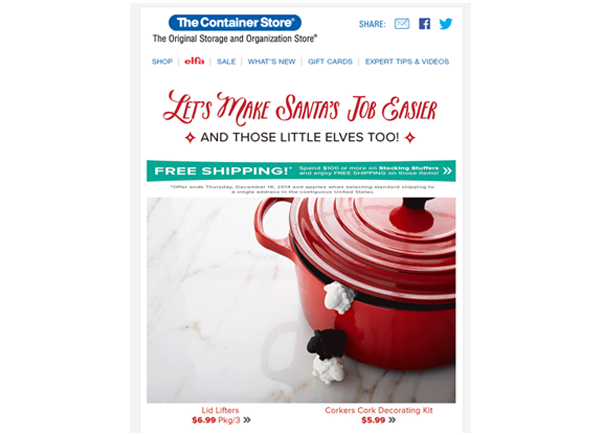
They use an animated GIF, and it makes their email pop! The Container Store used stop motion to make a quick little animation that leaves a lasting impression. Their GIF also has a purpose; they animated two of their products (lid lifters and a cork decorating kit) so it’s not only an eye catching design feature but it is also a good marketing tactic.
Quick Tip:
Animated GIFs are supported almost everywhere in email on desktop and mobile. There are a few clients that don’t play GIFs (Outlook 2007, 2010 and 2013), so when you create a GIF, make sure the first frame includes your message! Click below to see the GIF.
4. Vera Bradley
Why I Love It:
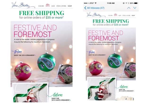
Vera Bradley’s holiday emails are optimized for mobile devices. According to Litmus, almost 50% of all emails are opened on a mobile device. It’s the holiday season, people are busy and on the run and they will most likely be reading your emails on their phone so you should tailor your design with that in mind. Vera Bradley does just that with their long column layout. Their email has big imagery that serves as links to their webpage making it easier to target and tap to buy.
Quick Tip:
You might be used to seeing emails that are two or three column format, but mobile friendly emails should be a single column template. Having one column accommodates to smaller screens and helps increase legibility.
5. Gifts.com
Why I Love It:
It’s loud and it’s fun! Gifts.com is offering a free wreath when you spend $ 100 and they use image and typography to make their message loud and clear. Notice how they have a red and green color scheme throughout the entire email but their call to action is bright blue. It stands out from the rest of the page, centered and in contrasting color to attract attention.
Quick Tip:
Your email should engage and entice your audience as sort of a teaser to your website. Give your reader just enough to motivate them to click through, don’t fill them with too much information all at once.

Want more email design inspiration? Visit Emailium.com! Emailium is a great tool to find email design inspiration for any type of email from holiday to abandoned cart or welcome emails.
Digital & Social Articles on Business 2 Community
(294)
Report Post