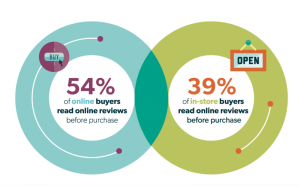
DID YOU KNOW: 39% OF INTERNET USERS WILL STOP ENGAGING WITH A WEBSITE IF IMAGES TAKE TOO LONG TO LOAD, OR THE DESIGN IS UNATTRACTIVE.
Spending money on a website is no longer a luxury. Whilst there are ways you can save money when building your website, you should not cut corners on the design aspect; this is where most businesses come up short.
The solution to designing a website that is visually appealing, and offers amazing user experience is truly understanding what it takes to build a website. I will be sharing with you an ultimate cheat sheet to designing a website, and templates you can use to get a website that will deliver the results you are looking for.
CHOOSE A THEME AND STICK WITH IT
There are two different ways you can look at this. The first, is if you are using a website building platform such as WordPress, or Magento you chose a theme that delivers what you are looking for, and stick with it. You will also need to look at your colour and font themes, and stay true to your branding. Changing the theme will give your consumers a disjointed outlook, and trust will be lost.
My advice: Pick 3 colours, 2-3 fonts and only use bold/italics when you want to emphasise things.
Resources: For colour inspiration, take a look at Pinterest. It is a great source of visual content, and may provide the perfect colour scheme for your website. For fonts, take a look at Google Web Fonts, and for website themes, take a look at Theme Forest.
KEEP IT CLEAN
Remember, 38% of people will leave your website if it is difficult to navigate and looks messy. You don’t have to keep every single piece of information above the fold. Keep it clean with clear breaks on the page, and keep the information flowing. Part of keeping your website looking clean is staying true to the colours and fonts you have chosen for your main web pages.
Resources: For inspiration, take a look at this article.
LINE HEIGHT & ALIGNMENT
This may seem insignificant, but I always make sure that my content is equally spaced out, and easy to read. You want your presentation to be clean, and easy to follow. See below for an example of how your lines should be heightened, and aligned.

IMAGE PERFECTION
When using images on your website in any capacity, you need to make sure they are of the best quality. If I visit a website that is using a blurry image, or one that is too small in size for the way it is being used, I immediately leave the site. This makes a website look messy, and less trustworthy.
BE INSPIRED BUT DO NOT PLAGIARISE
I always look at other thought leaders, or competitors in my industry to see what they are sharing. This usually inspires me to create great content that my audience will love. Yes, I pull inspiration from those around me but I will never plagiarise someone else’s content. Always stay original.
Resources: Take a look at Dribbble, and Pinterest for a wide range of inspiration on the design front.
KNOW YOUR TOOLS
When it comes to using tools to help you with the design of your website, you don’t need to be an expert to create professional looking images. Canva is one of the best image creation tools, and it requires nothing more than some time and effort. The design of your website is extremely important and even if you are working with a design agency, get to know tools like Canva so that you have something to reference when explaining how you want something to look.
I hope that after reading this article, you will be able to design a website you are proud of!
Digital & Social Articles on Business 2 Community(64)
Report Post


