What makes a landing page convert? Creating an effective landing page is quite some work. It’s not just about writing random stuff about your brand and embedding a form for sign-up. Yeah, the design of the page may look good too. But if your landing page (copy + design) does not cater to the needs of your prospects, it won’t generate leads. And what is a landing page without conversions?
Marketers, copywriters, and designers have come up with different ideas of how landing pages should look like. However, it appears that landing pages are suffering from a lack of uniqueness. Marketing is supposed to be a combination of creativity and technique, but it seems more of the latter is the norm.
Perhaps some out-of-the-box examples will inspire you to come up with creative ways to create landing pages that will be truly effective. Your landing page is often the first page for visitors to your website. Embracing uniqueness as a brand helps you stand out from the crowd, an important factor for big companies and small businesses alike.
Show, not tell
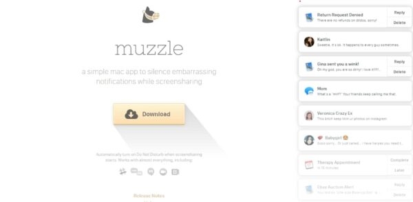
‘Show, not tell’ is the mantra of storytelling, marketing, and landing pages. Companies integrate pictures and videos to help visitors relate to the experience of using their product/service. But Muzzle, a Mac app to silence embarrassing notifications while screen sharing, takes the showing game a notch higher.
Instead of displaying an image or a video, it instead simulates the problem. On the right side of its landing page, Muzzle displays running notifications to make you see and experience the problem live. If you have been embarrassed by such notifications in the past, the recreation of the experience kills any hesitation you might have to click the bright ‘download’ button in the middle of the screen.
Simple Sign-up
Most landing pages (particularly for SaaS apps) feature a form where you enter your name, email address, password, date of birth, etc. Notion departs from that and only requests one detail: your email address.
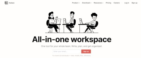
It is not that Notion does not collect any information about its users; it only postpones that until they have created an account. Unlike other apps that use sign up boxes with unnecessary fields to fill out, Notion makes its sign-up process frictionless with a conversion-first strategy.
Another major advantage of Notion’s technique is its maneuverability. The sign-up box can be displayed anywhere on the web without running the risk of annoying visitors.
Have Customers Write for you
We’ve all seen poorly-written landing page copies. They are filled with buzzwords, empty rhetoric, and a giant button captioned ‘get started’. What makes those landing pages ineffective is that they are disconnected from the customers of the brand. This is something that Design Academy goes against.
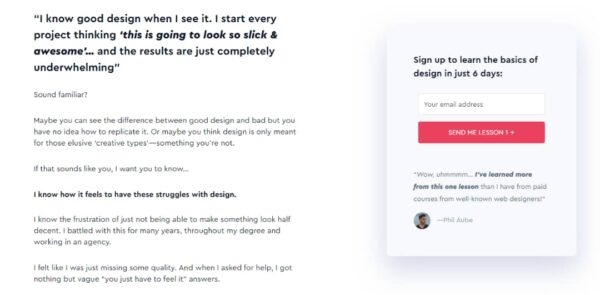
The landing page above boldly features a true statement from an actual customer. And just under the one-field sign-up form, there is another statement from another customer. Design Academy curates statements from its customers and uses them to create content for their landing page and blog.
Immediately people sign up for the free course, they receive an email with a request to answer a question: what is your biggest frustration with design? The answers to these questions are compiled into a spreadsheet from which they are applied to their blog content and landing page copy. Nothing beats a brand that listens.
Teach, then Convert
Marketers often advocate that landing pages should be useful for nothing else but conversion.
When you land on Digital Present, you are welcomed with an animation which then expands into this static screen:
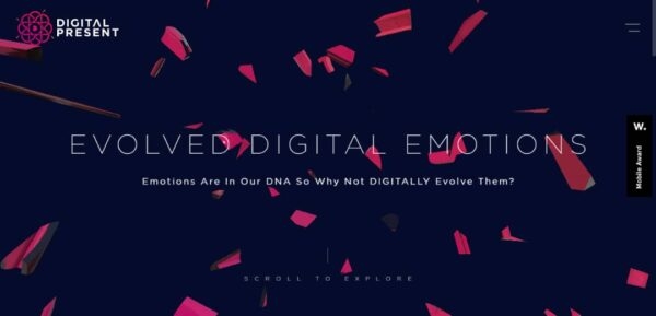
The CTA, which is displayed below, and not-so-conspicuously, is a simple request to scroll to explore. Given that the welcome animation must have hooked a visitor already, they are much likely to scroll. Scrolling up, the screen animates again as it displays information about the company.
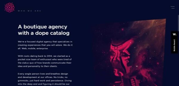
This is certainly not the typical landing page. The real call-to-action that is meant to convert users is displayed much below. Once the visitor scrolls a little further, the animation lifts to display the following:

Many digital marketers will probably cringe at the idea of placing the CTA far down the landing page. But this seems a cool idea. Though it might limit the company’s conversion opportunities, they know that anyone who signs up has been properly educated about the company and its services. Besides, the animation lights things up. Otherwise, it would have been boring and perhaps a waste of effort.
Conclusion
Creativity is important in marketing, and you can take a break from using generic landing pages. For a landing page to convert, it must first attract. Be innovative in your marketing strategy and think up ways to gain the full attention of your landing visitors; you will wonder why everyone else finds conversion difficult.
Business & Finance Articles on Business 2 Community
(62)
Report Post
