Color impacts us all. We choose colors for our living space based upon what makes us “feel” good; we choose clothing colors based upon what we believe makes us “look” good. And psychologists have known for a long time that color affects mood and, as well, our purchasing decisions. It only makes sense, then, that online businesses, content marketers, and web designers understand the psychology of color when it comes to the use of color – in the overall website design, in the depiction of a brand, and in the persuasion process of conversions.
Understanding the Basics of Color Psychology
Before you totally dump the current color scheme in your design, logo, packaging, etc., it would be a good idea to understand that psychology is not like chemistry. It is not an exact science because, after all, it studies human behavior, not the behavior of inanimate objects without thoughts, feelings, and varying backgrounds. If you do decide to change colors based on a study of color psychology, it is suggested that you do so carefully and methodically and test every change against conversion improvement. Nevertheless, here are some basic moods/emotions that are generally ascribed to specific colors, and, there may be implications for design color based upon the customer being courted.
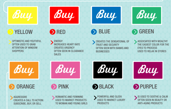
Black
Black generally connotes luxury and sophistication. It is not a mistake that Dyson Vacuum uses a lot of black on its website. The product is a symbol of sophistication and quality. The same applies to such items as high-end make-up packaging.
Blue
There are so many shades of blue, but it is a popular color. Generally, retailers who want consumers to trust them will use a lot of blue. Banks often use blue.
If you have a product or service that requires trust on the part of a customer, using blue in your design will help promote that.
Purples and Burgundies – Shades Of
These can connote a sense of refinement and even royalty, especially in darker shades. Lighter shades that move more toward violet and pink, however, have more appeal to a feminine side and are often used when appealing to women:

Note the yellow button – that will be addressed later.
Green
Green evokes a number of things. First, it may be perceived by a consumer as wealth; some psychologists say it promotes feelings of calm, and it is more recently used by companies who want to be perceived as eco-friendly. Here is how Greenworks displays its products on its site.
Brown
Brown is often associated with masculinity and is used to attract and maintain a focus of men. Appealing to this feeling can work to convert male shoppers if your product or service lends itself to this color. Check out the landing page of Dollar Shave Club.
Red/Orange
These colors often evoke emotions of energy and urgency and are often used as contrast colors for CTA buttons to subscribe or buy.
Yellow
Yellow also stimulates feelings of energy, but also optimism. It, too, is often used as an attention-getting CTA button if it contrasts with the other colors on the page. Thus, the reasons for the yellow CTA button on the Prevention Magazine offer above.
Here is an infographic that summarizes color psychology as used in marketing:

Again, remember that color psychology is not an exact science. Nevertheless, it has become important enough that it is part of the curriculum in most graphic design education programs.
Translating Color Psychology to Conversions
Your website landing page creates a first impression as soon as a visitor arrives. You want to use the colors that connote the emotional connection with your brand and thus your product or service. This is the way a potential customer is first engaged.
And if you want to continue to keep that emotional connection through color, all of your pages should be consistent with that color scheme. It keeps that mood and feeling you want a visitor to have.
Remember, however, that color is not the only factor in engaging and converting your potential customers. You have to promote the value and benefit of your product or service with great content and visuals. You have to solve a problem for the consumer. The point of color psychology is that it should be used to emotionally enhance what you are presenting. If a consumer does not see value or benefit, the color will not make a difference.
Conversions are the result of many psychological factors – need, sense of urgency, desire to belong, a sense of getting something at a great price, etc. These things must all work together with color psychology to create that decision to click a CTA button.
Getting That Button or Link Clicked
There is no magic color that will get a button or link clicked all of the time. And the color of a CTA button may not relate at all to the colors that have promoted the emotions you want to foster on your site. Actually, it should not relate at all, and here’s why.
On any website, there is a color scheme. Hopefully, it is psychologically correct for the brand. This color scheme becomes what is commonly known as the “passive color.” It is common throughout the site. The links and buttons you want users to click, however, must be “active colors,” colors that are totally different from your passive ones. As explained in this short Social Triggers video, the CTA color is not as important as the fact that it stands out from everything else on the site.
This concept goes back years but was more recently demonstrated by Parras Chopra, founder of Wingify, a marketing firm, and developer of a popular optimizer tool. He was attempting to get more visitors to click over to his blog, and so he began to put links to it on a sidebar. He tried different fonts and sizes, but the one link that proved the most successful was in red, even though it was in smaller print. This was his “action” color.
You need a single action color, and it needs to be in huge contrast to all of the other colors you are using on your site. You use the same color for every conversion you want because you are training your visitors psychologically to know that that color means to take action.
Beyond this, you should experiment with different action colors to see which of them works best for your brand, product and/or service. There can be a difference. Neil Patel, in an article recently written about color, points out a CTA button study conducted by Content Verve. One e-commerce business increased its conversion rate significantly by changing its button color.
The blue button was a passive color because it blended into the background color and the other text. The green button stood out and “told” the user to take action.
Color psychology is not magic. Do not expect to incorporate it into your design and CTA’s and expect to boost your conversions by huge amounts. Use it as one of many tools you have in your box to persuade consumers. And when you do make color changes, be certain to test them for efficacy.
Digital & Social Articles on Business 2 Community(131)
Report Post


