— December 28, 2017

In the modern world, attention spans are short and getting shorter by the year. According to research by Statistic Brain, the average attention span in 2015 was slightly over 8 seconds – compared to 12 seconds in the year 2000.
Modern society knows nothing about delayed gratification. People want to shop contactless, watch one Netflix episode right after another, buy that brand-new car now, pay for everything later, and they demand fast mobile internet and even faster food. If they don’t get something immediately, they either get bored or move on to the next thing.
So, it makes sense that the same applies when visiting landing pages.
Luckily, video caters to this need. Would you prefer to sift through paragraphs of text to understand a product, or instead have a video tell you all the best features and benefits in under a minute?
In a survey by Animoto, four times as many consumers would rather “watch a video about a product than read about it.” And, “one in four consumers actually lose interest in a company if it doesn’t have video.”
To bring this idea home, the proof is in the pudding – spell check software Ginger increased conversions by 15% when they started adding video to their landing pages.
Videos are a great way of getting a large amount of information across in a short amount of time. They also are very effective at building brand trust, employing emotional cues and adding value for your visitors.
If you want to get this type of result with your landing pages, let’s look at how you can start using video for your landing pages.
Types of Landing Page Video
It’s always best to get creative and think outside the box when coming up with video ideas but here are a few to get you started:
- Animation
- Product demo
- Product information
- Personalized message
- Comedy
- Clip from a previous webinar
- FAQs
Video Examples
One of the most effective videos to put on your landing page are those giving product information or “explainer” videos as AdVids put it.
Help desk software company Zendesk sums up nicely what they can do for you in a short and succinct animation:
Product demos are a great way to showcase how your product looks and how easy it is to use (if it is). They work particularly well for SaaS products, as the customer gets to see the layout of the interface and you can showcase its eye-catching design.
Autopilot provides marketing automation software and they get it just right with their male-narrated product demo:
As you will find out later, it pays to design your landing page video with a single goal in mind.
Crazyegg, a company that sells a heatmap tracking tool for online businesses, does this well by answering a single question in their video, “why aren’t my visitors converting?”
Why Video is a Good Idea
Speed
The number one reason for using video is the speed at which you can get your point across. The average modern-day attention span is less than that of a goldfish with Statistic Brain reporting that only 4% of users stayed on a page for more than 10 minutes. You need to get your point across and you need to do it quick! The beauty of video is despite being short you can still fit a lot in – you can build trust, add value and explain your product, all in less than 90 seconds.
Encourage Visitors to Stay on Your Page
Not only do videos command a high attention rate by themselves, they also get viewers to stay on your landing page for longer. Wistia found that “people spent on average 2.6x more time on pages with video than without.” This gives you more time to gain their trust and possibly a conversion.
Make Complex Products Accessible
If you sell a complicated product, like most SaaS businesses, then video is a great way to describe what you do in a short and succinct manner. Wordstream hit the nail on the head, “Videos can walk a prospect through using a product or service, explain intricate nuances of the product much faster and effectively than text could, and even illustrate the benefits of using your product or service in a more attractive, engaging way.”
Virality
Videos are much more shareable than copy. A creative video plus a share widget on your landing page, or putting your video on your YouTube channel, could see your production go viral.
Emotive
Emotional response sells by getting the reader invested in your product. Videos evoke an emotional response in viewers that is much more intense than text. Couple this with longer viewer attention and you have a match made in conversion heaven. Neil Patel explains why, “Those two elements, emotion, and attention, are the two most important elements of persuasion.” Get these two together and you are going to see fireworks.
Avoid Autoplay
The majority of the time autoplay is a bad idea for your landing page video. It’s the online equivalent of inviting someone to a dinner party and talking about yourself over the top of everyone else.
Although generally used to refer to email marketing, switching off this function is a form of permission-based marketing. Permission-based marketing is a massive buzzword these days and there is a reason for that. It’s the best way to build an engaged audience who wants to know about your product. Viewers who get to choose to watch are much more likely to invest in your business than those that have it forced upon them.
Be careful with this one, though, as there may be some instances where autoplay is a good thing. Vidyard warns of some instances where this may be appropriate such as after a, “watch this video,” link. Always A/B test to be sure.
What Are You Trying to Say?
It’s important that you have a specific aim when making a video. Neil Patel recommends asking, “what do I want my customers to do after watching this clip?” The answer will generally be to get a conversion – sign up for your list, buy your product, collect a coupon, start a trial, and more. Bare this in mind and plan accordingly. Designrs Hub recommends, “have a proper plan of action, rehearse, keep time out, do re-records if needed; make it as professional as possible. ”
Create Trust
Landing page videos are another opportunity for you to build trust in your brand. There are a number of ways to do this. A video of yourself can add a personal touch – if the viewer trusts you they are much more likely to trust your product. You could provide more information about your backstory and your company goals, a testimonial, or an interview with you or a member of staff. All of this is supported by the magic word when it comes to video: attention span. You’ve got the audience, so make the most of it.
Short and Sweet
Viewer’s attention spans for watching video is longer than text, but don’t push it. Marketing Rocket recommends using videos that are between 45-90 seconds long. Clarity is key here. Pick one message and stick to it. Kissmetrics compares this narrowing of options to an exam, “would you prefer multiple choice questions that require the process of elimination or true/false questions that make the answer more attainable?”
Call to Action
A landing page video without a call-to-action at the end is like a fishing line without a hook. Make sure you add one and make sure it is clear. What’s the use of educating a viewer about a product if they don’t know where to get it? Also, make sure the CTA aligns with the video goal. Search Engine Journal also stresses the importance of aligning it with the rest of the page as a whole. Everything should be working together to drive toward that conversion.
Integrate
It’s true that a video-only landing page can have a good deal of success. Personal trainer Carl Juneau increased conversion for his muscle building program by 46% with just a video. But to get consistent results you want to tie your video in with stellar content and get all elements of the page working together. Click Laboratory recommends using, “the right headline…and graphics with a well-placed video.”
Make sure all the elements support the same goal as the video. Draw the reader in with an intriguing headline and then support the video with your text. Finally, make sure that the call-to-action within your page matches up too.
Educate
The focus of your landing page video should be to inform the viewer about your product and business. As Disruptive Advertising discuss here, the goal of your landing page shouldn’t be to just “get clicks.” Sure, you want to have a call-to-action at the end of your video – and any conversions are welcome – but think of the video as a small piece of the marketing picture. Educate visitors about your product, add value, and in combination with your other marketing efforts, the clicks will come.
Build Around the Video
The video should be the focal point of your page, and everything else should work to support your video. Kissmetrics recommends keeping the page simple, “by removing your sidebars, headers, and anything else that could clutter and pull focus away from your goal.” Adjust the size of your video so it is prominent but not overbearing. Use the headline to hook the reader in and use copy to support it.
Tell a Story
Videos are a great opportunity to draw the viewer in and tug at the heartstrings. Tell them a story about or related to your business that really gets the emotions stirred. Wideo has a great article on giving advice on how to do just this. The main takeaways are:
- Treat video like a creative canvas. Brainstorm, think outside the box. How can you show your brand identity in a way never down before?
- Put things into context. Consider setting, character, and plot within the context of the story.
- It’s all about the customer. What are your audience’s goals when watching the video?
- Show conflict (and provide a solution).
Make your Thumbnail Shine
Your video thumbnail is the still image users can see before they click on your video. It’s the gateway to the video if you like, so it needs to draw the viewer in. This includes using a high resolution, managing the brightness of the image and keeping your branding consistent. Vidyard gives some additional tips over here.
It’s also worth noting that your thumbnail may show up in Google’s and YouTube’s search results, so it’s important to invest some time making it attractive and click-worthy.
A/B Testing
The golden rule of digital marketing.
Try out different versions of your video and see what happens. Change the type of video you make, the script, a female to a male narrator, your jokes, etc. Find out what works for your company.
This also applies to the supporting aspects of your video. Test different headlines, copy, images, and call-to-actions until you find the best converting combination.
Case Studies
Case Study #1: Grow Your Own Groceries

Grow Your Own Groceries provides DVD’s that teach you how to sustainably grow organic vegetables.
After trying various advertising strategies with poor results, the owner of the company, Marjory Wildcraft, decided to take a good look at her marketing funnel. The first stop being optimizing her landing page.
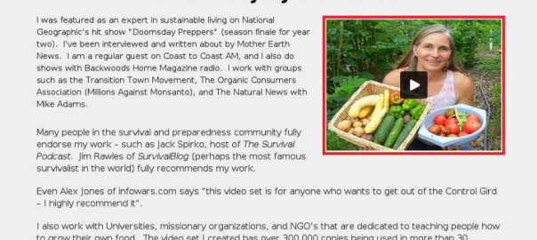
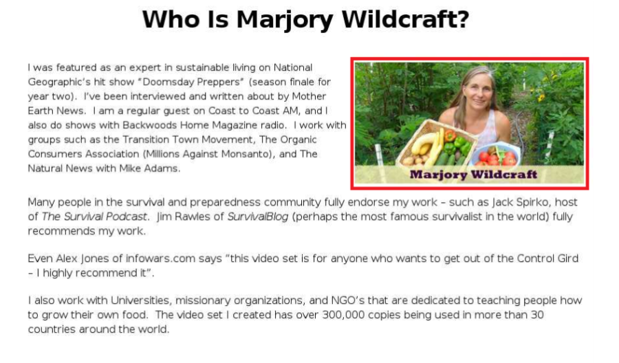
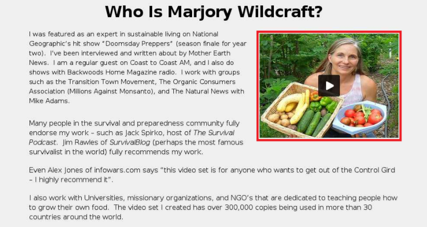
The landing page contained a description of the product and an “About Me” section with an image of Marjory. During A/B testing Marjory replaced the image with a video interview she did for a local news channel.
Here is the “About Me” section before and after adding the video:
Results
Replacing the image with video gave a 12.62% increase in conversions. The interview increased trust in her brand by acting as social proof, portraying her as an expert in her field.
Case Study #2: Tutorvista

Tutorvista is an online tutoring company providing one-to-one Skype tutoring for a multitude of subjects and grades.
Tutorvista wanted to increase conversions on their “subscribe” landing page.
Eyeview Digital carried out A/B testing on the page. Testing the original page against a video that autoplayed once when customers visited.
Results
The autoplay video page received a massive 86% increase in conversion!
Tutorvista’s manager Arun Kumar was happy with the result. “We implemented EyeView’s solution on one of our landing pages that already had an impressive conversion rate. The very first test they ran boosted conversion by over 80 percent.”
Conclusion
Featuring video on your landing page can dramatically increase your conversion rate, build brand awareness and trust. But you must use it in the right way. Do multiple cuts, A/B test everything and integrate video with your existing strategy.
Hubspot found 43% of people want to see more video content from marketers. So, what are you waiting for, get your director’s chair out and start filming.
Digital & Social Articles on Business 2 Community
(68)
Report Post