If there’s anything in this world that’s permanent, it’s change. And when it comes to website design, that’s even more true as search engines and users become increasingly critical and want different things from websites. Today we’ll share our favorite UX design tips to help you delight visitors and increase revenue.

While trends come and go, there are design factors that stood the test of time and we tried to pull together our 7 favorite UX design tips we don’t see changing any time soon. One example is basing your design on a detailed customer journey map when creating or modifying your website. If you want to know more about how a journey map works, get redirected here.
There are several other factors to consider when it comes to creating a great UX design. If you’re a budding designer out to conquer the web design world, here’s some information to guide you.
What is UX design?
To understand UX design, it’s important to know what UX or User Experience is before learning about factors desirable in your UX design. UX design refers to the general feeling experienced by a person while navigating your website. Such feelings are influenced by different elements found on your websites, like colors, typography, animations, images, video, text, and a lot more. The goal of the designer, however, is to ensure that all these elements would work together, resulting in an easy-to-use website that looks attractive and loads quickly.
Design, in general, refers to a plan for the construction of something, like an object or a system. It can also refer to the implementation of a process. Therefore, UX design is a plan involved in constructing a website focused on providing a great experience to your users.
UX design tips
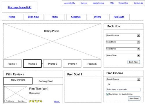
As part of the process of designing a new website or modifying an existing website with usability in mind, wireframes are an important part. A wireframe involves designing your website on paper or using tools that build clickable wireframes to demonstrate how elements link together. Wireframes allow you to test your design without the expense and time required to code the new website, even though a CMS reduces that time significantly.

With a clickable wireframe, you can test out the design with potential users and others within your workgroup. The more perspectives used and the more testing you do before coding, the better your resulting website will appear to users.
1. Hierarchy
Commonly you include many elements and a variety of content on your website. Some elements, like images, improve the look of your website, while other elements build toward conversion. Though you might argue that all elements reflect useful features and have purposes, it’s crucial to know that the degree of their importance may vary from the user’s perspective. Thus, hierarchy becomes an important factor.
There are two types of hierarchy that you should know as a web designer. There’s the content hierarchy and visual hierarchy.
Content hierarchy refers to how web designers organize content and information in a web design. For instance, the homepage acts as a teaser to invite visitors into the website deeper, while landing pages are designed with conversion in mind. Every page offers easy navigation, allowing visitors to access quickly the exact information they seek.
On the other hand, visual hierarchy refers to how your elements, like colors, typography, and images work together. Designing for the visual hierarchy involves understanding your goals and objectives, as well as your target audience. For example, call-to-action messages are usually written in bold, bright colors particularly if the main goal of the website is to convert visitors. A button users click as they move toward conversion enhances the prominence of this critical image, resulting in much higher rates of conversion.
Ultimately, the goal of considering hierarchy in UX design lies in providing users with ease in navigating your website.
2. Usability
Another factor to consider in efforts to achieve excellent UX design is usability. Usability in UX design requires that all the features of your site have a function and a purpose. Whether it’s a text, an icon, a button, or a widget, each little element should align to make your site as efficient as possible to its visitors.
Before launching any website, a web designer needs to conduct a usability test to evaluate any problems a user might encounter. For instance, are clickable elements sufficiently far apart to avoid accidental clicks, especially on mobile devices. You also want to test usability for people with varying abilities, such as those with visual difficulties. At this stage, you can eliminate problems easily to ensure a smooth user experience.
Interactivity
For some, usability is interchangeable with interactivity, while for others, it’s merely a related term. So, what’s interactivity?
Feedback is a key feature of interactivity. This means that when someone clicks on a design element, they expect a response. These responses might involve auditory signals that guide the users as they browse or navigate your site. Other users, however, respond more favorably through visual signals. Other ways your website might respond to a user’s action is by vibrating, changing colors, lighting up, or other reactions.
There are also those who think that interactivity is only possible when the site allows users ratings and feedbacks. Ratings and feedback are helpful tools for website owners to know what users love and hate about your products, services, and even the experience they have while navigating your site. Whether it’s positive or negative feedback, these are valuable sources of information that can help you improve your website and your business.
4. Simplicity
Think about the world’s biggest search engine today, Google. You might remember that its search engine hasn’t undergone any significant changes in the 2 decades since it first arrived to change the world of online search if you’re old enough to remember older search engines. Yet, consistency never stopped Google from becoming a search engine giant. Of course, its changing graphics do attract notoriety, especially when the platform creates doodles for historical or socially responsible reasons.
Google’s secret lies in simplicity and you should embrace this UX design tip. All you need is to type your query in their search box, hit enter, and your results immediately show up in an order designed so that links higher in results best meet your search intent and improves load speeds.
Simplicity allows efficiency. The internet users of this modern era don’t want extra operational and cognitive load. What many of them want is to have navigation paths that allow them to satisfy their needs and are as short as possible.
Simplicity applies to other aspects of the means your website uses to communicate to visitors. Take note of how users usually face simple options between ‘Yes’ and ‘No’ in certain situations, like claiming business listings, or how social media sites construct their questions for those creating an account on their platforms.
Simplicity is also a factor to include when dealing with your website’s typography, colors, and layout, though some might say that this aspect is up for debate. Most designers create a style guide listing two to three color combinations, accepted fonts, and simple layouts that are used in creating new pages.
In general, by keeping things simple, whether it be the site’s content, means of communication, web design elements, or navigation processes, you’re sure to increase the impact of your user experience on your website.
5. Consistency
If you think about how you interact with people in the real world, you find consistency a valuable UX design tip, as it aids in interpretation and smooths communication?
Consistency applies when creating UX designs. As a designer, your goal is to ensure that all the elements of your website are consistent from branding, like logos and colors, to your features’ functions. It’s simply because consistency results in familiarity and many users tell you that familiarity with your site’s designs makes them more comfortable to interact with you and your products. Consistency in your look and feel engenders trust and provides an anchor for attitudes about the brand.
Now, there might be concerns that too much consistency and familiarization might lead to your boredom. There’s truth in that because it’s innate in humans to look for something that might pique their interests once in a while. However, recognize that the way users navigate your website is very different from your own interpretation of your website. Visitors very rarely read everything on your website like you do and are less likely to find your content boring as they only read a few elements.
A good solution for this to avoid reinventing the wheel. A better approach is to come up with new or unusual concepts using patterns that your website used all along. This results in users who engage with your site even with a newly introduced learning curve. And don’t forget to provide similar consistent patterns on mobile devices.
6.Accessibility
The number of mobile phone users increased dramatically over the past few years. Thus, to avoid missing out on this source of leads, many business organizations tapped into the power of mobile phones to continuously create conversions.
To ensure that site visitors don’t get frustrated when browsing websites using their phones, web designers use technologies like responsive and adaptive web designs. These two offer different approaches when it comes to building an effective mobile presence. At the end of the day, though, both provide mobile-friendly websites that don’t simply look good but remain functional too.
The concept of accessibility also comes into play when it comes to providing special usability features for visitors who are differently-abled. Some tools used include screen readers, magnifiers, color filters, captions, high contrast texts, and speech recognition. This is especially true if your target market is older, where increasing the font size and contrast might benefit users.
7. Desirability
Last on the list of key factors in UX design is desirability.
Desirability refers to how attractive your web design is to your target audience. Desirability is a result of making use of colors, shapes, typography, and images the right way and how you put these elements together, so they appeal to your audience. Obviously, these preferences and likes of your target audience guide what is desirable or on your website.
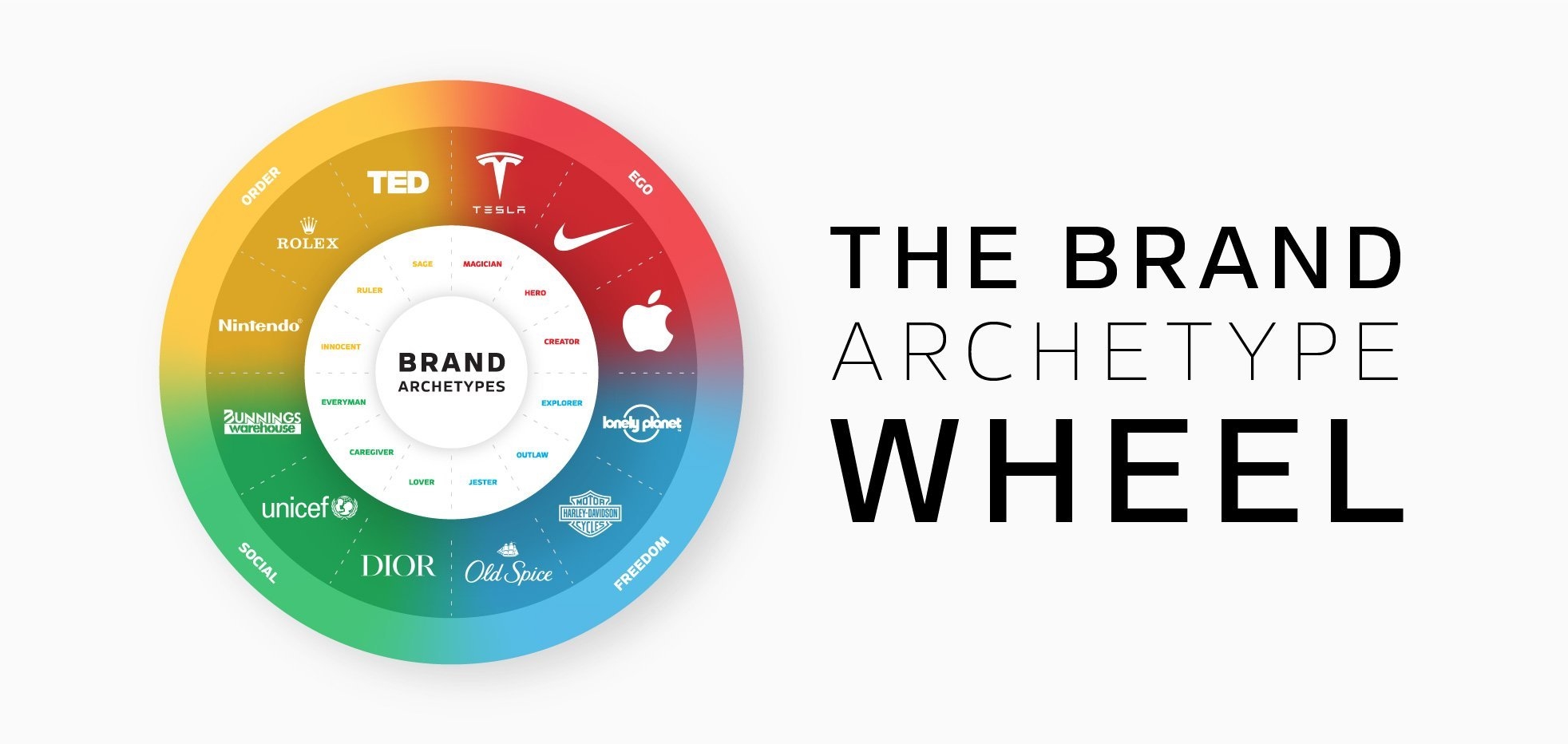
First, desirability, attractiveness, or aesthetics is subjective. What might appear attractive to one website visitor, might not appeal to another. Therefore, the right way to use these design elements starts by knowing your brand and your market, as well as what design elements your competition uses and fit between design and your product. Crafting a desirable personality goes a long way in attracting your target audience, as you can see in the image below.
 Image courtesy of Sketch Corp
Takeaways from our favorite UX design tips
I hope you found these seven UX design tips valuable and will consider implementing them as you build or modify your next website. Be aware that best practices in UX design change over time, so be prepared by periodically reviewing your design choices as well as those chosen by competitors. A few years ago, almost all modern websites included an image slider on the homepage. Today when you see a slider, you know that the website hasn’t been modified and a longtime or the web designer didn’t know what he or she was doing.
By considering website design elements including; hierarchy, usability, accessibility, and desirability, you begin your development/ revision on solid ground. Also, practicing simplicity and consistency are time-tested tips to consider. Now that you know the key factors comprising good UX design, it’s time to apply the UX design tips you learned and win the hearts of many site visitors and users.
Business & Finance Articles on Business 2 Community
(52)


