UX design has come a long way in recent years but the discipline is still finding its feet in an ever-changing digital environment. For every new UX design trend that promises to change the way we think about designed experiences (IoT, augmented reality, etc.), there’s still a lot of work to be done with the basics – like designing intuitive navigation and checkout systems.
With the start of a new decade upon us, it’s time for UX design to come out of infancy and put these issues behind us. We shouldn’t still need to talk about problems like loading times in 2020, but here we are. In this article, we look at four UX design factors that can put these problems – and so much more – behind us in 2020.
1. Designing to ease user concerns
In 2020, the casual web user has more reason to be concerned about their online activity than ever – or, at least, users are more aware of these reasons. The rise of fake news and mainstream conversations about privacy, ad targeting, cybercrime and other digital concerns have put these issues in the collective consciousness of today’s internet users.
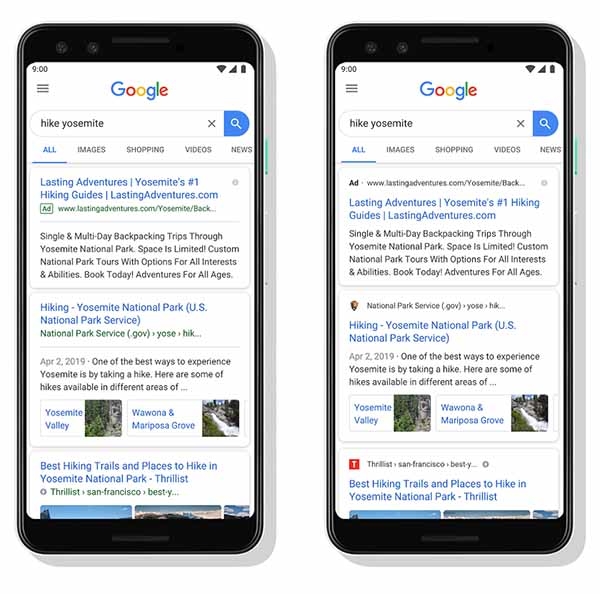
These issues are only going to become more important to users and the likes of Google, Facebook and Twitter are already taking steps to deal with them. A key factor in Google’s introduction of URLs and favicons to mobile search was making it easier for users to identify the source of information they’re receiving.

Commercial brands have been much slower to adapt to these issues. In fact, it took the legal sledgehammer of GDPR for businesses to rethink the consent process and it’s fair to say the solutions so far have generally been poor. Most GDPR-compliant consent processes are weak attempts at being legally compliant without much regard for the user experience. Worse still, surveys have found that consumer concern over data privacy has only increased since GDPR came into effect.
Now is the time for brands to take the lead and design experiences that ease such concerns.
2. Designing experiences for saturated markets
Over the past 20 years or so, every industry has seen remarkable innovation driven by internet technologies but we’re now at a point of saturation.
In 2020, the prospect of a new Amazon or Airbnb emerging seems very difficult. It’s more likely that an industry-leading rival like eBay or Booking.com would overtake the top names in their respective industry or buy out anything that might have the potential to do so.
You only have to look at Facebook’s acquisition of Instagram and subsequent demolishing of Snapchat to see how things work now.
We’re way past the point where users need another Amazon but we’re not past the point where the world needs a better experience than one provided by industry leaders – and this is where brands need to focus in terms of differentiation. For example, what would happen if an Amazon rival prioritised easing the user concerns we highlighted in the first section?

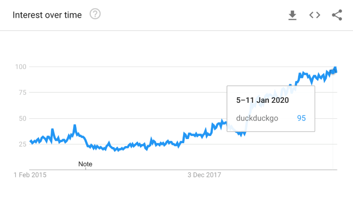
This selling point has certainly worked for search engine DuckDuckGo over the past five years. In 2020, every brand has a slogan that says they’re different but very few actually deliver this in terms of the experience they deliver.

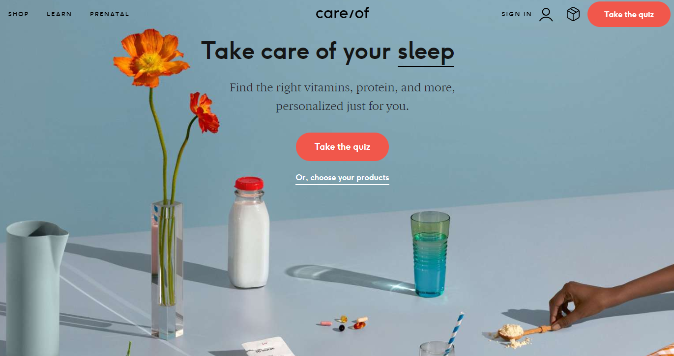
There are some exceptions, though. The most exciting brands right now are building themselves around the customer experience. Care/of helps its customers find the perfect vitamin, nutrient and diet supplements based on their goals and lifestyle. The process revolves around hyper-personalisation, delivering a unique experience to every individual customer.
Care/of not only stands out from the thousands of other brands in its niche but delivers an experience that is tailored to the individual needs of each customer.
3. Rethinking information architecture & navigation
In 2008, Apple introduced the iPhone 3G and the mobile internet revolution truly began. While 3G connections and capable phones had been around for years, the second iPhone was the device that made mobile browsing genuinely usable for the first time. The age of mobile apps, mobile optimisation, selfies, likes, shares and basically everything we associate with the modern web began.
Since then, UX designers have been playing catch-up in terms of optimising experiences for desktop and mobile.
As a result, the entire industry settled on a collection of hacks and quick fixes that did the job well enough. We ended up with hamburger icons, hidden navigation menus, grid layouts, responsive templates and a catalogue of “best practices” that worked for a while but ended up making every website, mobile app and online platform basically look the same.
 Why did it take so long to establish off-screen navigations are poor UX?
Any deviations from the norm (parallax designs, scroll hijacking, video backgrounds, etc.) only made the mobile experience worse, which reinforced the importance of following the tried and tested methods. Designers everywhere boxed themselves into a safe haven of guidelines instead of assessing the unique problems users face – something that is only now starting to change for the better.
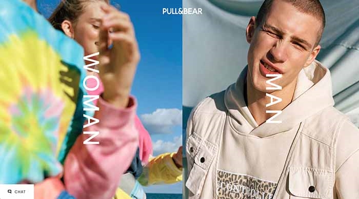
ECommerce brands can have a particularly difficult time with navigation but it’s amazing what can be achieved with a little touch of creative design. Put down that nested navigation template for a moment and think about active steps that can simplify complex website structures. In the example below, we have a clothing retailer that ditches the typical header nav in favour of an on-page navigation system – one that guides them through each tier of navigation and to the product categories most relevant to them.
 Pull&Bear segments traffic with an on-page navigation system that only shows relevant links to each user.
4. Putting UX at the heart of your marketing strategy
For too long, UX design has been treated as a bolt-on service for digital brands that often involves little more than following best practices and running the occasional A/B test. Sorry, but changing the colour of your CTA buttons every six months isn’t adding anything to the experience of engaging with your brand.
Something we haven’t touched on yet is the importance of positive UX performance when it comes to ranking well in search. Search engines need to know your website is accessible and engaging, which forces them to look at factors like navigation, bounce rates, the number of pages visited, time spent on-page, mobile-friendliness and a bunch of other signals that you can only achieve with strong UX design.
The close links between UX design and conversion rate optimisation (CRO) are more widely known. Yet brands typically make the same mistake of following “best practices” and making reactive changes to issues that could have been solved during the initial design process.
Conversion rates underperforming? Quick, make those web forms shorter. We all know shorter forms convert better because every form best practices article tells us to reduce the number of form fields. Except, in practice, shorter forms can also result in lower conversion rates, as shown in the test below.

The brands that are nailing UX design in 2020 aren’t treating it as a bolt-on – it’s at the heart of their marketing strategies.
Over the next decade, UX designers need to prove the discipline has come of age and this only going to happen when they take off the training wheels, put down the “best practice” guide books and innovate unique solutions to the unique problems their target users are facing. The days of hacks, templates and good-enough design fixes are (hopefully) behind us and there is reason to be optimistic, as seen by the examples we’ve looked at in this article.
Digital & Social Articles on Business 2 Community
(76)
Report Post


