us·er ex·pe·ri·ence (noun)
The interaction between a user and a digital system, such as a website or computer application.
To the question: What is User Experience? Google gives us a seemingly straightforward definition that actually doesn’t tell us much at all about what UX is or how your website or mobile app could benefit from a UX strategy. The underlying issue with this is that many companies (including many web design agencies) still see websites as one big business card rather than a complex, living and breathing instrument.
UX Starts with understanding the user
The foundation of every great digital experience starts with the user. Brands must perform their due diligence to understand exactly who the customer or user is, what they need, and how or why they will be interacting with the brand through this new touchpoint. This exercise, of course, is an extension of the overall understanding of the consumer-base being served. Doing this will not only be helpful in planning out the current project, but can be a refreshing exercise in gaining perspective on where you currently stand as a company.
Skipping out on this vital step, which happens more frequently than you’d think, is like driving without a roadmap – and, likewise, will ultimately lead to a misaligned strategy and poor UX. This takes us to the next part of the process: goal-setting.
A goal-oriented approach
Once you and your digital agency have done enough research to put yourself in the user’s shoes, the overarching goals of the whole project will really start to surface. You should quickly and easily be able to answer questions such as these: What is the primary goal of doing this project? Are we marketing a product or selling a service? How much can we invest, and how much ROI do we foresee? Are we trying to drive sales or encouraging inquiries?
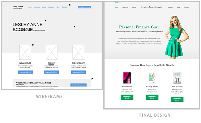
For example, in building out Lesley-Anne Scorgie’s personal website last year, we determined that a clean and simple experience was the primary design goal – although the trick was ensuring this UI did not degrade the site’s functionality. The result? A clean, bright and inspiring personal website that was easy to navigate yet feature rich. Strategic white space conveyed an intuitive UX, while still offering users the ability to read articles, buy books, and learn about Lesley-Anne.

During the design process, it is important to remember that you will be speaking to multiple types of users. Old vs. young, student vs. employed, English vs. French; there are many user segments to consider. Depending on the breadth of your user base, creating “user personas” may help you derive unique goals and UX standards that satisfy each group. In the case of Lesley-Anne, our primary user base was young professional females seeking financial literacy (via blog articles and book purchases) and PR representatives interested in engaging Lesley’s public speaking services.
content discovery strategy
Once the goals are defined and the target users are identified, the next crucial step is what we call “Content Discovery.” This practice involves reviewing and organizing content so as to plan out an efficient user experience. Again, look back at the goals: What are users here for – blog content or photography? Will users first need an introduction, or will they want to quickly access the catalog? Plotting an intuitive experience and laying out the right content go hand in hand.
In short, Content Discovery is about figuring out a) where you want your users to go, and b) how you can bring them there in as few steps as possible. In a way, think of a website as the opposite of an IKEA; Whereas your local IKEA is architected to purposely drive you past every single option before “converting” you at checkout, a great website should bring you to the exact room or product you want without added steps. That’s the customer centric difference!
IKEA:

Wireframes: backbone before beauTY
It is without a doubt that vibrant, visually pleasing website designs drive more traffic, get more shares and overall become more successful than their unattractive counterparts; by no means are we saying otherwise. However, it’s largely what’s on the inside that counts. A significant part of the user experience is what’s beneath the surface. Before delving into imagery, typography, colour palettes and interactive effects, it’s a crucial step to visualize the user experience using a wireframe.

Voila! While this article merely scrapes the surface of our Product Design Process, these steps are vital in engineering a digital experience that is brainy, brawny and beautiful. If you think a great UX strategy could benefit your website or application, you’re correct. For more on Vordik’s approach to smart design, don’t hesitate to reach out!
Digital & Social Articles on Business 2 Community
http://feedproxy.google.com/~r/B2C_Social/~3/MzH_Lnhu-qI/ux-just-pretty-website-01136167
(320)
Report Post


