June 26, 2024
Verizon’s new logo turns it into Netflix
9 years after a controversial rebrand, Verizon is back with a new look and bigger ambitions.
BY Mark Wilson
Today, Verizon is announcing a new logo and updated brand system. Gone is the Verizon electricity-inspired checkmark, which has been with the brand in some permutation for more than 20 years. In its place is a more flexible and adaptive letter V, which will serve as Verizon’s signature when its full wordmark isn’t the right tool for the job.
Nine years after its last rebrand, Verizon is still the largest wireless provider in the U.S., but it’s struggling with subscriber growth, and is competing in a market where the core offering—data from the sky—is commoditized. And so, Verizon is repositioning its brand farther from what it’s been known for (wireless infrastructure) and closer to the halo of media (from video games, to streaming platforms, to NFL games) that all of its partnerships, and perhaps most notably, its lucrative premium-tier subscriptions, provide to its customers.
“We need to take a leap to connect emotionally with consumers,” says Ricardo Aspiazu, VP of Creative & Brand for Verizon. “This is not just [a challenge] for Verizon. It’s a category issue. A network is an invisible thing…how do we start making the invisible visible?”
The evolution of the Verizon brand
Verizon’s previous rebrand—led by Pentagram’s Michael Bierut in 2016—redrew the italic logo in the stoic typeface Neue Haas Grotesk developed by Monotype, and accented the wordmark with a red checkmark (which was a throwback to a red laser Verizon featured in its logo since 2000). While highly criticized at launch, the rebrand’s intent was about positioning Verizon as a steadfast network during an era when signal reliability was always up for question. Whereas T-Mobile was a bright pink all-ages party, Verizon was meant to look a bit like The Man. The Man who had four bars.
Neue Haas Grotesk became the working hand of Verizon, so much so that be it on posters or its own website, the brand appeared as little more than bold white type upon a black backdrop. It’s proven identifiable, but also “very functional,” according to Aspiazu.
“That Swiss design feel was elevated at a little cost of the joy,” says Chris Garvey, executive creative director at Turner Duckworth, the firm that collaborated on the rebrand.
Step one of the rebrand was to question that red check. That check actually was Pentagram’s simplification of Verizon’s original “electric Z“—a Z that ran wild out of the logo and formed its own abstract mark. But it appears the Z and its permutations never did what they were meant to. While Verizon claims it has close to 100% brand recognition in the U.S., they say the check logo had an awareness of just 30%. “That was the root that we needed to evolve this,” says Aspiazu.
Verizon’s brand team opted to ditch a standalone mark altogether, and focus purely on the V in Verizon as its ownable shape. “We didn’t want to introduce a symbol out of left field,” says Garvey. Instead, they opted for a familiar symbol and “let color be the main story.”
Changing colors, adding glow
The logo went from reserved black to eye-catching red. The V itself was redrawn like a folded ribbon (almost identically to the Netflix logo introduced in 2016), albeit with a warm glow emanating from its vertex. That glow is meant to symbolize “a never ending flame and energy in the truth,” says Aspiazu, which “radiates from our DNA to showcase the power inside of us.”
That glow also showcases the power of partnerships. In a series of images and animations—some of which may roll out only over the course of months or years as the public warms to the rebrand—Verizon demonstrated how that glow of the V can be taken over by media from its partners including Netflix, Apple Music, Disney+ and even Walmart. In fact, the entire left stroke becomes a portal to these partnerships. (Not to be that guy, but I can’t help but see a parallel here to another Bierut project: his re-skinnable logo for Hillary Clinton.)
![]()
That glow will also be literal: Verizon will turn the V into signage for stores and other installations. They also imagine the V in physical spaces, shaping an entryway as the brand, and as abstract designs on newly designed employee uniforms, a collection of casual, mix-and-match tees, totes, and cross-body bags.
The old uniforms gave off a salesman vibe. “Almost felt like I’m about to be sold something,” says Aspiazu. “I want our employees to wear this swag at work and go out for happy hour after and not feel like they had to change their shirt.”
Verizon’s other marketing moments will loosen up, too. The company will no longer feature its big white words on black backdrops, balanced on a Swiss grid. They’ll keep the grid. They’ll keep the typeface. But the black backdrop will now be stone colored (an organic alternative to white), and we’ll see far more lifestyle imagery incorporated into promotions across the board.
“If we really want to become an experience of life company, we need to show people experience and life outside just holding a device in front of them,” says Aspiazu. “Life happens behind a screen, on a screen, and in front of a screen.” Some of these images centerpiece technology as part of our everyday lives—one features a middle aged man balancing his laptop while on a toilet—and some bury the technology almost like an easter egg (an earbud, an Apple Watch) lurking in an otherwise joyous scene.
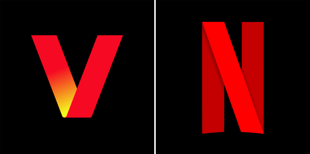
It still looks like Netflix
Overall, the rebrand makes a lot of sense. It takes Pentagram’s work—its crisp type anchor—and spins a world of media in and around it. However, its similarities to Netflix can’t be ignored (and almost certainly won’t be by armchair brand critics). When I mention them to Aspiazu, he denies much in common. “I would say the only similarity we have is they’re using the ‘N’ because their name starts with an ‘N,’ and ours with a ‘V,’” he says. “I see their animation more rooted in film.”
Yet even subliminally, the similarities to Netflix’s ribbon N feel strategic. Verizon is effectively reframing itself as a media company, or something akin to that, even though its core business is still wireless infrastructure. It doesn’t want to be the boring, if reliable, pipe for your data anymore. Verizon wants to be as exciting as everything it delivers your way.
ABOUT THE AUTHOR
Fast Company
(3)
Report Post