Making big changes to your website structure? Columnist Dave Davies shares a data visualization method that can help you predict what effect your proposed site structure changes will have on SEO performance.

In our last article, we looked at some interesting ways to visualize your website structure to illuminate how external links and PageRank flow through it. This time, we’re going to use the same tools, but we’re going to look instead at how a major site structure change might impact your site.
Search engine crawlers can determine which pages on your site are the most important, based, in part, on how your internal links are structured and organized. Pages that have a lot of internal links pointing to them — including links from the site’s navigation — are generally considered to be your most important pages. Though these are not always your highest-ranking pages, high internal PageRank often correlates with better search engine visibility.
Note: I use the phrase “internal PageRank,” coined by Paul Shapiro, to refer to the relative importance of each page within a single website based on that site’s internal linking structure. This term may be used interchangeably with “page weight.”
The technique I’ll outline below can be used to consider how internal PageRank will be impacted by the addition of new sections, major changes to global site navigation (as we’ll see below) and most major changes to site structure or internal linking.
Understanding how any major change to a site could potentially impact its search visibility is paramount to determining the risk vs. reward of its implementation. This is one of the techniques I’ve found most helpful in such situations, as it provides numbers we can reference to understand if (and how) page weight will be impacted by a structural adjustment.
In the example below, we’re going to assume you have access to a staging server, and that on that server you will host a copy of your site with the considered adjustments. In the absence of such a server, you can edit the spreadsheets manually to reflect the changes being considered. (However, to save time, it’s probably worth setting up a secondary hosting account for the tests and development.)
It’s worth noting that on the staging server, one need only mimic the structure and not the final design or content. Example: For a site that I’m working on, I considered removing a block of links in a drop-down from the global site navigation and replacing that block of links with a single text link. That link would go to a page containing the links that were previously in the drop-down menu.
When I implemented this site structure change on the staging server, I didn’t worry about whether any of this looked good — I simply created a new page with a big list of text links, removed all the links from the navigation drop-down, and replaced the drop-down with a single link to the new page.
I would never put this live, obviously — but my changes on the staging server mimic the site structure change being considered, giving me insight into what will happen to the internal PageRank distribution (as we’ll see below). I’ll leave it to the designers to make it look good.
For this process, we’re going to need three tools:
- Screaming Frog — The free version will do if your site is under 500 pages or you just want a rough idea of what the changes will mean.
- Gephi — A free, powerful data visualization tool.
- Google Analytics
So, let’s dive in…
Collecting your data
I don’t want to be redundant, so I’ll spare you re-reading about how to crawl and export your site data using Screaming Frog. If you missed the last piece, which explains this process in detail, you can find it here.
Once the crawl is complete and you have your site data, you need simply export the relevant data as follows:
Bulk Export > Response Codes > Success (2xx) Inlinks
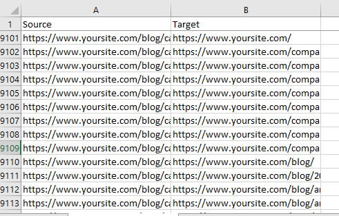
You will do this for both your live site and your staging site (the one with the adjusted structure). Once you have downloaded both structures, you’ll need to format them for Gephi. All that Gephi needs to create a visualization is an understanding of your site pages (“nodes”) and the links between them (“edges”).
Note: Before we ready the data, I recommend doing a Find & Replace in the staging CSV file and replacing your staging server domain/IP with that of your actual site. This will make it easier to use and understand in future steps.
As Gephi doesn’t need a lot of the data from the Screaming Frog export, we’ll want to strip out what’s not necessary from these CSV files by doing the following:
- Delete the first row containing “Success (2xx) Inlinks.”
- Rename the “Destination” column “Target.”
- Delete all other columns besides “Source” and “Target.” (Note: Before deleting it, you may want to do a quick Sort by the Type column and remove anything that isn’t labeled as “AHREF” — CSS, JS, IMG and so on — to avoid contaminating your visualization.)
- Save the edited file. You can name it whatever you’d like. I tend to use domain-live.csv and domain-staging.csv.
The third set of data we’ll want to have is an Export of our organic landing pages from Google Analytics. You can use different metrics, but I’ve found it extremely helpful to have a visual of which pages are most responsible for my organic traffic when considering the impact of a structural change on page weight. Essentially, if you find that a page responsible for a good deal of your traffic will suffer a reduction in internal PageRank, you will want to know this and adjust accordingly.
To get this information into the graph, simply log into Google Analytics, and in the left-hand navigation under “Behavior,” go to “Site Content” and select “Landing Pages.” In your segments at the top of the page, remove “All Users” and replace it with “Organic Traffic.” This will restrict your landing page data to only your organic visitors.
Expand the data to include as many rows as you’d like (up to 5,000) and then Export your data to a CSV, which will give you something like:
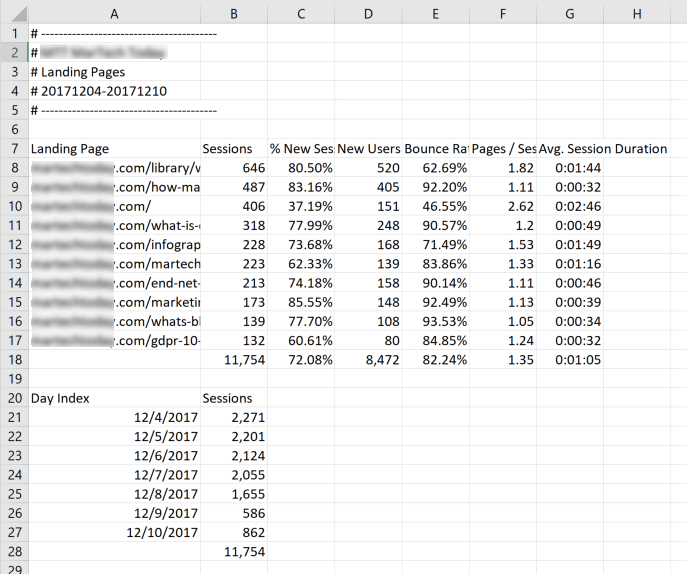
Remove the first six rows so your heading row begins with the “Landing Page” label. Then, scroll to the bottom and remove the accumulated totals (the last row below the pages), as well as the “Day Index” and “Sessions” data.
Note that you’ll need the Landing Page URLs in this spreadsheet to be in the same format as the Source URLs in your Screaming Frog CSV files. In the example shown above, the URLs in the Landing Page column are missing the protocol (https) and subdomain (www), so I would need to use a Find & Replace to add this information.
Now we’re ready to go.
Getting a visualization of your current site
The first step is getting your current site page map uploaded — that is, letting Gephi know which pages you have and what they link to.
To begin, open Gephi and go to File > Import Spreadsheet. You’ll select the live site Screaming Frog export (in my case, yoursite-live.csv) and make sure the “As table:” drop-down is set to “Edges table.”
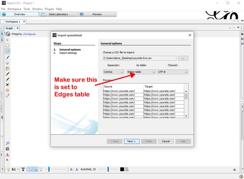
On the next screen, make sure you’ve checked “Create missing nodes,” which will tell Gephi to create nodes (read: pages) for the “Edges table” (read: link map) that you’ve entered. And now you’ve got your graph. Isn’t it helpful?
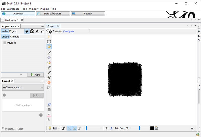
OK, not really — but it will be. The next step is to get that Google Analytics data in there. So let’s head over to the Data Laboratory (among the top buttons) and do that.
First, we need to export our page data. When you’re in the Data Laboratory, make sure you’re looking at the Nodes data and Export it.
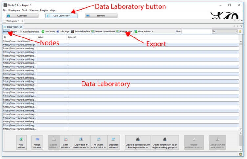
When you open the CSV, it should have the following columns:
- Id (which contains your page URLs)
- Label
- Timeset
You’ll add a fourth column with the data you want to pull in from Google Analytics, which in our case will be “Sessions.” You’ll need to temporarily add a second sheet to the CSV and name it “analytics,” where you’ll copy the data from your analytics export earlier (essentially just moving it into this Workbook).
Now, what we want to do is fill the Sessions column with the actual session data from analytics. To do this, we need a formula that will look through the node Ids in sheet one and look for the corresponding landing page URL in sheet two; when it finds it, it should insert the organic traffic sessions for that page into the Sessions column where appropriate.
Probably my most-used Excel script does the trick here. In the top cell of the “Sessions” column you created, enter the following (the bolded numbers will change based on the number of rows of data you have in your analytics export).
=IFERROR(INDEX(analytics!$B$2:$B$236,MATCH(A2,analytics!$A$2:$A$236,0),1),”0?)
Once completed, you’ll want to copy the Sessions column and use the “Paste Values” command, which will switch the cells from containing a formula to containing a value.
All that’s left now is to re-import the new sheet back into Gephi. Save the spreadsheet as something like data-laboratory-export.csv (or just nodes.csv if you prefer). Using the Import feature from in the Data Laboratory, you can re-import the file, which now includes the session data.
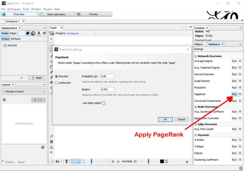
Now, let’s switch from the Data Laboratory tab back to the Overview tab. Presently, it looks virtually identical to what it had previously — but that’s about to change. First, let’s apply some internal PageRank. Fortunately, a PageRank feature is built right into Gephi based on the calculations of the initial Google patents. It’s not perfect, but it’s pretty good for giving you an idea of what your internal page weight flow is doing.
To accomplish this, simply click the “Run” button beside “PageRank” in the right-hand panel. You can leave all the defaults as they are.
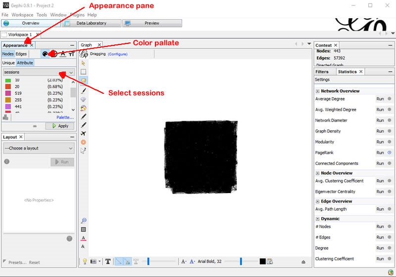
The next thing you’ll want to do is color-code the nodes (which represent your site pages) based on the number of sessions and size them based on their PageRank. To do this, simply select the color palette for the nodes under the “Appearance” pane to the upper left. Select sessions from the drop-down and choose a palette you like. Once you’ve chosen your settings, click “Apply.”
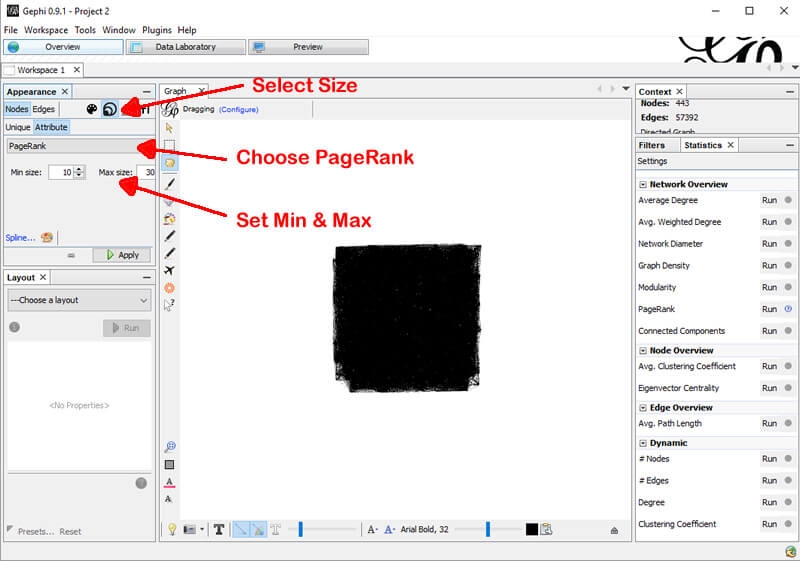
Next, we’ll do the same for PageRank, except we’ll be adjusting size rather than color. Select the sizing tool, choose PageRank from the drop-down, and select the maximum and minimum sizes (this will be a relative sizing based on page weight). I generally start with 10 and 30, respectively, but you might want to play around with them. Once you’ve chosen your desired settings, click “Apply.”
The final step of the visualization is to select a layout in the bottom left panel. I like “Force Atlas” for this purpose, but feel free to try them all out. This gives us a picture that looks something like the following:
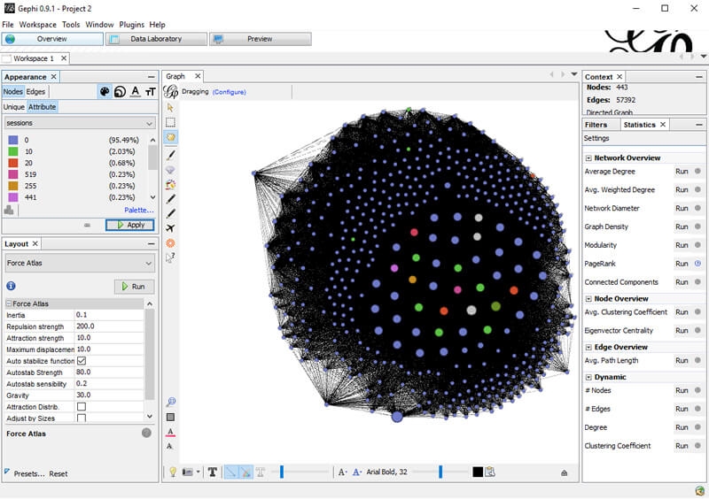
You can easily reference which pages have no organic traffic and which have the most based on their color — and by right-clicking them, you can view them directly in the Data Laboratory to get their internal PageRank. (In this instance, we can learn one of the highest traffic pages is a product page with a PageRank of 0.016629.) We can also see how our most-trafficked pages tend to be clustered towards the center, meaning they’re heavily linked within the site.
Now, let’s see what happens with the new structure. You’ll want to go through the same steps above, but with the Screaming Frog export from the staging server (in my case, domain-staging.csv). I’m not going to go make you read through all the same steps, but here’s what the final result looks like:
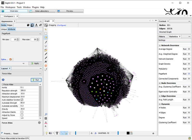
We can see that there are a lot more outliers in this version (pages that have generally been significantly reduced in their internal links). We can investigate which pages those are by right-clicking them and viewing them in the Data Laboratory, which will help us locate possible unexpected problems.
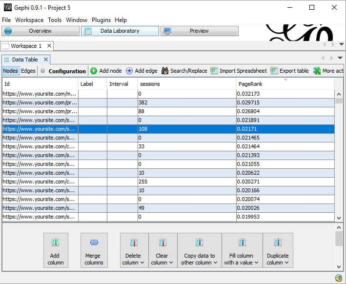
We also have the opportunity to see what happened to that high-traffic product page mentioned above. In this case, under the new structure, its internal PageRank shifted to 0.02171 — in other words, it got stronger.
There are two things that may have caused this internal PageRank increase: an increase in the number of links to the page, or a drop in the number of links to other pages.
At its core, a page can be considered as having 100 percent of its PageRank. Notwithstanding considerations like Google reduction in PageRank with each link or weighting by position on the page, PageRank flows to other pages via links, and that “link juice” is split among the links. So, if there are 10 links on a page, each will get 10 percent. If you drop the total number of links to five, then each will get 20 percent.
Again, this is a fairly simplified explanation, but these increases (or decreases) are what we want to measure to understand how a proposed site structure change will impact the internal PageRank of our most valuable organic pages.
Over in the Data Laboratory, we can also order pages by their PageRank and compare results (or just see how our current structure is working out).
And…
This is just the tip of the iceberg. We can substitute organic sessions for rankings in the page-based data we import (or go crazy and include both). With this data, we can judge what might happen to the PageRank of ranking (or up-and-coming) pages in a site structure shift. Or what about factoring in incoming link weight, as we did in the last article, to see how its passing is impacted?
While no tool or technique can give you 100 percent assurance that a structural change will always go as planned, this technique assists in catching many unexpected issues. (Remember: Look to those outliers!)
This exercise can also help surface unexpected opportunities by isolating pages that will gain page weight as a result of a proposed site structure change. You may wish to (re)optimize these pages before your site structure change goes live so you can improve their chances of getting a rankings boost.
[Article on Search Engine Land.]
Opinions expressed in this article are those of the guest author and not necessarily Marketing Land. Staff authors are listed here.
Marketing Land – Internet Marketing News, Strategies & Tips
(43)
Report Post


