— August 28, 2018
A lot has been written about choosing the right words to lead prospects from browsing to buying. But there are important ways to visually lead prospects through the buying process. By the end of this article, you’ll know how to visually lead your visitors to your most-desired action, whether that’s a sale, a sign-up or a contact request.
A tale of two passport applications
A quick look at two pages about the US passport application process gives an idea of the difference visuals can make.
Here is the USPS (the Post Office) page:
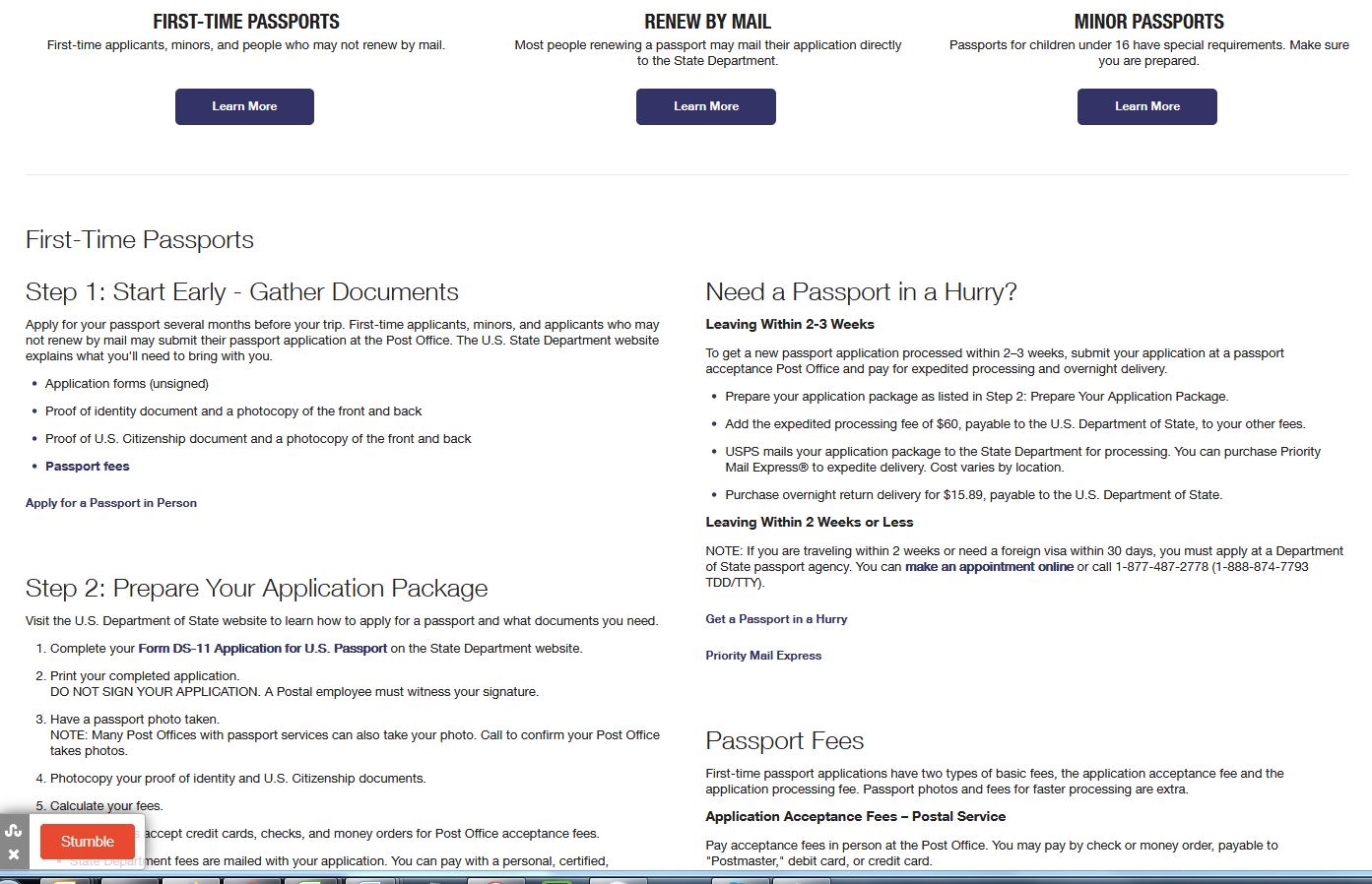
It’s an endless stream of text…in a tiny font, no less. The only visuals are the three identical buttons, by which you can choose which endless stream of text to give you headaches.
The State Department page takes an almost opposite approach to the exact same process:
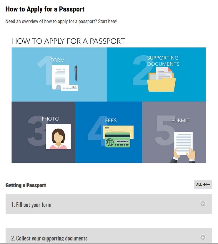
Here, you’ll find multiple visual clues to point you in the right direction. The bulk of the text is hidden behind step-by-step tabs. When you click on the tab, the information for that step is revealed. The user is not overwhelmed by the whole process at once.
When a visitor knows in advance what to expect, the process is much less scary. It’s much easier to say “Yes!” They don’t have much choice when applying of a passport. But they do have a choice when considering a purchase from you. So you have to help visitors feel at ease with what you plan to put them through.
Lead them with a visual list
Your sales process is probably less complex than applying for a passport. Few things are as complicated as passport and visa applications. So let’s look at a less-complex example you can follow. MyUKmailbox does a classic job of visually leading people through its process.
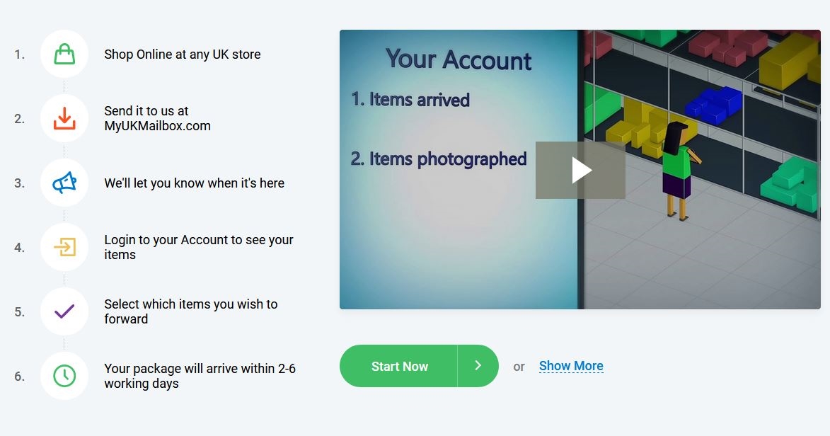
There are six steps.
- Each one is numbered.
- Each one has an image.
- Each one is color-coded.
- Each one has a quick text description.
The process looks easy and organized, removing almost all barriers to signing up. And, conveniently, the “Start now” button is placed right at the end.
Some people like more details, so there is a video for them. There is also a “show more” button for those people, similar to the pop-down information on the State Department’s website.
But the myUKmailbox visual clues are better than the State Department’s. While less artistic, they appear more organized, because they are in a list. The State Department’s do not look visually organized, with different sized boxes spread across two different lines. Furthermore, there are colors that do not follow through to the steps, although the numbers do.
Make it look simple, and you remove possible psychological barriers to signing up.
When your process is too complex for a list
Some processes are not simple. Sometimes there are options. The challenge is to make a complex process look as simple as possible. That’s why flow-charts were created. But flow charts can be as intimidating at a wall of text. This is the old Crown copyright permissions flow chart for Canada’s Department of National Defence, which I grabbed from the WaybackMachine:
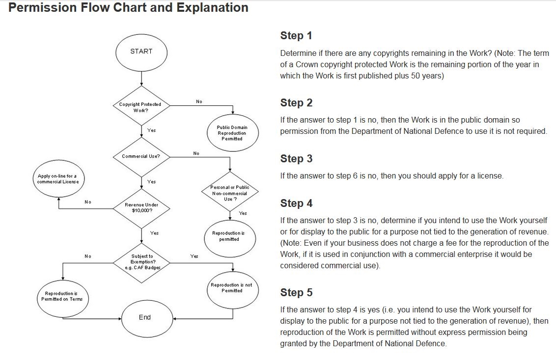
This is the type of flow chart that gives people nightmares. There is no numbering of the boxes to match the numbering of the text. In fact, the boxes don’t even mirror the text.
The revised flowchart is much better:
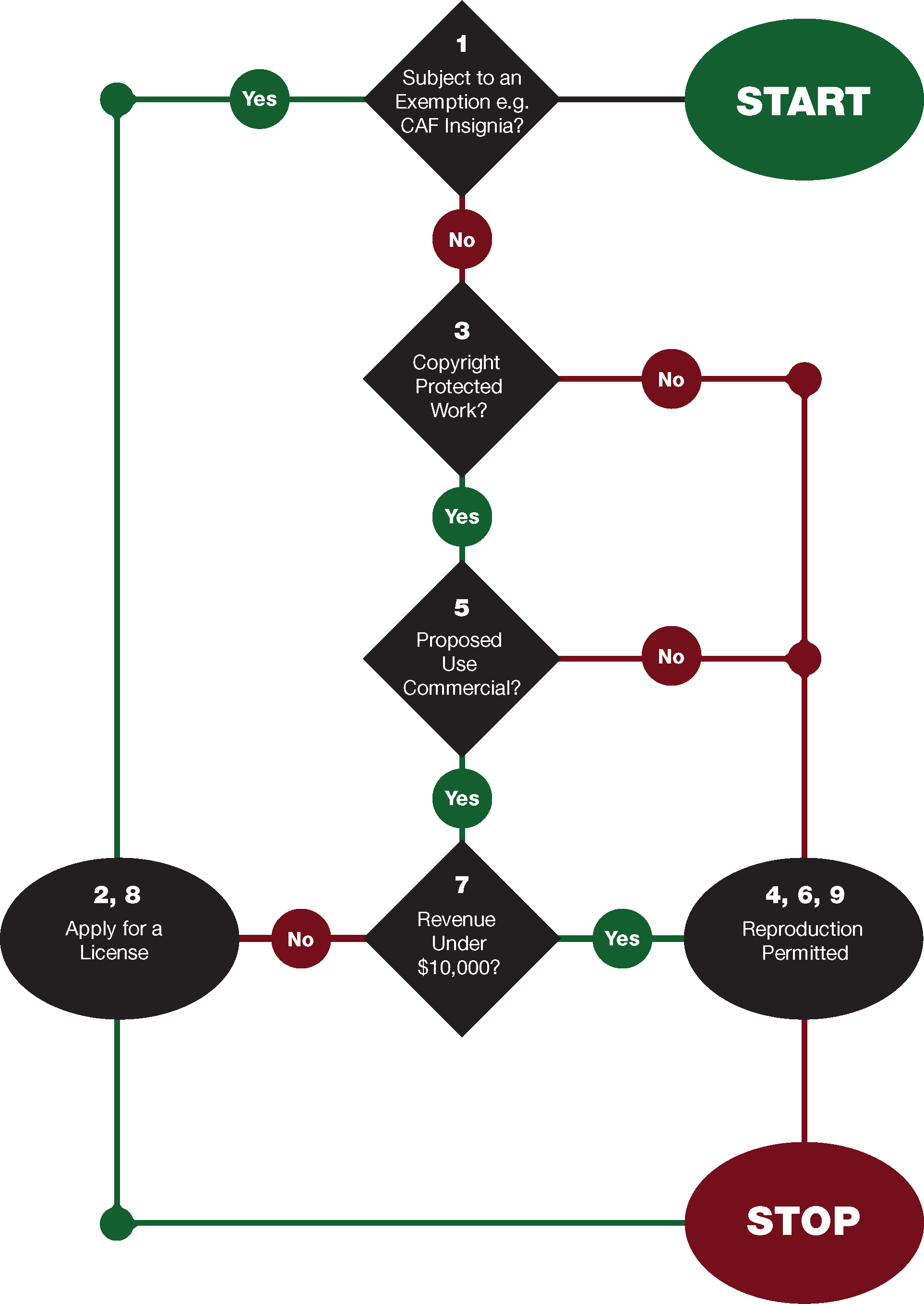
The steps have been clarified, which created several more steps (from 5 before to 9 after). But the structure of the flowchart has been simplified, mostly because the same actions apply to more than one situation. The boxes are numbered to correspond to the new steps. “Yes” and “No” are color-coded, so it’s easy to follow. The shape and size of the boxes help distinguish their function for people, too.
If you see a pattern, this is it: color-code and number your steps to make them easy to follow.
When your process is too simple for a list
I offer a custom service. We write books, speeches, screenplays, etc. No two books are the same. No two speeches are the same. No two screenplays are the same. The lengths are different. Client goals and expectations are different. Clients want to work differently with our writers. And client information can be more or less (or not at all!) organized.
In other words, we don’t have a “process”. Our only process is to fill in the query form. But it’s still worth while leading people through it. And we do it visually.
The colors I chose are designed to get attention and create a sense of urgency. The yellow you see here is bright and it contrasts with the background. The red contrasts with the yellow, and red generally gives a sense of urgency. When you scroll, a red button follows you down the page, leading you to “Get my free quote”.
All the visual clues point to the most-desired action. Note that in the site banner, there is also a Get my free quote” button. Click it, and it takes you to the form. Three identical buttons, same shape and same color, in three places. All three give a single message to lead people through the process.
Honourable mention
I want to share one more example, just to get you thinking outside the box. Many companies offer different packages with different pricing and different options. There are typically basic, advanced and pro levels, depending on customer needs and budget.
BoomTown! has three packages. They are listed much like any other company would list its packages, one beside the other.
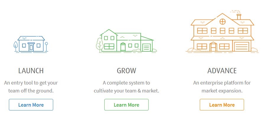
But the way Boomtown has visually and verbally designed its display is more like a process. Start small, grow, then grow more. It’s a process that preconditions new customers for future upgrades. I love it!
Key takeaways
What are the key takeaways from this review?
- Give people advance notice of the process you will take them through. When people know where they are going, they are less apprehensive about making the trip.
- Number the steps, and be consistent with the numbers.
- Color-code the steps, and be consistent with the colors.
- Use shapes and/or icons to distinguish the steps, and be consistent with them.
- Use simple text that matches the visual clues.
Whatever your most-desired action, you can move people through your process with visual clues. You’ll get higher conversions and those leads, subscribers or customers, will feel much more positively about their experience.
Digital & Social Articles on Business 2 Community
(95)


