— November 26, 2018

If you’ve ever launched a website, you know that Murphy’s Law does in fact exist: anything that can go wrong, will go wrong. From small grammar mistakes to plugins that make the site inaccessible, you must be prepared to troubleshoot both the expected and unexpected. Below are three core elements to account for when launching a new website, and tips on how to make each go more smoothly.
Content
The more content that you have on your site, the more organized you must be. Here’s a list of some of the things to watch out for when you’re juggling content for your new site:
- Content version control (or lack-thereof)
- Losing assets
- Wrong content/media in the wrong location on the site
To avoid these pitfalls, here’s a couple recommendations to help your content launch goes more smoothly:
- Assign a “Content Manager:” Similar to a project manager, this person’s role isn’t to create the content, but to make sure everything is in-line, organized, and the right assets progress accordingly.
- Don’t use email as storage: Any assets that are transferred via email should always be saved into a centralized storage location (CMS, shared folders, etc.). You should never have to “look back” into your email to find an asset that someone sent you. As soon as you receive it, save it in a shared location.
- Digital storage/organization tips:
- Organize assets by website structure: consider setting up your folders according to your site structure. This way, there’s a 1:1 match between the content and where it should reside on the site, minimizing the chance that the wrong content ends up in the wrong locations.
- Plan for multiple versions: have separate folders for each round of content revisions – ie version 1, version 2, etc. That way, when you get to the final version, every asset is included and everyone will know where to pull the latest update from.
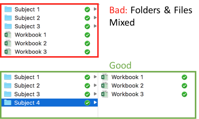
- Files of a feather flock together: folders should sit next to folders and files next to files. Whenever a file sits next to a folder, that means it’s time for a new folder. I realize many people have their own naming conventions that they remember, but it’s better to build an organizational structure that doesn’t require you to be there to find something. While creating nested folders within your storage system may take a few more clicks to access, it will pay off in the time you won’t have to spend sending files to people who could instead find them themselves.

Design
The two big design factors you need to account for when launching your site are:
- Browser compatability
- Device compatibility
If you have a responsive website (you should), it can and will appear differently depending on which browser and device your visitors are on. While doing your testing, it’s important to download different internet browsers and do a spot-check to make sure everything looks how you want it to. It’s also a good idea to check your web analytics to see which browser the majority of your traffic uses; then, you can prioritize your testing with that browser.
Similarly, your site elements will appear differently on different size screens. Pull out your phone, tablet, and a couple computer sizes if possible to see if everything looks right. It is also important to note that there could be SEO implications, as sites that are not responsive or mobile-friendly could be penalized in search results. A great tool you can use instead of manually looking at different screens is called Screenfly. You simply enter your URL, it’ll pull up your site, and you can pick virtually any device brand, model, size etc to see how it appears.
Functionality
Elements on your site can look pretty, but if the plumbing doesn’t work, then your Demand Generation efforts will be for naught. Be sure to double check that:
- Links are working properly.
- Form submissions are leading to the right ‘Thank You’ pages as well as sending the correct data to your database.
- Any automated follow-up emails are triggering.
- 3rd party site integrations such as marketing automation, sales CRM, SEO plugins, social plugins, etc. are working properly and not interfering with other site functionality.
- Any old content is redirecting to the respective new page(s). If you have high-traffic pages, you don’t want to lose that SEO “juice.” Using redirects to the new site locations, will make sure you don’t lose out on that valuable traffic.
Pre-launch quality assurance testing is not optional. It’ll save countless hours of fixing later. However, not everything will be caught pre-launch. Here’s a few tips to minimize the bumps in post-launch damage control:
- Launch when traffic is low: Sites have different traffic patterns depending on audience, so check your analytics to see when would be best.
- QA is a team effort: You should have multiple eyes testing the site, then reporting bugs to a single person who will prioritize them.
- Prioritize bugs: Bugs should be prioritized based on urgency and impact. Urgency refers to how quickly the bug must be fixed (based on site priorities, site-usability, etc) and impact refers to how big the bug is – what are the downstream ramifications of the bug? High urgency and impact bugs should be addressed first.
Summary:
- When launching your site, you must account for content, design and functionality elements to make sure everything’s running smoothly.
- Accountability and organization are critical to ensure bugs and their fixes don’t fall through the cracks.
- Post-launch bugs are inevitable, but they should not all be treated equally. Those with high urgency and impact should be prioritized.
Launching a new website is a strenuous endeavor, often including many parties. With so many balls being juggled simultaneously, it’s easy to let something drop. However, an organized process and clear lines of accountability will greatly reduce the firefighting needed.
What are some other key elements you had to keep an eye on while launching your website?
Digital & Social Articles on Business 2 Community
(111)
Report Post


