Your website is the hub of your business online, it’s your digital image that customers and potential customers see.
Your website is all about you and it should reflect your business and what you do clearly and simply. Websites have come a long way from where they started, but within the last 3 years so much has changed.
Past

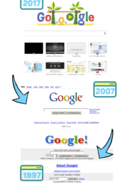
We all remember the basic website designs that were just there for the function of telling a customer simple information such as a the company phone number, address and what services they offer. Just take a look at Google (below) in 1997 compared with 2017. The design is very boxed, the text is plain Arial, also the shadowing on the ‘Google’ makes it look very dated. These older websites clearly didn’t have the modern focus on UX (User Experience, the functionality of the site and how it works) and UI (User Interface, what the site looks like aesthetically) that we value so much now.
Present
Companies are realising that the cheapest and most basic websites are actually doing them a disservice. Just think about it yourself, if you were browsing online and visited a website that looked like it hadn’t moved on or developed from 20 years ago, would you stay on the site? The last thing you want is your customers to think that your website is outdated and boring.
We could talk about website design and styles all day, but it’s all about understanding what works for you and your customers. First and foremost, any website in 2017 must have a responsive design. This means building not only a main website frame, but also a responsive site for the use on all devices such as IPads and IPhones. Back in 2009 the rise of mobile began, a study was conducted in October 2016 to understand how people’s browsing habits have shifted, it found that mobile and tablet accounted for 51.3% of internet browsing, versus the desktop’s 48.7%. Whatever updates you are doing to your main website, it is important to make sure you are updating it for responsive devices too, especially as mobile is becoming the new TV for millennials. Plus, this all feeds your organic SEO campaign as Google now ranks mobile sites higher in internet searches.
Website trends in 2017 have taken a turn towards the modern and streamline:
- Less is more, everything important on your site needs to be just 3 clicks away. The UX side of development has streamlined this process, by simplifying navigation of newer sites for users.
- Don’t forget the typography, make it big, make it bold and make it out there, you must grab the attention of the website user instantly.
- Something that we hardly ever used to see was authentic photography. People are bored of seeing the usual Adobe Stock images. As Google doesn’t rank them as high anymore, because it classes them as duplicates. So make your photography authentic and humanise your business with your own professional photos.
- If you underestimate the use of colour on your website then you will get nowhere in 2017. It’s all about choosing the perfect colour to both represent your brand and grab a customers attention.
- Video, we all know how important videos are for marketing in 2017, so make sure yours is embedded onto the homepage of your website and if you haven’t got one, get one. Not only does this help with your Google rankings, but it creates visual engagement on your site to keep your customers on there for longer.
- Break out of the normal layout, experiment with layers and text to really make your website stand out. Symmetry is considered outdated and boring.
All of these components have to work together to bring your website into 2017 and engage customers whilst they are on your site to increase your sales.
Future
Although we have already come so far with website design trends in 2017, there is still a long way to go. Over the next year we are expected to see a rise in animated websites. These are going to bring another website style revolution, with interactive features to make the experience of a website less about the functionality and more about the fun.
Animations can soften the appearance of your site and increase engagement, every animation you use must be well thought out and add value to your site. Just the simplest animation can enrich your site. Even techniques such as open composition (where you have animations that can fly in from off the screen) are quickly taking over website design trends.
So why wait? Bring your website into 2017.
Digital & Social Articles on Business 2 Community(68)


