Before we start, please, let’s just agree on something. It’ll make reading this post a lot easier for all involved!
Mobile is important.
So why do so many of the big brands not have mobile friendly websites?To combat all of this negligence from brands, large and small – Google just released their ‘Mobile Friendly Test’. This new toy let’s you enter any URL from around the web and check whether or not it matches up to Google’s Mobile Friendly Criteria.
“69% of tablet owners have shopped on their tablet in the last 30 days”
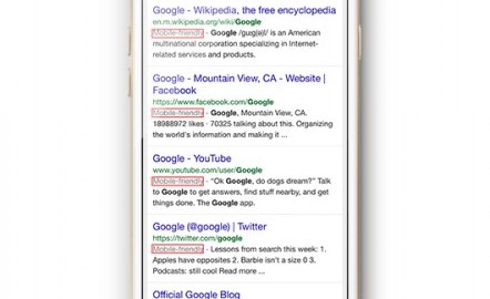
Just to make sure everything is as easy as possible, Google now have a Mobile Friendly label when you perform a search on mobile, to let you know which sites you will not need to squint, pinch and scroll your way around. Sounds good, right? Yeah, us too! 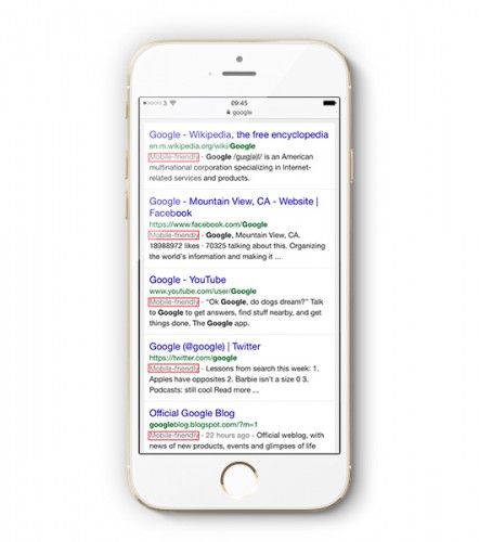 Clearly this whole ‘Mobile’ thing is kind of a big deal. So we thought we would have a look at some of the big boys’ websites, whether or not they are mobile friendly and, if not, why not!
“85% of adults now agree that a company’s mobile website should be at least as good as their desktop version”
Nike
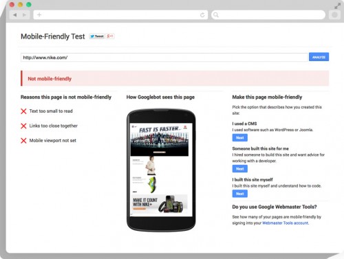
These sports fashion giants have not done such a great job on optimising their website. Google has found 3 major issues that mean you don’t want to be using this site on a mobile:
- Links too close together
- Mobile viewport not set
- Text too small to read
Xerox
A big tech firm, “Of course their site is responsive” I hear you cry. Guess what? It’s not. We reckon it’s time Xerox got a little more compos mentis with their mobile design! With text that is toosmall to read, the mobile viewport not set and links too close together, one thing’s for sure, you’ll be pinching and zooming your way through this website. Tech support? Not here thanks. 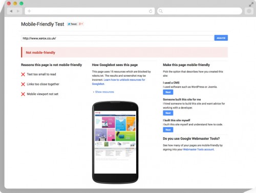
“By the end of 2014 there will be more Mobile Internet users than Desktop”
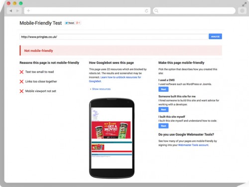
Pringles
Once you pop, you can’t…read any of the website. You will really have to crunch your way around this under optimised, old school website for one of our best loved crisp brands. Three big issues here, but go and check it out, it’s worse than this makes it seem!
- Text too small
- Links too close together
- Viewport not set for Mobile
 Luckily, it’s not all doom and gloom, most of the big boys have got it spot on. Check out offerings from:
- Missguided
- Google…luckily!
- Amazon
So there you have it. Qualifying for Google’s Mobile Friendly test is going to be a key component of websites, as looking out for the ‘Mobile Friendly’ label becomes more and more a part of how we browse the mobile web.
“Only 36% of the top 100 UK brands have optimised their websites for mobile devices”
[All sites were tested and found to be mobile friendly/unfriendly on November 20th 2014]
https://econsultancy.com/blog/9836-69-of-tablet-owners-make-a-purchase-on-their-device-every-month
http://www.businessinsider.com/mobile-will-eclipse-desktop-by-2014-2012-6?IR=T
http://www.iabuk.net/about/press/archive/iab-uk-launches-first-european-mobile-optimisation-study
http://www.huffingtonpost.com/john-rampton/business-mobile-responsive-design_b_5267077.html”>
Digital & Social Articles on Business 2 Community
(579)
Report Post