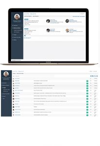
Any business, no matter what industry or size, is collecting information about its customers, its market, its conversions, etc., and just about every business looks to manage that data through dashboards.
Dashboards do the tricky work of presenting complexity in the simplest of ways. Organizing information so that it can be understood at a glance by the intended audience requires attention to detail and considerable revision. It’s not an impossible task, but the lift can be considerable. Done correctly, however, a good dashboard can help get the right data in front of the right people at the right time.
The process for designing a great dashboard for users begins as every important project does: with research.
Step 1: Define Your Audience and Anticipate Its Needs
It sounds harder than it is, but it’s a vital step that’s all too easily overlooked. Designing the right dashboard for the right people requires that you know who’s using it and why. Executives are going to want to see the high-altitude views with the option to drill down to better understand trends. The folks in the trenches don’t necessarily need to know about the big-picture stuff, so more detailed findings are best communicated up front.
It’s worth spending a little extra time on this step because it can set the stage for the rest of the task ahead of you. The better you get to know your users and their needs, the better your dashboard will be.
Step 2: Establish Requirements for Each Individual Element
Every dashboard is a mosaic of data visualizations, each with specific requirements stemming from the data itself. Expect to face the challenge of matching business terms to their data definitions.
For instance, don’t assume you know what a “customer” or a “week” is to your stakeholder. Every company has its own way of counting customers, and a week might run Monday to Friday instead of Sunday to Saturday. By defining these terms precisely and according to the available data, you’ll be able to say, with confidence, “a customer is an opportunity with a closed status in the deal column.” Defining terms ensures that your dashboard accurately reflects the company’s semantic understanding of the data.
Beyond data definitions, you will also have to make sure you have all the information you need in order to build each element on the dashboard. Here’s a handy checklist to get you started.
- What are the insight(s) your audience needs from this element? (What are they trying to do?)
- What dimensions and measures are needed for this visualization?
- How can the data be modeled to produce the correct output?
- What type of visualization should it be (bubble chart, table, map, KPI)?
- What limits and benchmark lines should be included?
- Is it important to have point labels? Any preferences for axis labels and titles?
- What should the units be? (Data stored in USD might need to be converted to EUR for the intended audience, for example.)
- What colors should be used/avoided?
- Will there be conditional formatting? If so, what will the logic be?
And then also be sure to explore non-visualizations:
- Will there be interactive filters? If so, what are the specifications?
- Are there any images or icons you should include?
- Any URLs to embed?
- What is the text you’re using, and is it all correct and concise?
Don’t hesitate to add to the checklist as you refine your process!
Step 3: Build a Wireframe
This step is crucial and a good opportunity to get feedback from a select group of both power users and casual users. This is also a great opportunity to finalize the visualizations you’ll be using. The choice between a table and a bar chart can mean a lot to your users.
Step 4: Just Go Ahead and Make the Dashboard
There’s not much to say for this stage, except this: make it! Assemble your dashboard and present it to your beta testers. They might be the same group who saw your wireframe, but not necessarily. Don’t be afraid to share it with multiple groups, especially if your dashboards have a broad user base.
Step 5: QA and Gather Feedback
Once you’ve successfully launched your dashboard, it’s time to gather the data you’ll need to iterate. Ask yourself, and your testers, the important questions:
- Does your dashboard work? This can be interpreted in the most basic sense (i.e., it doesn’t crash) but also in terms of usability. Are your users finding it, well, useful? If not, they can help you with Step 6.
- Does it make sense? Make sure someone with semantic knowledge of the data reviews the dashboard and can verify that the data presented is accurate.
- Does it commit any statistical fallacies?
- Does it follow design best practices?
- Does it look the way you intended on the device it’s meant for? For example, does it look good on the CEO’s desktop but janky on the warehouse technician’s tablet?
Step 6: Revise Your Dashboard
Take action based on the data you’ve gathered about how your users are using your new dashboard. This is the perfect time to remind you of something you hopefully already know: if something isn’t working, get rid of it. Even if you spent a lot of time and energy on an element that your users aren’t using, be brave enough to drop it.
Step 7: Finalize
You did it! You’re finished! Well…sort of. Data sets and use cases are always changing. Not only that, but updates to your dashboarding software could also cause new behaviors. As the dashboard author, it will likely be your job to maintain it going forward.
As always, practice makes better. What you learned during this implementation will inform how the next one goes. Speaking of the next one, don’t you have a dashboard to build?
Originally published here.
Business & Finance Articles on Business 2 Community
(20)
Report Post


