— October 6, 2017
Website design and development is essential to the success of your business. Considering that there are billions of people online today, businesses can’t afford to have a sub-par website presence anymore. Even consumers who are familiar with your company locally will investigate online, whether it’s to find out more about you and your company, discover what else you offer, or sign up for your services or products if applicable.
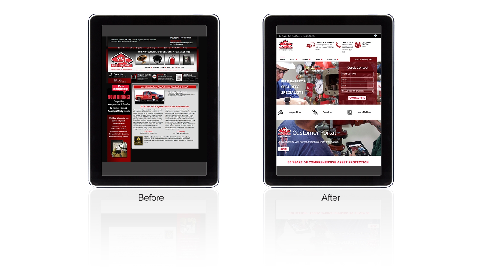
As design best practices have progressed, the best-in-class websites of 2017 are being built with minimalism in mind, including clean lines, contemporary, mobile-friendly design and an easy, user-friendly interface, all to provide a superior user experience. According to Kissmetrics, if users have a bad experience on a site, 40% won’t return and a whopping 50% of sales are lost because of bad structure and navigation.
So, how can you tell if your website presents more than an attractive face for your company? That’s a difficult question to answer, but asking yourself the following questions will help.
Does your website take forever to load?
People in general have short attention spans so they aren’t willing to wait very long for your site to load. If it takes too much time they’re going to go somewhere else. You can manage this by avoiding any use of Flash, compressing big image files, and using optimized plugins that reduce extra coding that causes slowness.
Can visitors quickly determine the purpose of your website?
You only have a few seconds to present the purpose of your website so make sure that it’s crystal clear. The last thing visitors want to do is have to figure out what the point of a website is. This is harder than it sounds. In our experience, clients tend to want to have more than one goal. That complicates matters and often causes confusion. It’s best to have a singular focus and funnel visitors to that end.
Do you provide a clear direction of what your target audience should do?
The navigation system on your website should offer an adequate number of choices that meet the needs of your visitors. Adequate, but not too many. You don’t need your main navigation to look like a site map. As part of our strategy development process, we try to flush out exactly what’s required in the main navigation to keep the site clean and un-cluttered. It’s not easy to do, but with careful thought, it’s achievable.

A successful web presence clearly communicates the purpose of the website immediately. A highly functional website loads quickly and easily, makes visitors feel welcome and offers clear directions to get anywhere on the site that they want to go easily.
Website Functionality and SEO
There’s a lot more to SEO than choosing the right keywords. Website usability and functionality are critical requirements for ending up in SERPS (search engine results pages). You may not have known that having a secure website is one of the factors on Google’s radar. Even if you end up ranking well and visitors show up on your site, if it isn’t user-friendly and has sub-par functionality, those visitors won’t just bounce and abandon your site, but will also consider it a bad experience and won’t return. Worse, due to today’s socially connected world, they’re likely to share their negative experiences with their networks. On top of that, search engines monitor user behavior very closely today, monitoring websites that have high bounce rates, using these signals in their ranking algorithms.

All of today’s new website functionality requirements have placed even greater demands on a site’s performance, leading to visitor abandonment, loss of conversion opportunities, sales, and as a result, revenue. Consequently, it’s clear that maximizing your website’s functionality to meet your target audience’s expectations is essential to the success of your business. If you’re unsure that your site is optimized to deliver results, you may want to talk to a professional.
Digital & Social Articles on Business 2 Community
(58)


