 As part of Google’s continued efforts to make the internet more mobile-friendly, they’ve been incorporating mobile-first indexing into their ranking process. So, if you want your website to rank higher on search engine results pages (SERPs), it will need to be optimized for mobile Google search.
The institution of this new ranking process, however, has some SMB owners concerned about what Google’s mobile-first indexing will mean for their website and what they’ll need to do to make their sites ready for mobile-first indexing. In this blog post, we’ll walk you through the basics of Google mobile indexing and what changes you should be implementing to ensure your website will rank as high as possible for Google mobile-first indexing.
What is Google Mobile-First Indexing?
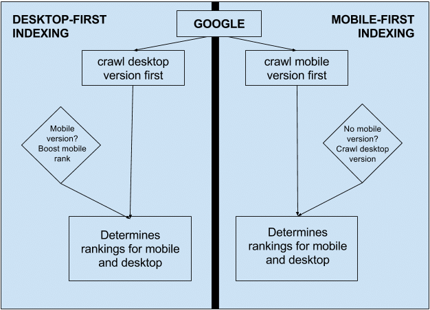
According to Google, “mobile-first indexing means Google predominantly uses the mobile version of [your website’s] content for indexing and ranking.” Before, Google’s index used the desktop version of your website’s content to evaluate the relevance of the page’s content against a user’s search query. However, since most people now use their mobile devices to access the internet, the Smartphone Googlebot has been indexing web pages designed for mobile-first searching.
In fact, since July 1, 2019, “mobile-first indexing [has been] enabled by default for all new websites (new to the web or previously unknown to Google Search).” Google has been monitoring and evaluating desktop web pages based on the Google mobile indexing best practices for older or existing websites.
As Moz.com reiterates, “it’s called mobile-first indexing because it’s not a mobile-only index: for instance, if a site doesn’t have a mobile-friendly version, the desktop site can still be included in the index. But the lack of a mobile-friendly experience could impact negatively on the ranking of that site, and a site with a better mobile experience would potentially receive a rankings boost even for searchers on a desktop.”
Here’s a look at the difference between desktop-first and mobile-first indexing:

What’s the Difference Between Mobile-Enabled vs. Mobile-Optimized?
It’s important to understand that the phrase “mobile-first indexing” should tell you that the mobile version of your website will be considered the primary version of your website from now on. Up until now, the desktop version of your website was considered the primary version, but if you’ve been diligent about implementing changes to your site to ensure mobile users have the same experience as desktop users, then Google mobile indexing should, theoretically, have very little impact on your website’s search performance ranking.
If your website is mobile-enabled, but you haven’t been as diligent about ensuring that the desktop and mobile versions offer the same experience to visitors, here are some best practices to implement:
- Structured Data: According to Google, “If you have structured data on your site, make sure that it’s present on both versions of your site. If you have to prioritize which types [of structured data] you add to your mobile site, start with Breadcrumb, Product, and VideoObject structured data.”
- Metadata: Be sure to use the equivalent of titles and metadata descriptions on both the desktop and mobile versions of your site. The official guidance from Google states that you should use “equivalent” as opposed to “identical” titles and metadata because if you can further optimize your mobile titles for a shorter character count, that provides a better user experience.
- Social Metadata: Twitter cards, OpenGraph tags, and other social metadata should always be included as part of your mobile-first indexing SEO process.
- XML and Media Sitemaps: To ensure that your site is ready for Google mobile indexing, review the XML and media sitemaps for your site to make sure that any links to the sitemaps are accessible from both the desktop and mobile versions of your site, which also means reviewing the robot directives (robots.txt and on-page meta-robot tags) and trust signals, such as links to your privacy policy page.
- Content: Make sure the mobile version of your site has all of the same valuable content that you have on your desktop site, which includes videos, images (always include alt tags for the images on both versions of your site), and text. Just be sure that your mobile site’s formatting can be crawled and indexed.
- Hreflang: If you use rel=hreflang to enable your site to offer your content in different languages, regions, and countries, then your mobile site’s hreflang tags should always point to the mobile version of your website and the desktop hreflang tags should point to the desktop version of your site.
- Search Console Verification: If you’ve only verified the desktop version of your site in Google Search Console, log in to your account and add and verify the mobile version of your site as well.
- Server Capacity: If the mobile version of your website is on a separate host, then make sure that your host server can handle the increased crawl rate.
Remember that Google only uses one index for all indexing. Google mobile indexing doesn’t generate a new, separate mobile-first index. It’s merely changing how the content is added to the existing index, which is why is so important to make sure that you have a comprehensive SEO mobile-first indexing process in place for your website.
*Photo Credit: Moz.com
Digital & Social Articles on Business 2 Community
(63)


