— May 2, 2018
A punchy call to action (CTA) is a must-have for any marketing video, but getting viewers to take the action is tricky. It’s frustrating to make a video, pay for a social ad campaign, and then see disappointing conversion rates again and again.
When you’ve engaged viewers to the end of a marketing video, you’ve already done something extraordinary. With the right call to action, you can persuade people to make the leap from intrigued viewer to paying customer.
With a consistent video call to action strategy, you can win more conversions over time. We’ve come up with a framework for that strategy. You just need the 3 C’s.
The 3 C’s: Context, Content, and Comparison
The goal of a conversion-focused video CTA is to turn passive viewers into active users of your product. The main challenge is convincing people that clicking through to your site, signing up for a trial, or subscribing to a plan will be worth it. A CTA can fail if the button doesn’t follow compelling content, it isn’t placed in a logical location, or people do not know where it leads. If your CTA doesn’t perform at least as well as similar CTAs, you’ll lose customers to your competition.
Because you want people to start using your product, and because it’s easy for viewers to misunderstand or dismiss your offer, the most important things to consider when you build a CTA are where to place it, what text and design to use for the button, and how to test it. These considerations can be broken down into a three-step process:
- Create a focused context for the CTA: where the video appears, what the video is about, and how the messaging leads to the CTA.
- Produce the content of the CTA: the text and design of the button itself.
- Compare with similar CTAs: in other words, A/B testing. To judge whether a CTA is successful, you have to measure its relative performance against other CTAs.
The context, of course, carries the weight in getting a call to action to work. Without a compelling video, your call to action will fall flat. However, incremental improvements will be achieved through copy, design, and testing. These measurable results add up over time to create stronger calls and, of course, more action.
Let’s take a closer look at each step.
Create a focused context
If you’re creating video marketing content to drive conversions, the call to action is the keystone of that content. It holds it all together. The content should center on and lead to the conversion action so that the CTA doesn’t appear out of the blue.
Here are a few quick ways to make your video content more focused on the call to action:
- Write the CTA or select the desired action before producing the video so you know exactly what you want the viewer to gain by watching it.
- State the value you’re offering.
- Reinforce the call by having an actor say it out loud or by having the card’s CTA match the one that’s onscreen.
Hubble’s Facebook ad puts its product, contact lenses, center stage, and the call to action alongside it. “Take this quiz!” the ad says. The quiz is just the conversion action, gamified—Hubble gathers your data for a trial of their product.
The value offered—a free box of contacts—is also conveyed in the video caption, the headline, and the post caption.
The “Learn More” call to action leads to a special landing page that will collect your eyesight prescription, email address, and payment method. The subhead and post copy reiterate the call. When you pause the video, “Learn More” is again displayed on the screen.
Since the content of the post is so clear, the button text almost doesn’t matter. The video is all about getting the viewer to go to Hubble’s site and sign up. The Facebook post is also focused on the single goal of conversion. The lack of distractions or alternatives directs interested viewers toward the CTA.
Write and design toward action
After you’ve put in the effort to create a compelling video that’s focused on the desired action, you’d hate for people not to see the link itself. When it comes to call-to-action text and design, simplicity and visibility rule. You need to help people “get it” instantly. Some platforms and players, like Facebook, even limit CTA choices to a short list. If you’re creating a video from scratch or using a Shakr template, you can customize the CTA button.
Since every audience is unique, you may have to test several different versions of the CTA to tweak it to perfection. However, there are a few best practices you can adopt for better CTA copy and design.
Use “power” words and “action” words
According to Wistia’s detailed study of video calls to action, certain words have proved more successful than others. Power words are supposedly the most persuasive in the English language and will be familiar to any marketer. These include you (personal), free (everyone loves free stuff), now (urgent), and new (satisfies a craving for novelty). Action words command something specific, such as click, download, register, sign up, and buy.

Curaytor’s post-roll CTA uses both power and action words.
Use a recognizable phrase
Anything you can do to reduce cognitive load will help viewers make a decision faster. “Click here” and “Try it now” are recognizable to viewers the world over. People can quickly scan these phrases without having to figure out exactly what’s going on.
Be succinct
Though there are some instances where creativity and humor make a long call to action worthwhile, it’s usually a safe bet to keep things short. If your call to action is longer than three words, try something else.
Make the words pop
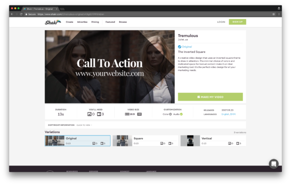
Again, some players and platforms limit the way CTAs look. But if you have the option to design a CTA, you should aim for readability overall. Opt for a large font that’s not too fancy (Wistia uses Whitney, YouTube uses Roboto), and use contrasting colors between text and background color. Shakr has baked many of these design practices into our video templates, so you don’t have to worry about optimizing for readability.

To make a video using this template, visit Shakr.
To make sure you’ve found the best fit between brand, message, and design, try testing lots of text and design options and optimize for the platform you’re using.
Test and compare
Speaking of options, testing is the third and arguably most important step in your call-to-action strategy. A CTA is one of the key places A/B testing can really make a difference in gaining a competitive edge. Anything you can do to smooth the conversion moment will translate into more active users of your product and more revenue for your company.
To create an accurate A/B test, change one variable at a time. Keep everything else controlled, and place the video in the same location in front of similar audiences. If you need ideas on what to test, here are several:
- Copy
- Color
- Font
- Size
- Position (beginning, mid-roll, or end)
- Button vs. text
- Background (image, solid color)
- Button location (top right, middle, bottom left)
If you’re a small business, try running the CTA tests for about a month to make sure enough people see the video. If you’re in a rush, a week or two could be sufficient. Next, use Google Analytics, platform native analytics, or your measurement tool of choice to view the results, pick the winner, and record it. Then, start over with a new test.
Do it all again
It takes time and consistent effort to hit your CTA stride. The CTA that works depends on your audience and what speaks to them. You can only learn what resonates by putting your best marketing content out there and trying a few different things. If producing several different videos for several different types of actions seems daunting, try a video template. It’s the best way to find out quickly how to get viewers to take action.
Digital & Social Articles on Business 2 Community
(38)
Report Post


