Creative ideas to balance visuals with functionality in your B2B emails — even in Outlook-dominated inboxes.
Recently, I shared an example of a work email on LinkedIn, sparking a flood of opinions on whether images belong in B2B emails. It turns out, the question of “to image or not to image” is a surprisingly divisive topic in B2B.
Here’s the email in question for reference. While the names have been hidden to protect privacy, the situation still reflects a poor experience for everyone involved.
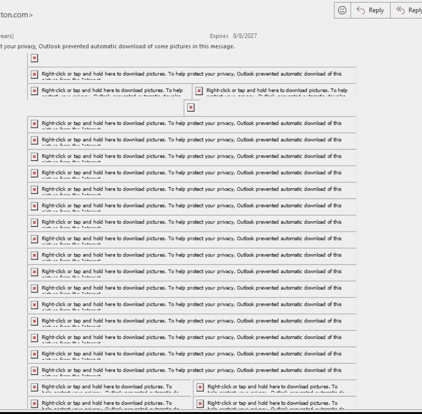
I would love to make a B2B email that renders like a beautiful flysheet, but Outlook isn’t a member of the Creative Suite. Beautiful designs that stack and interact aren’t your friend in an Outlook inbox. Even if you can code your way through most style rendering issues, you’re still faced with the fact that many businesses automatically suppress the download of images in email.
Why bother adding images at all, my B2B email friends? Because a picture is still worth a thousand words. If you’re struggling with the balance of text versus image-based B2B emails, let’s arm you with some talking points.
Less is more, but not never
Before you make any major changes, check your inbox reports. If your marketing automation platform reports on inbox placement, this is your go-to report for making decisions about email design. Here’s an example of what you might see.
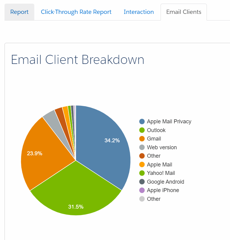
If a large percentage of your audience uses Outlook, keeping your designs simple and less table-heavy is best. Keep in mind that Outlook often turns off images by default, so avoid overly complex designs. While it’s tempting to prioritize design, optimizing for Outlook compatibility is key to ensuring your B2B emails perform effectively in the inbox.
While we’re at it, make yourself a reminder to check on your email fallback fonts and avoid those rounded corners — but that’s a conversation for another article.
Get inspired by other B2B designs
You can be simple and not boring. Really Good Emails is a great place to get inspired by newsletter formats, nurture emails and so much more that’s working well in B2B. Check out their curated list of B2B email designs.
Align your email design with your audience’s expectations
If your only image is a stock header or a basic thumbnail, it’s likely not worth downloading. Instead, consider your audience and tailor your design to their expectations.
Give recipients a reason to download images — such as sharing valuable information in a graphic. Add a preface that helps recipients anticipate the image’s content to encourage this. For example, include a dynamic, personalized image with a note like, “We’ve provided your specific results in a quick visual…” followed by the custom graphic.
Customize images based on the recipient
Are you adding any new value to your header images? You could consider creating dynamic header images that trigger off a person’s industry, region or area of interest. Recommended supporting content could also be dynamic. For instance, rather than showcasing one upcoming webinar, why not showcase the one the recipient is most likely to attend based on their buyer profile?
Use alt text strategically
Alt text is essential for accessibility, but it can also be a tool to encourage image downloads. You might make it humorous (if it suits your brand), intriguing or simply descriptive. Rather than just describing the image, consider using alt text to convey the image’s purpose or add a creative touch that invites curiosity.
Deploy hidden images to detect security bots
You can also use images in unconventional ways — like creating captures for security bots. Adding a 1 px by 1 px image into your background with a dedicated link can tell you which recipients have a security bot that might pre-click all email links and lower the engagement score by clicking the link.
Optimize image dimensions for email clients
Use images that fit the space allowed, ideally keeping the width at or below 680 px. Oversized images can disrupt the layout, especially in Outlook, which often ignores specified dimensions and displays images at their full size. For instance, uploading a 1200 px header into a 600 px slot could result in a 1200 px display, causing recipients to scroll horizontally to view the entire email.
Avoid text in images
Avoid placing text directly within images — especially if many of your recipients use Outlook. Text embedded in images can appear blurry, become too small to read on mobile or remain hidden if images aren’t downloaded. While the image may look perfect in your browser’s preview, remember that most recipients won’t have the same large display experience.
Test, test and test again
Have an email rendering tool? Use it! Email rendering tools are the best way to see how your new design will look across countless email inboxes — and it’s a lot more user-friendly than sending your email to a dozen of your coworkers.
The post When and how to use images in B2B emails appeared first on MarTech.
(10)
Report Post
