 You have an “About” page. You have a blog. You have a very nice slideshow with images of your products or your offices or some vague-looking nature scenes. If your web site were an awards show gown, it would be timeless high fashion: classic, clean, and always in style.
But all gowns need accessories. What goes best with classic?
Something new. Something fresh. Something a little unexpected, but not so strange that no one understands it. Something that tells people you know what’s going on right now even if you are following convention enough follow timeless design principles.
What goes best with a clean, simply-designed web site? Social media, my web fashionista. Social media. Here are some of the web sites that know how to wear it.
Bling on Top
Web sites that include links to their active social media channels on the top are declaring proudly that they have a presence there that is important to their overall business. These days, the trend is for a series of round buttons using either predictable color, logos, or — ideally — both, only for the networks where you can find them in active participation. We all know what the “f” and “t” with their varying blue shades represent, but beyond that, the little circles of social connection often include the “p” for Pinterest, the “L” for LinkedIn, and the orange-background radio-waves of RSS feeds. Smashing Magazine — not surprisingly — wears it well:

Statement Pieces
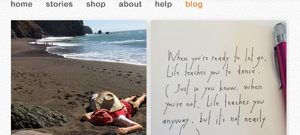
When a movie star wears her grandmother’s costume necklace — something no one has seen before — it grabs the interest of every reporter and all the blogs. It’s a window into her personal life and so, too, is a feed from your most active social network. Including a live stream from your Twitter feed, or a gallery of your latest Instagram shots, is an alluring way of showing your web site readers what you’re really all about in-the-moment. Folk-art design company StoryPeople uses the Instagram feed of its artist, Brian Andreas, as a blog, including shots of his current design notebook. Not only does this force a regular update of the website every time he posts to Instagram, but it adds an even more intimate voice to this already-personal-feeling site.

“I Love That! Who Are You Wearing?!”
Anything truly great — whether it’s jewelry or content on a web site — will inspire others to talk about it and share it with their friends and colleagues. Web sites that value that kind of sharing use social media to make it happen, and those who use social media well are the ones who’ve embraced the easiest possible user-driven sharing tools. Nowadays, that’s almost everyone. When was the last time you read something great online and couldn’t find a button to click on that would let you share it to Facebook, Pin it, or Tweet it? The trick is WHERE to put those sharing buttons. There are several options.
First option: at the top of your article. Salon puts the share buttons just below the title of the article:

Not willing to commit to just one spot (bracelet & anklet?), Slate puts them at the top and bottom:

Even better, Wired Magazine runs the share buttons along the left side of all its articles, the whole widget moving as the user scrolls. It’s inescapable, more of a perfume than a piece of jewelry.

However you decide to accessorize your web site, be sure you’re choosing the right style for your audience. Social media is moving as quickly as any other trend, and what’s the latest thing today might be as uncool as black rubber bracelets and MySpace tomorrow.
(303)
Report Post


