A list of contacts is essential for any business that wants to stay in touch with prospects and customers. That list also shouldn’t be static. It should be ever-changing and consistently evolving due to attrition through unsubscribes, (some reports say you will lose as much as 30 percent of your list each year), email address abandonment and adding new subscribers.
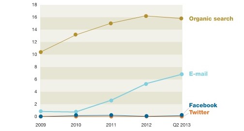
In order to fuel continued and sustained list growth it’s a no-brainer to have an email sign up form on your website, blog and your other digital properties like social media sites. By providing visitors a quick, easy and efficient way to sign up for your email list, you can proactively grow your list 24/7/365. Having a solid email list is important because, “email remains a significantly more effective way to acquire customers than social media—nearly 40 times that of Facebook and Twitter combined” according to a McKinsey & Company report.

Visit nearly any quality website today and you’ll see a clear call-to-action to sign up for a company email list. That’s because year after year, email marketing continues to rule the roost as the most cost-effective marketing tactic for businesses of every size. “Email averages a return on investment (ROI) of $ 40 for every $ 1 spent, far outstripping banner ads ($ 2) and keyword ads ($ 17),” says an article by MarketingProfs.
In addition, companies of all sizes count on email marketing for its many benefits including its positive impact on revenue. In a survey of more than 350 marketers done by The Relevancy Group for its report “The Relevancy Ring: ESP Buyers Guide 2015,” 37 percent of marketers attribute 20 percent of their revenue to email marketing.
So, if you’re not using an email sign up form, you should make it a number one priority to do so. VerticalResponse provides sign up forms for free with every free or paid account. Plus, we have a list of the top six places you should feature your sign up form in order to grow your list, and a post chock-full of real-life examples of effective sign up forms for B2B, B2C, and non-profits.
If you’re using an email sign up form for the first time, or you’ve been using one forever (good for you!), make sure you follow these three rules:
3 Golden Rule For Sign Up Forms
1. Don’t Hide It: Don’t make people hunt for your sign up form. If someone wants to subscribe to your newsletter or email list, put it front and center on your homepage (or across all the pages of your site) so it’s easy to find and fill out. Some of the most effective sign up form real estate on your website will be the top right corner or across the top of the page. We’ve featured Off the Grid’s sign up form many times as an example of this and we’ll do it again.

2. Explain The Benefit: You need to provide some context and the benefit that a potential subscriber will get for forking over their email address. The last thing anyone wants is more email in their inbox, especially if it’s not going to have something in it for them. So, tell them exactly what you’ll deliver and why they should care. For example, “Be the first to know about limited-time sales, find out about special guests, etc.” Also, be sure to include the frequency that your subscriber will hear from you. Will you mail once a week or once a month or daily?

3. Stick To The Basics: You might be tempted to collect heaps of information on your sign up form so you can do all kids of personalization in your emails, but try to resist the temptation to ask everything under the sun. Stick to the basics like first name and email address. In most cases you should only ask for what you need, as the more fields you add, the less likely someone is to fill it out.
These no-brainer email sign up form tips and examples should help you grow your email list easily and efficiently. Have any tips you’d like to add? Share in the comments.
(402)
Report Post


