As we charge full steam ahead into the last few weeks of 2019, we cannot help but notice all the festive colors and lights that are beginning to line the streets and shopping malls.
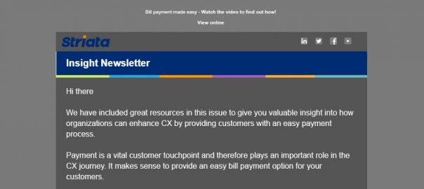
Our email marketing schedules are laden with festive emails and Christmas specials, but this year, not all these emails are light and bright – this year, these emails, in true ‘Star Wars’ fashion are moving over to the dark side.

Source: tenor.com
Although, in this case, the ‘Force’ driving this change is not as dramatic….
Email’s hot topic this year has undoubtedly been “accessibility,” which has brought this new craze with it – dark mode for email.
Thrust into our inboxes by the likes of Apple, Android, Outlook and Gmail, this hot new trend is gaining momentum and becoming increasingly more popular, as it becomes more widely available.
A study by market-research group Nielsen, shows that a significant portion of adults report using a digital device for an average of 11 hours a day.
What is dark mode for email?
According to Apple: dark mode is a setting that “uses a darker color palette for all screens, views, menus, and controls, and it uses more vibrancy to make foreground content stand out against the darker backgrounds”.
Simply put, when you turn on dark mode, or change to a dark theme, your app or device uses dark backgrounds and light or white text – replacing the more traditional dark text on a light background. This means that your perfectly designed email with a white background and black font is now displayed with a black background and white font.
Why is dark mode the latest accessibility craze?
Like any new trend, there are pros and cons to dark mode.
Pros:
- It helps reduce eye strain and eye fatigue. While dark text on a light background is generally regarded as the best in terms of readability, dark mode is better in low light conditions (e.g. at night), as it reduces eye strain
- With the majority of the screen being dark, the screen glare is reduced, thereby minimizing flickering and blue light
- It helps preserve energy, as it uses less power
- Some people just prefer the look and feel of the dark mode themes
Cons:
- Dark themes can, at times, actually increase eye strain. In bright light conditions, some text may appear washed out. This makes it more difficult to read, which can increase eye fatigue.
- Long, text-heavy emails can be more challenging and more difficult to read in dark mode.
- Currently, the vast majority of emails are not designed with dark themes in mind and therefore do not render correctly
4 Tips to help ensure your emails render correctly in all themes
1. Use transparent images
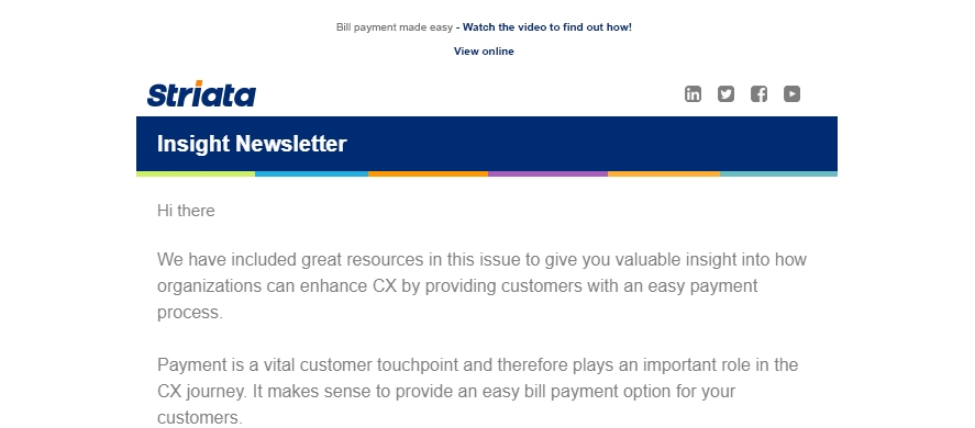
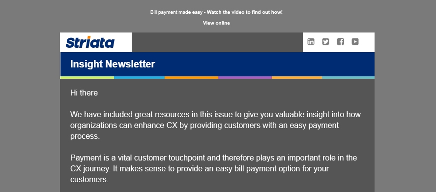
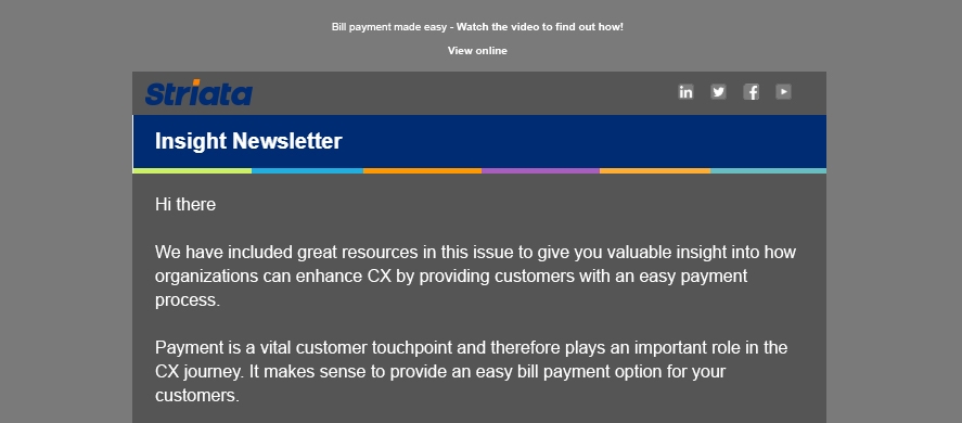
If your email contains any images at all – even your logo, make the background of the image transparent. This will ensure that when the background color of your selected theme changes, you won’t see a block of the original color around the image. See examples below…
Original email
Now, when we switch to dark mode:
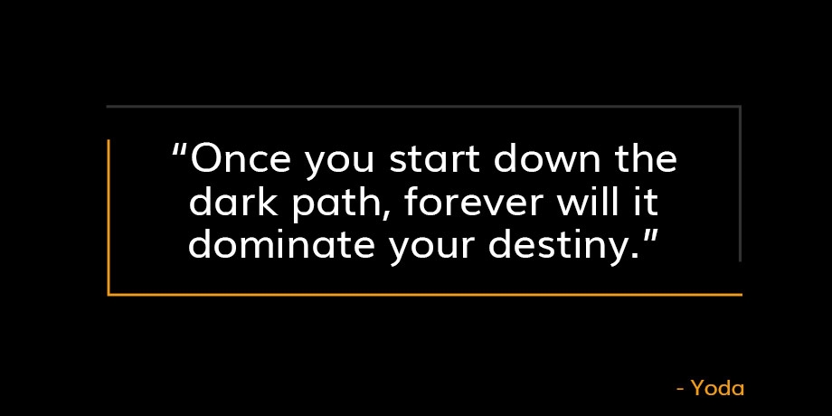
Images with solid backgrounds:
Images with transparent backgrounds:
2. Add a white stroke around your dark text
Adding a thin white stroke to your dark text won’t change the look and feel of your email when viewed in a lighter setting or theme, but it will ensure that your text is clear and easy to read when in dark mode.
3. Avoid mixing images and background colors
Try to avoid mixing background colors and images. In other words, don’t try and match your background color to your image color. Remember, the background color will change according to your theme, but the image will remain the same.
4. Add this to your Checklist
I think it’s safe to say that dark mode is here to stay and my advice would be to start testing your emails on both light and dark themes to ensure that all emails render perfectly for all users..
May the force be with you!
Digital & Social Articles on Business 2 Community
(59)
Report Post