It’s pretty obvious by now that overlays are a key part of driving conversions for some of the top online brands and businesses. Yet many are still skeptical of the benefit that overlays can provide in both lead generation and overall sales conversion. You may be looking to drive your visitors to subscribe to your mailing list or check out your clearance section. You also may want to drive individuals to purchase by providing promo codes. These are all actions that you want to encourage visitors to take and overlays provide the most effective way to accomplish this.
In this post, we will take a look at why overlays are a must for any website and how we can improve our website experience with proven tactics.
Why Use an Overlay?


While people continue to bash on overlays for being annoying and disrupting website visits, the others are using overlays to achieve tremendous conversion results. Look at the top e-commerce brands, world class bloggers, successful SaaS businesses, and global online publications; they’re all using overlays! Why is this the case?
The short and simple answer is that they work very well. The main purpose of an overlay is to engage website visitors with a visible and strong call-to-action that will drive them to take the desired action. The reason why overlays are so effective is in large part to the typical consumer of today. The consumer has a short attention span, little brand loyalty, and are always looking for ways that they can receive value. With an overlay, you engage visitors in a way that they can’t ignore and can drive the actions you want with visible calls-to-action and incentives.
Ecommerce Success Story: SkinnyMe Tea
SkinnyMe Tea implemented an overlay promotion that offered a 10% off promo code to shoppers who subscribed to their newsletter. By engaging shoppers with an enticing offer of value, they were able to boost email sign ups by 758%! But it wasn’t just email capture. SkinnyMe Tea experienced a 50% increase in conversions over the same period.

Benefits of Using Overlays
Convert a Higher Percentage of your Traffic
Around 98% of people that come to your website will leave without converting into a lead or sale. This is not ideal, especially when most of the focus today is on driving traffic. To convert your websites you have to engage your visitors. Using overlays allows you to engage visitors with enticing offers and content that drive them to take actions you want them to take. This engagement results in a higher percentage of traffic that converts.
Build your Email List
The only thing your email sign up form in the corner of your website is doing is collecting virtual dust. Present your sign up form in a highly visible place with a strong call to action using an overlay. You can also add incentives to drive more sign ups. You’re going to build your email list so much faster with overlays than any other means.
Drive More Sales
You can drive more sales both directly and indirectly with overlays. Drive sales directly with sales promotions at key points in the purchasing process (product pages, cart and checkout pages). By converting more of your traffic, you will also have the ability to drive these visitors back to your site at another time. This opens your business up to more sales opportunities. We have to remember that people make purchasing decisions at different times and different paces. We constantly need to re-engage our contacts to drive sales over time.
Reduce Cart Abandonment and Bounce Rates
Exit offers provide one more opportunity to convert visitors into a contact or sale. With around 78% of all shopping carts ending up abandoned, it’s key that you have tactics in place to keep people on your site and incentivize them to purchase. Exit offers enable you to engage visitors right before they leave your site fore another opportunity to convert. Consider implementing exit offers from the cart page to directly target those cart abandoners (discussed later in the post).
Why do Email Addresses Matter?
The reality of ecommerce is that around 98% of your website visitors will leave your site without purchasing from you and most of the time, these visitors never find their way back onto your site. You need a way to drive these people back to your site.
Email converts at a 4X higher rate than any other source and this is for a couple reasons. First, email is the most personal channel because it directly markets to each individual. Second, email deals with much less distraction than that of social channels and search.
Aside from a sale, getting an email from a visitor needs to be your top priority!
Why Overlays Get a Bad Rep
Yes, there are websites that use poor practices with overlays that can damage brand perception and the website experience. Your site doesn’t have to be like these sites. Here are the main reasons why people dislike overlays:
- People don’t like seeing an overlay right when they get to a site. “I haven’t even seen your website yet! Why should I give you my email?”
- The same overlays appearing multiple times throughout the visit
- An irrelevant message or offer that doesn’t align with your conversion goals.
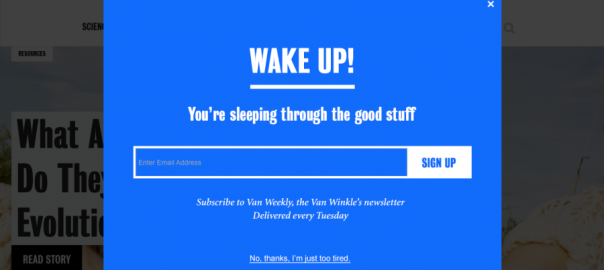
Check out this interaction below. While some like to call them pop ups, we prefer to call them overlays.
Ecommerce entrepreneur and blogger, Richard Lazazzera, educates an opposer with one reason why he uses overlays on his sites: They Drive Sales.

Thankfully, there are ways to prevent these poor practices from damaging your website experience while also using new and innovative tactics to provide value with overlays.
Best Practices with Overlays

Add a Delay
In order for visitors to absorb your site, they actually need to see it. Adding a delay of 10-15 seconds to your overlay will allow visitors to form an opinion on your website. While 10-15 seconds isn’t a huge delay, we must keep in mind that 55% of visitors will leave your site within 15 seconds. Keeping within this range will open you up to more conversion opportunities. You can choose your own delay length to fit your onsite marketing needs.
Use Overlays Sparingly and Strategically
There are plenty of uses for overlays but there’s no need to go overboard. I’d recommend using 1-3 different overlays throughout your site, each aimed at accomplishing something specific. Convert new visitors with a home page promotion, drive sales with offers on the cart page, or display an important announcement to all shoppers. Here are some more strategic uses of overlays to use on your site.
Design and Branding Matters
Want to damage your brand perception? Present a generic or ugly overlay to your visitors that they’ve seen a million times. I still don’t understand how businesses spend a ton of time, money, and manpower on designing an attractive website and use an unbranded overlay. Every element of your website must represent what your business is about. This is an opportunity to showcase your brand and engage visitors in a unique way. It also can boost engagement by 5X! Check out these awesome overlay designs.
So Does Copy
Be short, clear, and quirky. People tend to respond well to fun and witty messaging. When writing your promotional copy, clearly state what kind of value the visitor is receiving, what they have to do to receive the value, and when and where they will receive the value. Here’s a list of words to use within your copy in order to evoke action.
Target Visitor Behaviors for More Relevant Content and Offers
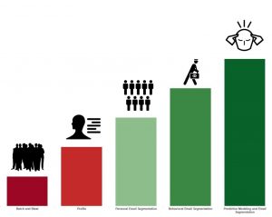
Again, you don’t have to go crazy with targeting but a few key rules can help you deliver a more personalized experience and drive results. Whether you’re trying to decrease cart abandonment, convert first time visitors, or reward people that have purchased from you before, overlays provide an excellent way to engage your visitors.
Behavioral Profiles to Target
The Cart Abandoner
First, we want to target the cart abandoner. To do this we’d set up an exit offer that is only displayed when a visitor leaves the cart or checkout pages. Instead of asking for an email, just display a promo code. This prevents the visitor from exiting your site and incentivizes them with a promo code to complete a purchase. Here’s how to set up and exit offer on the cart page
The Window Shopper
Second, we want to target visitors who are browsing particular pages of the site. The key is to determine what offers will convert on specific pages or your site. For example, visitors on product pages are telling you that they have interest in buying so hit them with a discount or free shipping offer. Visitors on your blog generally have more interest in the content and lifestyle of your company so present them with an overlay to follow you on Twitter and Instagram (or just go with a classic email sign up).
Visitors from PPC Ads
Third, we want to target shoppers who are arriving at the site through PPC ads. We pay for this traffic and if we don’t actively convert these visitors, we’re just wasting money. To maximize ROI for PPC campaigns, implement a high converting offer that will only be displayed to these PPC traffic sources. You can customize messaging to fit each traffic source or PPC ad to be sure you’re hitting them with relevant information. Locked offers and contests perform the best in converting new visitors.
Return Visitors
Lastly, target return visitors. These people are returning to your site for a purpose and this is a great opportunity to either convert them into a subscriber or into a customer. Use locked offers with incentives like discounts, free shipping, or access to free content. To prevent these offers from appearing to the wrong visitors, you can set up specific rules that will hide these promotions from visitors who have already seen or engaged with them.
Digital & Social Articles on Business 2 Community
(191)
Report Post


