Years ago, websites were designed, built and then optimised for search but this divided approach simply doesn’t work in 2020. If you’re planning a new website launch, it is vital that you get SEO advice right from the moment you start thinking about it.
Today’s search engines analyse the performance of websites with such scrutiny that every design choice needs to consider the impact on rankings. If you want a website that’s truly competitive in the SERPs, web design and development has to start with SEO.
Designing website structure for humans and search engines
Website structure allows you to organise your pages and content in a way that makes them navigable for users and search engines. Your first task is to create a site map that logically groups and orders your pages into relevant categories. There are several approaches to this, depending on the nature of your website and how many pages you intend to create.
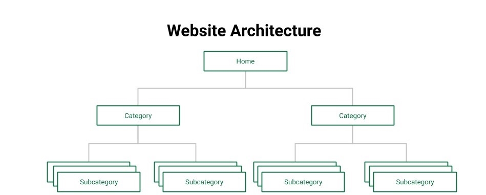
Keep in mind that you’re going to add more pages over time and your site map will become more complex, making it increasingly difficult to maintain an intuitive structure and navigation. It’s important to consider both the design and search marketing implications of website structure during the first stage of development.
Build around your search strategy
The two components of website structure are pages and internal links (navigation). Each page acts as a destination for users to arrive at and a space for you to deliver relevant information, while the links allow you to guide them to other parts of your website – to complete certain actions or simply access more information.
Every page plays a role – organic search was responsible for 53% of all website traffic in 2019, up from 51% in 2014. This demonstrates how consistent organic search has been in generating the majority of website traffic over the past five years.
It also explains how the majority of visitors are going to find the information on your website.
When you’re designing a website structure, it makes sense to build around your search strategy by creating top-tier pages for your primary keywords and then subsequent tiers for related keywords, grouping related pages together in categories.
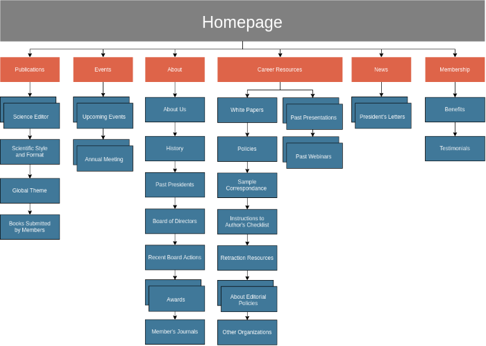
This provides you with full keyword coverage and creates a logical navigational structure for users to progress through once they land on your website.
Internal linking holds this navigational structure together, connecting individual pages and creating groups of relevant pages. The primary purpose of these links is for users to move from one page to the next but you can also use these strategically to guide visitors to specific parts of your website.
Generally speaking, there are two types of internal links. The most obvious links are navigation menus that provide a basic UI for moving around your website. These typically provide links to top-tier pages and the most important parts of your site, although some websites use nested menus to provide access to deeper levels of navigation.
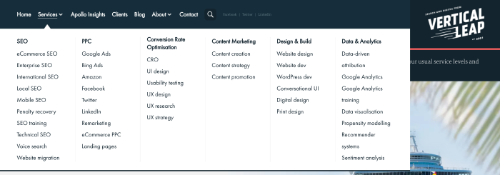 The navigation menu on Vertical Leap’s website uses a partially nested menu for service pages.
The other type of internal links are often called “on-page” or “in-content” links. These allow movement between pages by clicking on elements within the main body of the page. They could be HTML hyperlinks placed on the page, CTA buttons with a URL destination or clickable elements that navigate to another part of your website.
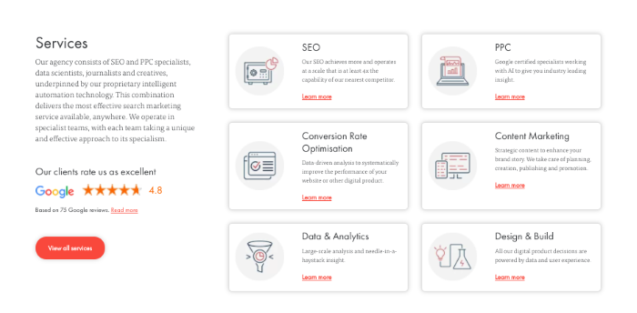 Internal links directing users towards service pages, all services and Google Reviews on the Vertical Leap website.
These links are crucial for guiding users to the most important parts of your website, but you can also use them to provide search engines with contextual information about the relationship between pages on your site.
Optimising visual design elements for SEO
The visual elements on your website don’t just impact user perception, but also its performance and search ranking. Images and video might be the first visual elements that come to mind from an SEO perspective, but there are some design fundamentals to consider for a successful website launch.
Layout and on-page elements
One of the biggest design mistakes businesses make is putting layouts or templates together and then creating content to fill spaces. With this approach, you’re confining your message to pre-defined boxes when you should be doing the exact opposite. The content on your pages should determine which web elements you use, where you place them, the amount of whitespace you add and every layout design choice.
The whole point of layout design is to organise information in a visually digestible way that guides readers from the start of your message to the key takeaway.
So start by creating the content for each page and then work on building a layout around it that maximises its impact. Define your keywords for each page, use them to map out your headings and then expand upon them to create the main bodies of text. Then, define your CTA goals, how many you’re going to have on each page and where they fit in among the rest of your content.
Once you’re happy that the text aspect of your content is spot on, you can start thinking about which images should be used to reinforce your points. Again, this isn’t something you can do effectively before you know which benefits, user problems or concepts you need to visualise.
Designing for readability
Search engines want your content to be readable and engaging – two things that go hand-in-hand. Users aren’t going to engage with content that’s difficult to read or uninteresting; they’re going to hit that back button and leave you with some nasty bounce rates pulling you down the SERPs.
Structure and layout also play a key role in readability, breaking up the content on your page into digestible sections that users can visually navigate and understand quickly. Headings are one of the most important visual elements for breaking up text, providing a visual cue that grabs user attention and helps them understand which parts of the page are most important.
Of course, they also help search engines understand the structure of your pages, which parts of your content are most important and the keywords you’re targeting throughout the page.
However, this only works if you understand how to use the right headings (h1, h2, h3, etc) in conjunction with each other and the other content on your page.
There are a number of other factors that determine the readability of your page and have a direct impact on your search ranking:
- Content quality
- Accuracy
- Word count
- Content above the fold
- Use of images
- Use of popups and interstitials
Aside from these, you also have core design choices that impact readability, which will have an indirect impact on your search ranking. For example, if you fail to use enough contrast or white space to make your text readable or engaging, users are going to bounce, spend less time on the page, visit fewer pages and convert less often.
Designing links and CTAs
Earlier, we talked about on-page internal links and we also touched on CTA layouts/placement. Internal links are your primary tool for directing visitors to other pages on your website and guiding them along the buying process. Your aim is to build paths using internal links and then create content that compels users to follow them.
You’re not limited to embedding links in text either. As you can see from this section of Zapier’s homepage, there are various types of links used here:
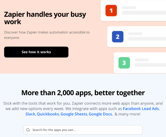
First, you have a navigational CTA that simply asks visitors to find out more about the platform by visiting the “how it works page”. Then you see the more traditional hyperlinks embedded in blue text to illustrate the fact they’re links. There’s even an embedded search box that users can engage with to select which app they wish to automate.
When a user clicks on one of these links, several things happen:
- The user progresses to the next stage of the funnel
- Another page visit is registered
- Total time spent on the website increases
- No bounce can be registered
- Chance of converting increases
Search algorithms consider all of these factors when they assess the performance of your page/website against the query each visitor typed in. The better you perform across these signals, the more reason you give search engines to rank your pages higher for the same query, based on your historical performance.
It’s no coincidence that the most important internal links often use the same design conventions as primary CTAs. A bold headline, brief description and prominent CTA button housed in a full-width div with plenty of whitespace and contrast.
Optimising images and video
Optimising images is one of the most important SEO tasks in an increasingly visual web. Unfortunately, images are some of the most resource-heavy elements you can add to a page, especially in the modern age of Full HD displays crammed into six-inch smartphones.
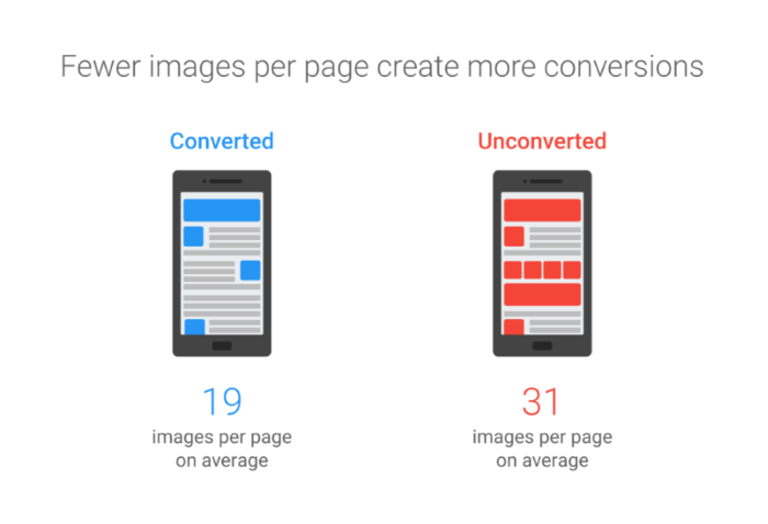
The best design philosophy you can have from an SEO perspective is to use images as sparingly as possible. This alone is reason enough to ensure that you have SEO expertise influencing design choices in the early planning stages of development – it will save you so many headaches further down the road.
Fewer images mean fewer server requests while reducing the total amount of data the browser needs to download and render to load the page.
Next, make sure you’re using the right file format for each type of image. Consider using Google’s WebP image format for lossless files that are 26% smaller than PNGs and 25-34% smaller than JPEGs. Support for WebP has significantly increased over the past few years and Safari is expected to add support in version 14, which is scheduled for September 2020.
With images kept to a minimum and the right formats being used, you can follow basic image optimisation principles, knowing they’ll have more of a collective impact. Reduce file sizes to the smallest reasonable resolution and consider using media queries to load smaller versions of images for mobile displays.
The same principles generally apply to video content but the method of hosting and rendering is very different. First of all, you have to decide where to host your video footage and this is very much an SEO decision. Are you going to self-host the video and retain full control or use a third-party option like YouTube for speed and simplicity?
It all depends on what your objectives are for your new website launch.
Website performance and SEO
We’ve talked about the importance of website performance and user experience for SEO before. There are direct UX signals search engines consider in their algorithms, including:
- Navigation
- Behavioural metrics – bounce, avg time on site, page views
- Mobile-friendliness
- Site speed
- Secure encryption
- Popups and interstitials
- Content accessibility
- Content quality
- Content formatting (headings, paragraphs, sentence length etc)
- Content readability
There’s also a range of engagement signals Google uses to gauge the reaction of users to your website – time on page, time on site, pages visited, bounce rates, etc. It’s not difficult to compare these with loading times and the presence of popups to diagnose potential UX issues with your website.
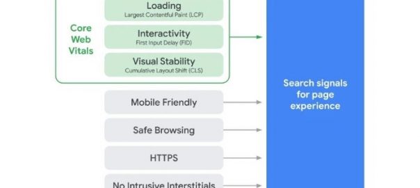
More recently, Google announced a new ranking signal due at some point in 2021, called page experience.
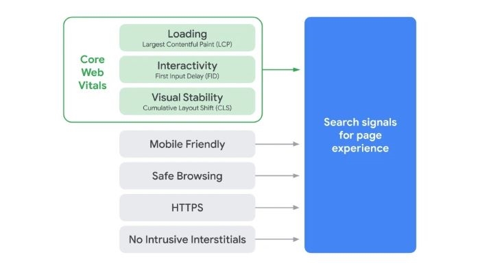
The signal combines existing UX-related signals (mobile-friendliness, safe browsing, HTTPS and interstitials) with a new/revised set of signals called Core Web Vitals. Basically, these cover loading times, the speed of interactive elements and the structural integrity of page layouts.
Based on Google’s description of the upcoming page experience signal, this is going to be a major ranking factor that’s up there with content quality and link profiles:
“While all of the components of page experience are important, we will prioritize pages with the best information overall, even if some aspects of page experience are subpar. A good page experience doesn’t override having great, relevant content. However, in cases where there are multiple pages that have similar content, page experience becomes much more important for visibility in Search.”
We already know that Google takes user experience seriously but the Core Web Vitals aspect of the page experience signal allows Google to measure UX in far greater detail – down to the milliseconds it takes for interactive UI elements to respond.
For brands competing with rivals that produce very high quality content, page experience opens up more space to beat them by providing a better experience for users. And, in most measurable cases, better means faster.
Something else the introduction of page experience as a ranking signal shows is that the lines between SEO, web design and development only continue to blur. We’re at a point now where it’s impossible to divide these processes and search marketing teams need to be present at every stage of design. It also places an even greater emphasis on optimising websites for humans, not only search engines – a trend that has been developing for many years and benefits everyone involved.
Where design and search marketing teams of the past may have pulled in different directions, their interests are now more aligned than ever.
Digital & Social Articles on Business 2 Community
(49)
Report Post