If you are sending emails and getting a low click through rate, it can feel like you are sending emails into an endless void. Email marketing can be challenging, especially when you are just starting out and trying to find out what your audience wants. An email click is a prospect asking for more information and your email link helps them find it. Make it easier to find out what customers want by avoiding these email marketing missteps.
gabrielle_cc / Pixabay
Misstep #1: Adding too many links
Having too many links can distract or even confuse your subscribers. It is a sign that you have not created an objective for your email campaign. Decide what action you want a reader to take before you hit send. Then, be sure that most—if not all—of your clickable links draw subscribers toward that action. It is important to stick to essential links that provide value to your subscribers. If your subscriber is a prospect who is not ready to buy, a BUY NOW button will not likely inspire them to do so.
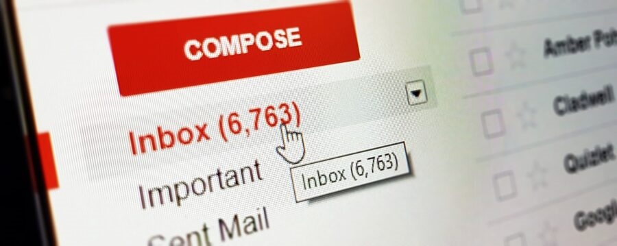
Consider that most people do not have much time to read every email that hits their inbox. Inboxes too often overflow with irrelevant emails. So much so that email scanning has become an art form for many. Keep your emails focused. Make it easy for your subscribers to find the links that encourage the action you want them to take.
Misstep #2: Writing with nonactionable language
Capture your subscriber’s interest using inviting language that keeps their attention as they read (or scan) through your email. If your emails are not engaging, your subscribers may just hit delete. Write too many irrelevant, boring emails and you may just find your prospects unsubscribing. Above all, be sure that your email objective is translated into clickable links. Email links should answer the question “What action do I want subscribers to take?”
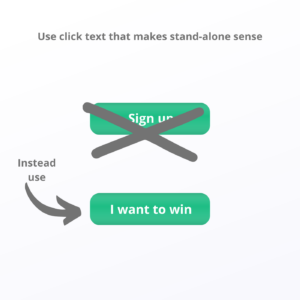 Misstep #3: Creating link texts that say “click here”
Find ways to stand out and intrigue your subscribers. “Click here” as a clickable link is just boring. People are more likely to follow links in emails that have descriptive link texts. Use text that can be taken out of context and still tell your subscriber what’s next. For example, if you are running a promotional giveaway and want subscribers to sign up, instead of using a button that says “Sign up”, use one that says “I want to win.”
An email link is more actionable if it has a description of where it will take the reader or what the subscriber will receive for clicking. On that note, make sure links go where you intend them to go. Double-check that the link works and that your link and text match.
Misstep #4: Hitting send without checking and testing
Always, always, always preview and test your email. You must be willing to proofread each and every email you send out and go through them as if you were your subscriber. Be sure to preview your email in both a desktop and mobile browser. Check the preview in your inbox before you open the email. If your subject line is truncated (which is more likely to happen on a smartphone) be sure that what is visible is enticing enough to encourage the recipient to open the email. If not, consider rewriting your subject line.
Your default should be to optimize for mobile as a majority of emails are now opened on mobile devices. Check your email marketing service provider’s analytics tools and your subscribers past behavior to determine if this is true for your contact list. Test your links to be sure that they are clickable and referencing the source you intended.
Misstep #5: Using design or color schemes that are incompatible
Yellow text on a red background is the digital equivalent to fingernails on the chalkboard. Using color should enhance rather than distract from your email campaigns. Make your email link text pop with color and stand out from the other text on your page. Use clickable buttons in colors that compliment your overall email design.
Go through your email to ensure that images with links also stand out to attract your subscriber’s eye. Do not use colors that obscure text that is meant to stand out. Be sure that everything is easy to see and read by appropriately using white space. Create and maintain a common design theme that reinforces your brand assets.
Misstep #6: Optimizing for only desktop users
Most people open emails from their smartphones, quickly scrolling and then tapping with their fingers on links. Make sure you optimize emails for phone users and make it easy for them to click links. Different links should have plenty of space between them so users can click on the one they want to open. Consider making text larger to make it easier to click. Review your email from a mobile device and test it out to see if it is easy to click every link. When referencing your own digital assets, ensure the links also open to mobile-friendly pages.
Misstep #7: Including too much copy
Your email is not a blog post. Instead of writing long paragraphs, write interesting excerpts and introductions for links that have more information. This way, your subscribers can click on links that they want to read more about. Clickable links also give you insight into what is of interest to your subscribers. Review your email analytics to determine which links received the most clicks and which subscribers clicked on which links. This will give you insight on what to send to each subscriber next. Given that email is often consumed in bite-sized chunks, make your emails concise and to the point and guide your subscribers to more information through links.
Digital & Social Articles on Business 2 Community
(84)
Report Post


