It’s 2016 and web marketers are examining through new trends to decide which ones to pick up. Yesteryear’s top design trends are no longer useful in bringing an outstanding return on investment and new trends are the need of the hour.
In 2016, design and SEO are essentially linked. Design begets SEO. A website with an attractive layout and smooth navigation items has better chances to capture a lead than a site with unattractive layout. Top design trends for this year are
Use of cinemagraphs
Cinemagraphs are .GIF files, but unlike standard .GIF files, they mark only certain areas of still images. A cinemagraph is an image which has one or more areas to it in motion. The image of a moving ball after being kicked by a soccer player, in which everything is static except the ball is a cinemagraph.
Cinemagraphs made their presence felt in 2015 but were not taken seriously by SEOs. Ignoring them in 2016 could be a risky deal for marketers because case studies are proof that banner ads with cinemagraphs can lead to a CTR that is 5 times higher than CTRs triggered by still images.
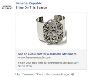
If snippets appears on social media news feed with thumbnail size dynamic images, the odds of clicking on the snippet links will invariably increase. Whether used onsite or on social channels, cinemagraphs can boost engagement.
Ghost button
The complaint against ghost button is it can function like the secondary or tertiary CTA button but not as the primary CTA button. That’s only partially true. We already had a discussion over the importance of ghost buttons for sales conversion. A site with minimalist design can use ghost buttons to offer visitors a clean and unobtrusive browsing experience.
If it makes few changes on its homepage, then the minimalist design can bode really well with ghost buttons. The changes include the button turning colored from being opaque when someone hovers his cursor on it, the background being highly appealing, etc.
Basically, ghost button presupposes that your site has an outlandish background and the CTA button is not obtrusive to the viewing experience. So make the background rich with design elements or stock or original photography.
Ghost buttons are often dismissed for no fault of their own. They are often used along with parallax scrolling, which distracts visitors and ghost buttons get the blame. Two things to keep in mind if you expect success with ghost buttons are not putting too many texts around them and not using parallax scrolling.
Adaptive design
2015 saw the popularity of adaptive design rising. It’s an exaggeration that adaptive web design (AWD) is here to replace responsive design. A more sensible statement is AWD can overcome the shortcomings that limit the application of responsive design.
One such shortcoming, critical to search engine visibility, is on which side the site layout is to be determined. In case of responsive web design, the layout is rendered on the client side. Everyone receives the same file, and the file readjusts itself depending on the screen size and resolution of the device.
Due to this, some parts of the file may stay hidden and users may not be able to see them. As content is the key determinant of SEO success nowadays, an obtrusive viewing experience spells disaster for a site. But AWD ensures that everyone receives the same file and see the full content. That apart, AWD accounts for a quick load-time and increases a site’s SEO friendliness.
Mobile typography
I sincerely hope marketers understand the value of mobile typography this year. No, it doesn’t have any direct SEO benefit, but if you want to penetrate into the handheld user-base, then mobile friendly typefaces are a must. Handheld devices may be more sophisticated than desktop devices, but their screens are small.
A small screen poses challenges for typefaces. Lines may break, texts may not be juxtaposed properly, and certain fonts may not be visible at all. The biggest fear is users might not see hyperlinked areas in the text because of the screen being low-contrast. That apart, the typefaces may not appropriately accompany the multimedia contents, resulting in a hideous user-experience, which hurts your brand instead of giving it a boost.
To make sure the typography for your site is mobile-friendly and device-agnostic, you need to have texts, which are optimally sized, add extra space between texts, to margin and between lines. Most importantly, select a simple typeface because this is the age of flat and minimalist design.
Follow these trends
Want to be one step ahead of your competitors? Then follow all these design trends discussed here. This will bolster your online marketing campaign, you’ll get more fans, more engagement and have a better prospect of sale.
Image Courtesy: www.entrepreneur.com
Digital & Social Articles on Business 2 Community(74)
Report Post


