Google’s launch of the Mobile-Friendly Algorithm almost set the world of SEO on fire. Digital marketers, SEOs, web designers and developers were preparing their torches and pitchforks for an Apocalypse of unforeseen magnitude as Google were stating the update would have a bigger impact than Panda and Penguin combined.

It’s been over two months since the update began rolling out, and while changes were slow to appear in the first days following, subsequent studies showed that major ranking shifts started to occur with sites below the third results pages. One answer for the slow rollout was that a lot of sites had managed to become mobile-friendly by April 21st so sites who were already ranking in the first three SERPs didn’t see much movement, but some say the hype Google created was only to scare webmasters into getting to the mobile side sooner rather than later.
Are You Mobile Yet?
The good news to come out of all this confusion is that if you haven’t gone mobile yet, you can start today and it’s just as fine. However, the lack of drastic changes doesn’t mean that mobile isn’t very important, and you should do it to avoid being left behind by the competition.
As such, one of your primary concerns should be deciding what type of mobile site you want. There are several considerations to a decision like this; some have to do with the type of business you run online and the goals you set, others to do with the resources you can dispose of. In what follows I’m going to present the options you have, and together we’re going to answer a few questions that will get you closer to making a decision that suits your needs.
As you know, there are three options: responsive design, dynamic serving, and separate URLs.
Why does Google recommend responsive web design?
On a first impression, responsive design sites make the most sense for a number of reasons:
- they use the same HTML for both the desktop and the mobile versions of the page
- they consume the fewest resources in terms of time and reconfiguring a website
- desktop page and equivalent mobile page have the exact same URL, so there are no redirects issues to worry about
- page load time is ideal precisely because there are no redirects
- indexing occurs naturally, without you having to signal there is a mobile version of your site
- they make for better UX because users can link to or share your pages from any device, with the meta tag deciding which version of the page to serve depending on the device that accesses it
- you only have to do SEO once, for both versions of the site.
Doing separate SEO for both your websites can have certain advantages, but it will require more work and dedication. You can find out more about mobile SEO, by reading this thorough guide I wrote recently.

But are responsive websites the best solution for any business? There are many arguments for it, but some are against it, which is why I’ve prepared a list of questions that should help you decide.
What Factors In Choosing A Mobile Configuration?
Depending on the type of business you run, and the kind of actions you’re looking to attract to your site, it might make more sense to opt for something other than responsive design. So here are some of the more important things to chew over before choosing how to go mobile:
A. Do You Have A Desktop Website?
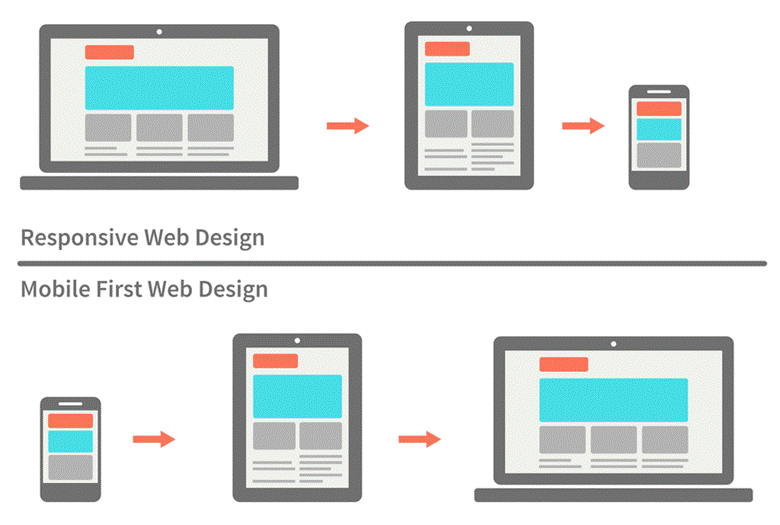
If you’re in one of those rare instances where you’re just starting to work on your online presence, you have one advantage: you can develop your mobile site first (check out this article that explains why responsive design is actually ideal for a mobile first approach). Creating a mobile site first is a good thing when you’ve opted for dynamic serving or separate URLs as well, because when you’re done creating the optimal mobile site, you can go on and add any other details and features that the desktop site can fit in. Subsequently, some features work for mobile only, and others for desktop only.
Making a mobile website first may streamline your efforts down the road. Yet if you already have a desktop website, going with responsive design is in most instances the better choice for the reasons stated above, and mainly because it requires fewer resources and will be quicker to implement.
source: marketalia.com
B. What Are The Goals Of Your Business?
- The same goals on desktop, mobile and/or offline – if you hit the trifecta, you’re in luck. You can simply go for responsive design, because you’re expecting the same user actions and results from any platform you use. For instance, a news site expects users to read its content and subscribe (the same applies if a physical form of the newspaper/ magazine exists).
- Different goals on desktop, mobile and/or offline – if you’re looking to influence user behavior differently on mobile than you do on desktop, you need to consider one of the other two mobile configurations because they allow you to customize content and conversion paths. For instance, a study conducted by Webusability discovered that for websites that offer financial services, mobile users are rather interested in checking their portfolios or finding contact details, rather than doing research on what the company does. This means most users on mobile are already converted customers for this type of website.
C. What Keywords Are Used To Find Your Content/ Pages/ Site?
If you already have a desktop site, you can use tools like Google Webmaster Tools and Google Analytics to see how users reached your site from mobile devices. Although there might not be much data to go on, it might provide insight into the actions people are looking to complete.
For instance, a high bounce rate from mobile users to your desktop site could indicate that they were looking for something else, in which case you might have to build a mobile site that serves those needs and, therefore, different content.

This is also the case if keywords used by mobile users are different from those input by desktop users – it shows that visitors want to complete different actions, or find different information.
If the majority of keywords from both desktop users and mobile users are the same or similar, it means there is no need for your mobile site to be different from the desktop one, and responsive is indeed the way to go. Now there’s a lot more to say about the keywords you should use when dealing with both a desktop and a mobile site. In their study on The New Multi-Screen World, Google match their statistical research with a few takeaways, one of which goes like this:
“Consumers rely on search to connect their experiences across screens. Not only should brands give consumers the opportunity to find them with multidevice search campaigns, strategies such as keyword parity across devices can ensure consumers can find the brand when resuming their search”
With responsive design, you have no other option than to rely on keyword parity, which is a good thing if it makes sense for your business profile. But you can choose to use the same keywords with other types of mobile configurations as well, and only modify content where it makes sense to shorten it, make it more focused, or introduce different calls-to-action.
Another solution perhaps, for those who can invest the time and resources, is to rely on semantic keyword research and LSI. If the situation applies where mobile keywords and desktop keywords are not identical but synonymous, you can use them together in a single piece of content, and target two different audiences.
Kristina Kledzic puts it best in her SEO guide to building a mobile site:
“If you and your customers want the same things from the mobile site that you do from the primary site, you probably want to build a mobile site with content that’s identical to your primary site, unless you have the time and desire to regularly modify the mobile version. For example, SEOs who want to tweak their mobile sites so that they target slightly different search engine queries and browsing behaviors will want to build a mobile site that can be independently modified.”
D. Do You Want Users To Have The Same Experience On Both Versions Of The Site?
As I mentioned before, it makes total sense for the type of website users visit only for content consumption, to want to maintain the same experience and offer identical/almost identical content on the mobile version. Visitors will convert into subscribers the same way on either site version, and if your blog sells related products, you’re still doing it through content and email subscribers.
But what if you’re dealing with an insurance website, or an airline company website? What if you not only offer content, but services as well (consultations, customer support, quotes, rentals, etc.) maybe products, or online calculators and converters?
How do you decide which is the best experience for a user on your mobile site? Even more, should you be the one deciding, or should it be the users themselves? In her very insightful and data-reliant article on how Uncle Sam Wants You (To Optimize for Mobile), Karen McGrane argues:
“The stories about how mobile computing has changed human behavior often emphasize the developing world. Billions of people will only ever connect to the internet from a mobile phone. That development might seem positive and exciting, but remote. We assume that a ‘mobile-only’ user is as foreign to us as a villager in Africa, in India, in China.
We’re wrong.”

She then goes on to say that several American minority groups and different demographics only ever access the internet through a mobile device. This should raise questions for every online marketer about who their audience is, and whether a big chunk of it only comes from mobile users. And if a lot of users only ever see the mobile version of your site, wouldn’t it make sense to serve them the full experience, to offer them all the options and features that desktop users get?
If the answer is no and you don’t need, or don’t want to offer users the same experience across all sites (for your own various reasons), it becomes clearer that dynamic serving or separate mobile sites are much more appropriate for you. But we’re not there yet.
E. How Does Multi-device Usage Affect You?
Google’s document on the new multi-screen world is a must-read for anyone marketing online, not just those looking to decide on a mobile configuration. It includes essential data in device usage: how and when people use smartphones, tablets, or desktops, what they use them for, how they combine different devices (including TV!) for different actions, and much more.
There are some outcomes I thought relevant to our subject here:
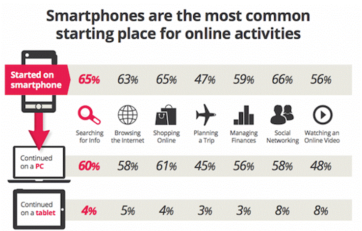
1. Sequential device usage: a lot of people use multiple devices nowadays, and sometimes they begin a search or action on a device, and continue or finish it on another.
source: services.google.com
Considering that smartphones are a common starting place for so many activities, with searching for information being the most prevalent, it seems logical to want to include all the available content from the desktop site to your mobile site. Adding fuel to the fire, in another one of her articles, Your Content Now Mobile, author Karen McGrane quotes Jason Grigsby, co-founder of CloudFour.com:
“We cannot predict future behavior from a current experience that sucks.”
That is to say, how do we know what mobile users want to do on our sites since their experience is limited anyway? How can we predict what their behavior might be, had they access to the same information and features on a mobile site that they do on a desktop one?
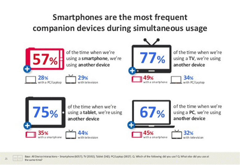
2. Simultaneous device usage: People also use two or more devices at the same time. When watching TV, a user might be prompted to take out their smartphone to search for more details about a movie or actor, or more information about a product that is being advertised. According to the same Google study, smartphones are the most common device within simultaneous usage, and during this time
“content viewed on one device can trigger specific behavior on the other. Businesses should therefore not limit their conversion goals and calls to action to only the device where they were initially displayed“.
source: services.google.com
If we’re being told we shouldn’t discriminate content based on context, then responsive web design seems to be the best solution. What of the other two options?
Both dynamic serving and separate URLs sites have some advantages. The most obvious ones are that you can adapt content to better match a mobile user’s needs, and target different keywords if it seems that mobile users look for different things when submitting queries related to your business or industry.
But the disadvantage is that this will extend your marketing efforts, and require more resources: more keyword research, more (different) content, separate measurements, and so on. Is it worth it, business-wise, for you to convert users differently on mobile? With a separate URLs site, you risk duplication issues if you don’t apply the necessary tags, and dynamic websites have slower page speed because you’re redirecting users all the time – which for a mobile user on a 3G connection can mean a lot of time.
My Take On Things
I’m not a developer, nor a web designer, so understanding all these considerations was a bit of an effort. Yet as a mobile phone user, it just makes total sense to me that I would like to find the same content on mobile searches that I do on desktop. Whether I want to purchase something or just search for information, I see no reason why you would limit my access or presume to know what I need before giving me a full mobile experience.
That being said, responsive design does seem like the best choice out there, especially if you start designing the mobile version first. What’s your opinion on the subject? Do you see any other pros and cons for responsive design? Please let me know in the comments!
Now Read
- 5 Tools To Test If Your Website Is Really Mobile Friendly
- Why Mobile Is Content Marketing’s Missing Link
- Everything You Need To Know About Marketing Mobile Apps
* Title image adapted from philcampbell
Why You Don’t Need to Choose Responsive Design (But Should)
The post Why You Don’t Need to Choose Responsive Design (But Should) appeared first on Search Engine People Blog.
(259)
Report Post
