— September 6, 2017

Are you wondering why aren’t you hitting the bullseye when it comes to getting conversions through pop-ups?
Pop-ups can be tricky and visitors can be really choosy. We have all had our share of annoying pop-ups that come up at the wrong time, are really messy, way too long, hit your eye with weird color combinations… the list could go on.
Various influencers have used different methods to integrate pop-up forms that have helped them convert their blog into a lead magnet. But blog or no blog, these are some of the most common mistakes that people make when it comes to designing a pop-up.
#1 Need vs. Want (Too much information)
Step into the shoes of a user and tell me if you’d be willing to fill up the form fields that ask for information like the name of the company you work at, your position, and the number of employees in your company.
Do you think all that information is mandatory for you to download a guide on Responsive Web Design?
All that’s mandatory for a user to download an eBook is an email id. But usually, the marketers also ask for the name of the user, which is perfectly okay.
But why should the user give you the extra information that you asked for?
And additionally, the user will not only NOT give that information, but will also start doubting your intentions. Can you blame him for that?
And to top it all, filling up the form is time-consuming and users are known to hate all kinds of long and complicated procedures.
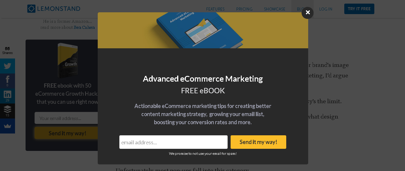 (Source: Lemonstand)
The user will always be ready to fill up a pop-up form if all the fields asked in the form define a reason to be filled.
Now if you look at the pop-up shown above, all that has been asked for is the mandatory email id. This pop-up is short, to the point. and is not giving the user any reason for doubt.
If you have already created a long form, this is what you can do! Remove all those unnecessary form fields.
#2 Standing out yet blending in
Who in his right mind would do this? A pink pop-up on a purple background won’t sit right and would not appeal to the user in any way. And what’s unappealing to the user won’t arouse his interest no matter how exclusive the offer is. The user wants to see something that doesn’t conflict with his design sensibilities.
(Source: Crazy Egg)
Look at the example of the pop-up shown above. The color of the pop-up matches well with the color of the background.
A pop-up needs to stand out and yet blend in with the design of the rest of the page.
No, I am not talking about using a color that makes the pop-up invisible in the background.
I am talking about using a color that either contrasts with the background color or matches with the background color. The typography used in the pop-up must also go with the typography used in the rest of the website or the typography should be same everywhere on the website.
Let’s say that you have a website filled with red and white colors. You can make your pop-up stand out by giving it a green background.
Don’t use muted colors like grey since they don’t make the pop-up have the noticeable punch that it is meant to.
#3 Too much text
A pop-up text is very important when it comes to a user’s decision on whether to accept your offer. You could write a paragraph consisting of four to five sentences that describe exactly how interesting and educational your eBook is.
These paragraphs not only add to the clutter but are also time-consuming to read.
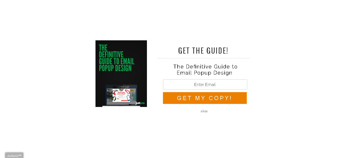
(Source: Justuno)
Now, if you look at the CTA placed right above, the designer has used 10 words instead of 50 and the message is as clear as it could get. The main heading explains the offer in the CTA and the second line explains what the user should expect in the eBook.
Instead of mentioning everything that is included in the index within the eBook, the contents of the eBook have been summed up in the second line giving a clear message without making the pop-up look cluttered.
#4 Irrelevancy
John was browsing through various brands of shirts on some XYZ website. He had wanted to buy one and then suddenly a pop-up that offers women’s scarves to look “effortlessly chic” shows up. Why would John be interested in something like that?
On the other hand, being accustomed to the frequent pop-ups, he half expected a pop-up that would offer him a discount on men’s shirts.
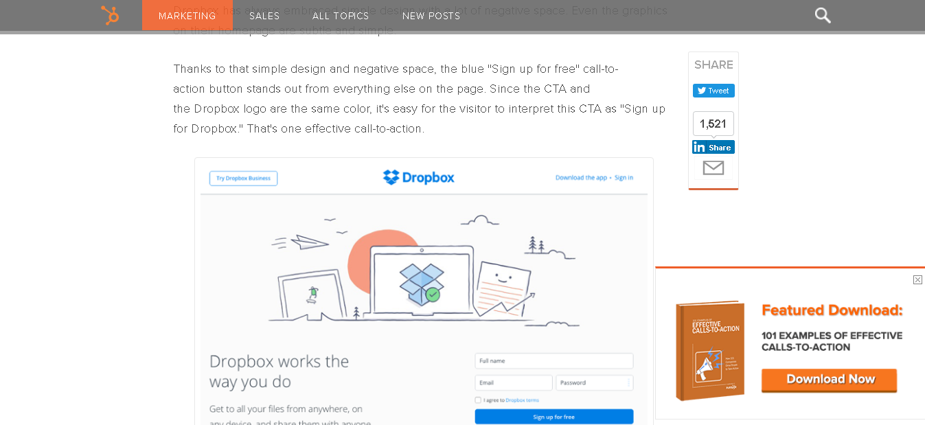
(Source: Hubspot)
Now, in the image above, the pop-up is offering an eBook that has various examples of effective calls to action. This pop-up is relevant because it is integrated on a page that has a blog written on Calls to action. Makes perfect sense, doesn’t it?
And relevancy here means that the pop-up needs to be in agreement with the page it is on. When the pop-up is relevant, the user would be able to relate the pop-up with the information on the page.
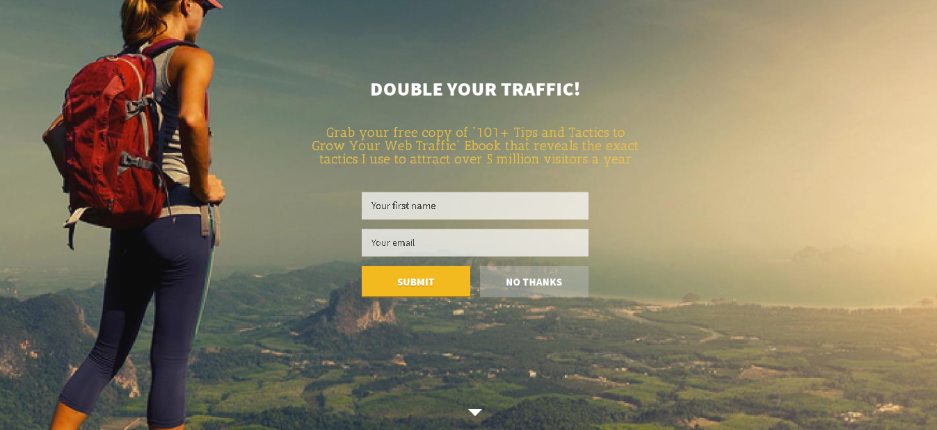
#5 Bad Timing
(Source: Jeff Bullas)
A pop-up needs to be timed in accordance with user behavior. There are various kinds of timed pop-ups like:
a. Scroll Intent Pop-up – The scroll intent pop-up comes up after the user scrolls to a certain extent. This pop-up needs to be timed in a way that all the necessary information related to whatever you are offering in the pop-up is explained before it comes up.
b. Exit Intent Pop-up – The Exit Intent Pop-up comes up when the user shows an intent to exit the particular page. Such a kind of pop-up needs to include offers that give the user an incentive to stay.
c. Time Intent Pop-up – The time intent pop-up depends very much on user behavior which can be tracked using various user behavior tracking tools like Hotjar, Kissmetrics etc.
#6 Too many pop ups on a single page
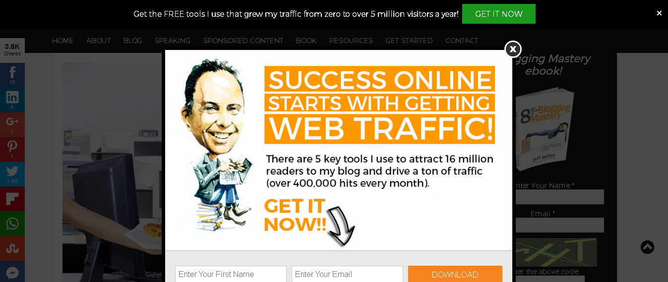
A pop-up is created to boost conversions, no doubt. But using too many of them at once can be a conversion repellant. It would be better to opt for two different pop-ups on a page instead of seven.
If the visitor lands on your website and spots one pop-up for signing up to your website, one to download a free guide, one to try out a tool for free, one to subscribe to your newsletter, one to buy your products, chances are the user might not respond to even one of the many offers you have put up on that particular page.
This is known as Decision fatigue – you are giving way too many choices to your reader to choose from.
(Source: Jeff Bullas)
An average person makes about 35000 decisions a day. Do you really want to increase the bounce rate of your website by giving a user way too many choices to choose from?
#7 Untargeted pop ups
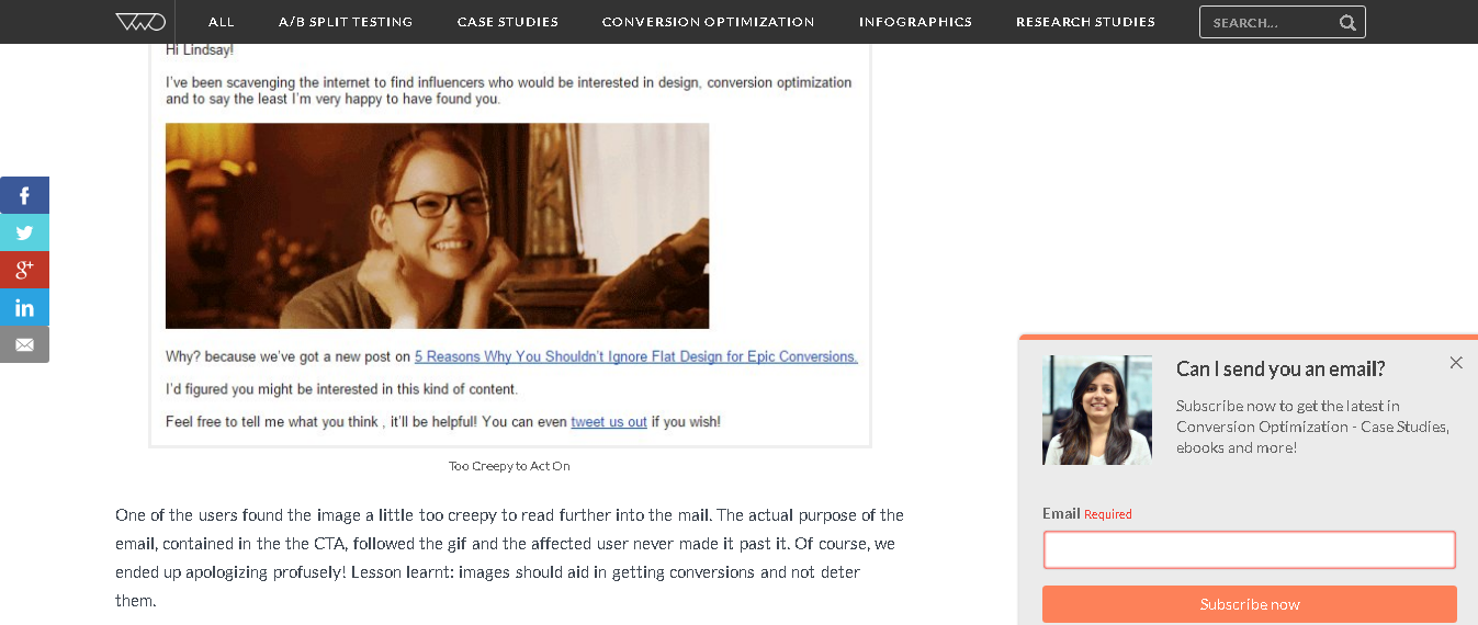
Pop-ups need to be targeted so as to get more conversions. For e.g., there is no point in showing the visitors a pop-up to sign up when they are already logged in as a user.
It annoys your customers when the pop-ups are not related to their interests. You can always create a personalized pop-up by tracking user behavior.
(Source: VWO)
You can also get to know the visitor’s interests by creating a short form where you ask the visitor about his likes and interests. Now based on the data collected from the form, it would be easier for you to create a personalized pop-up.
You can also personalize real time pop-ups that would depend on the visitor’s location and show him products accordingly.
#8 No exit
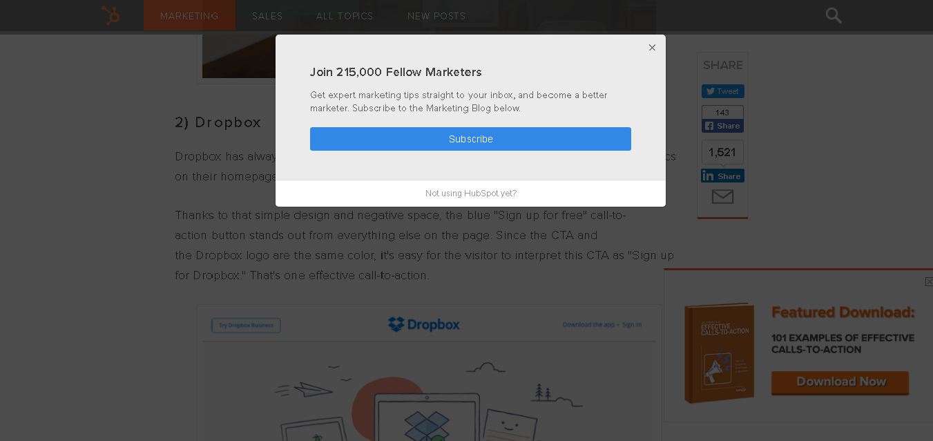
It is very annoying to know that you cannot simply close a pop-up. There is just no cross sign or no No Thanks button to close the pop-up. And if this is the case with an overlay pop-up that pretty much takes up the entire page, then the easy and the only way to close the pop-up would be to close the tab.
And here’s the psychology behind not giving them a way out. Not giving an option to close the pop-up means that you are coercing the visitors to take up the offer. Now, who likes being forced to do anything?
(Source: Hubspot)
So, to avoid making users feel like being forced, you can always use a cross sign on the right side of the CTA and you can always use a button on the pop-up that lets the visitor deny the offer and close the pop-up.
#9 No Urgency
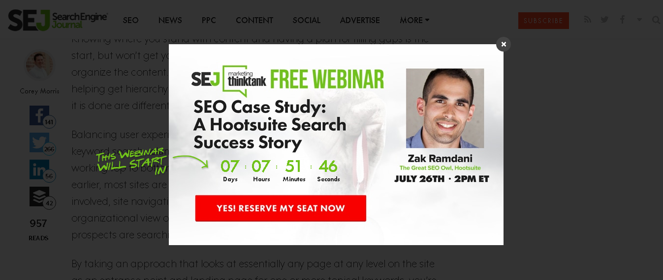
(Source: Search Engine Journal)
If the text on your pop-up shows an offer, limit the offer to a number of hours or a number of days.
Have you ever looked at a pop-up that shows the remaining number of seats for a webinar? That’s a psychological hack which is known as the element of scarcity. When you show the users that an offer is only going to last this long or a product is on the verge of being sold out, they automatically want it more.
#10 A/B testing
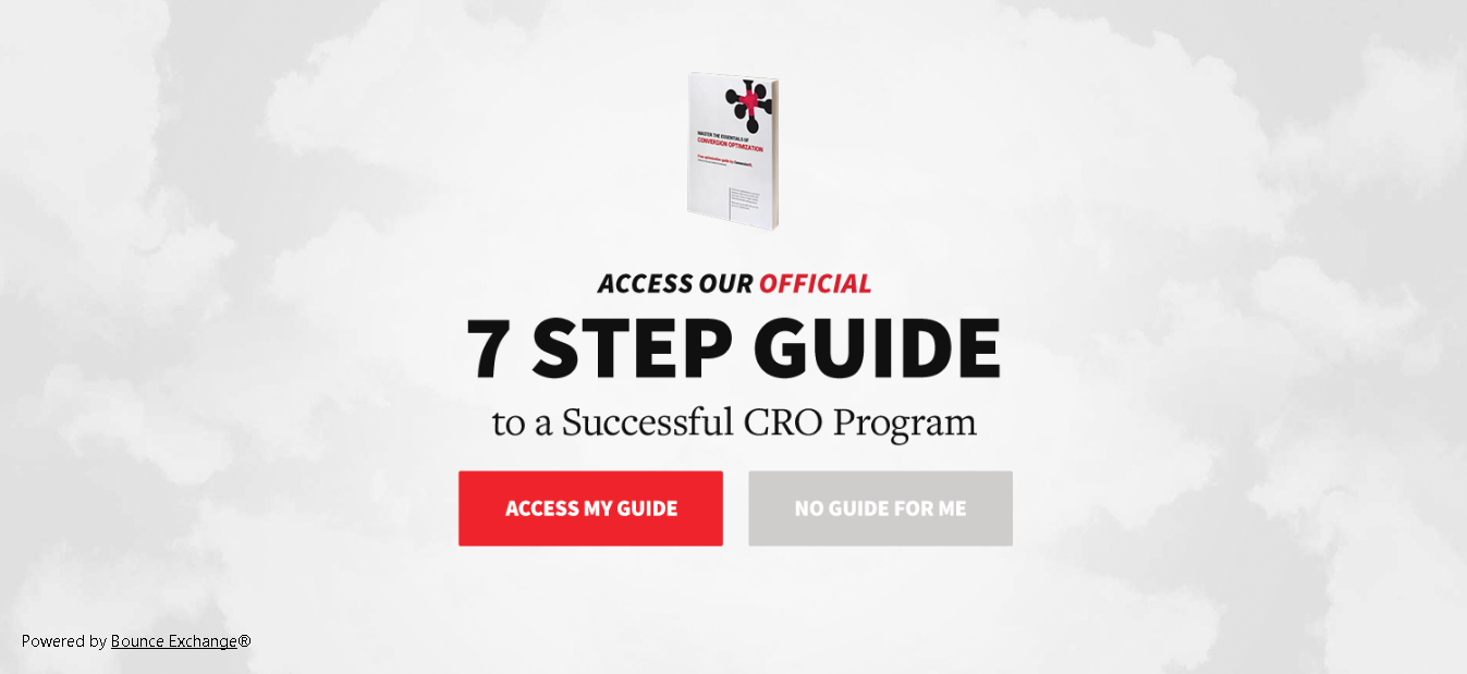
(Source: ConversionXL)
A/B testing nearly every element of the pop-up at least once a month would help you know what hacks work to what extent. It would also help you out when you set out to design a pop-up the next time.
Here are some pop-up elements that you must A/B test before you decide on the final one.
1. The Offer – Split test 2 of the best lead magnets you have. The lead magnet that you use in the pop-up could easily be an eBook or a free trial to one of your tools.
2. The Headline – Spilt test the headline you use in the pop-up if you are stuck in a jam and you cannot decide between two main synonymic keywords.
3. Images – Split test the images in the pop-up either by using two different images or by using an image in one pop-up and not using an image in the other one.
4. Form Length – You can split test the length of the form by creating a form consisting of fields that ask for only the most mandatory information and one consisting of some extra form fields as well.
5. Popup Design – The design of the pop up needs to be decided on the base of the design of the page where the pop up is placed.
6. Button Text – Split test the button text by using a first person text and a second person text. Then you can decide on the one that brings you more leads. For e.g. you can create one CTA button using ‘Download my copy!’ and one CTA button using ‘Download your copy!’
7. Button Color – The button color should be split tested using different colors as long as both colors look good with the background color.
8. Button Placement – The placement of the CTA button on the pop-up can be either below the pop-up text or beside the pop-up text.
9. Number of steps – You can split test the pop-up by adding an extra step in one of the two.
a – You can ask for the name and email id on the pop-up directly.
b – You can make the users click Access my guide which would then lead them to another page where they would give their name and email i.d. to download the guide.
Key Takeaways:
For every wrong pop-up designed, you have lost out on a huge amount of leads that you might never be getting back. To ensure that nothing of the sort happens in the future, make sure you do not make the mistakes mentioned above.
And if you already have, you can stop freaking out and use various pop-up creation tools like Marketizator and Hello Bar using the tricks mentioned above to fix your pop-ups or create new ones.
Digital & Social Articles on Business 2 Community
(120)
Report Post