— October 12, 2018
Massive WordPress Update Fails to Impress
More than six centuries ago when Johannes Gutenberg invented the printing press, he brought mass media to life, forging the way to the large-scale printing and dissemination of information and knowledge across the world.
Almost 16 years ago, when WordPress entered the world, it nearly did the same for the web. Offering an easy-to-use interface, WordPress has made publishing on the web a simple process for lay users and provides a stable and reliable foundation for further development for advanced users and more robust functions. In a decade and a half, WordPress has become a dominant force on the web, with W3Techs saying that some 31 percent of all websites – and 60 percent of all websites using a known content management system – rely on WordPress.
Change on the Horizon

However, the winds of change are in the air. WordPress has been developing a new way to interact with the platform and to manage content. Codenamed “Gutenberg,” WordPress is attempting to make managing and manipulating elements of a page designed using the default WordPress builder – a TinyMCE variant – as simple as movable type made printing half a millennium ago.
But how effective is it?
With the release of WordPress 4.9.8, users now have the ability to download and install the Gutenberg functionality as a plugin. This new user interface takes over from the default editor and offers the features of the new platform for creating pages, posts and more.
I recently moved a copy of one of our client sites built with Visual Composer to a sandbox environment to implement Gutenberg and find out just how it works and what to expect when the next major update goes live.
Writer’s note: This testing began with version 3.6.2, and all comments below are still applicable through version 3.9.0.
Five Positives in Gutenberg
Drag and Drop
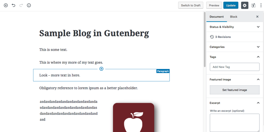
By default, the new UI allows for simple management of many common page elements. Users can enter text, images or other elements and then simply click or drag to move them up and down in the layout. This makes it incredibly easy to manipulate the layout of a post of page for even the most novice of users, making page design more accessible to more people.
Prebuilt Elements

Gutenberg also contains a vast selection of common, prebuilt elements for users to add on the fly. This includes many of the elements you would expect – paragraph blocks, embed elements, images and lists, and even a Columns block option (currently in beta as of this writing). This makes it easier than ever to add sections to a page to simply design a more artful look for a site.
Simple and Intuitive Controls
The controls for managing these elements are also simply designed and allow for versatility whether you’re an entry-level user or a more seasoned pro. Each block element offers options to duplicate, insert new items before or after, add to reusable blocks – a sort of soft templating feature for common elements.
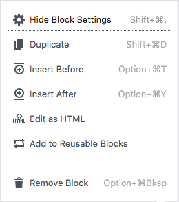
This is also where users can access the HTML editor – the new swap point for Visual versus Text that is a common sight in the top right corner of the current WordPress UI. Here you can add any manual coding or adjustments using HTML.
Keyboard Shortcuts
You may also have noticed in the image above that there are keyboard controls included. This is also a handy feature from an editor’s perspective, allowing for quick and simple duplication, insertion or deletion of a block using just keyboard shortcuts. Some of these are usable in the current iteration of WordPress, but the new shortcuts include functions for manipulating and adding new blocks, as well. As someone whose command keys are in near constant use, this promises to be an incredibly handy tool for quick management of page elements.
Baked-In Word Count

Another handy feature from a writing perspective is the built-in metrics tracker. This info tool at the top of the page allows you to click and get a quick word count along with totals for headings and paragraphs. It also gives you a tally of the blocks used on the page – perhaps not as useful, but an interesting stat to be aware of and all great to have readily available.
Five Negatives in Gutenberg
Line Breaks as Block Breaks
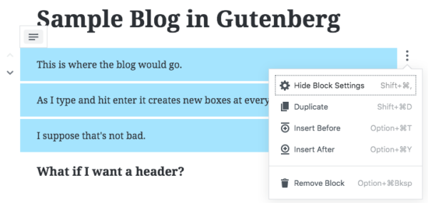
Every time the new editor encounters a line break, it treats it as a place to separate the content into a new block. At first glance, this seems like a fine idea – and I even typed that “I suppose that’s not bad,” thinking of a situation where I may have written my copy flexibly and want to move a section up. While that functionality exists, other text manipulation quickly proves problematic, particularly if trying to select text across multiple paragraphs for formatting changes.
While you can select multiple blocks, for instance, you’re unable to implement any kind of formatting change, meaning no changing font styles, classes or type across multiple blocks. You can, however, move the selected chunk of selected text up and down the layout using the left-side arrows, which is handy, but so is copy and paste in WordPress’ current form.
Inline Image Issues
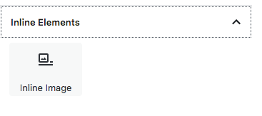
One of the best ways to break up copy – particularly in large copy blocks or blog posts – is to inject an inline image and have text wrap around it. In the current WordPress build, this is no problem – just click to add media, resize as needed, and click to right or left justify in line and the text will fall around the added image.
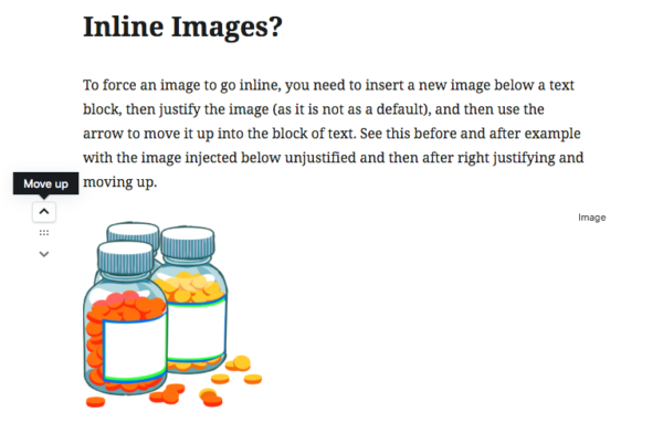
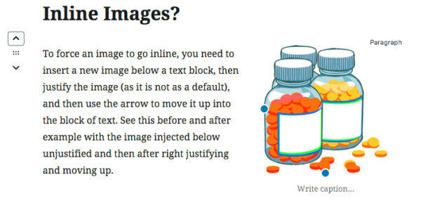
In Gutenberg, the default inline image additional does not allow for this functionality. Instead, the only way to achieve this is to insert an image below a block of copy and use arrow functions to move the image up and into an adjacent block of content. This will allow for text wrapping, but is not an intuitive option – and in fact, was only discovered by accident through working with my developer. After all, there is – quite literally – an inline image function that fails to achieve this.
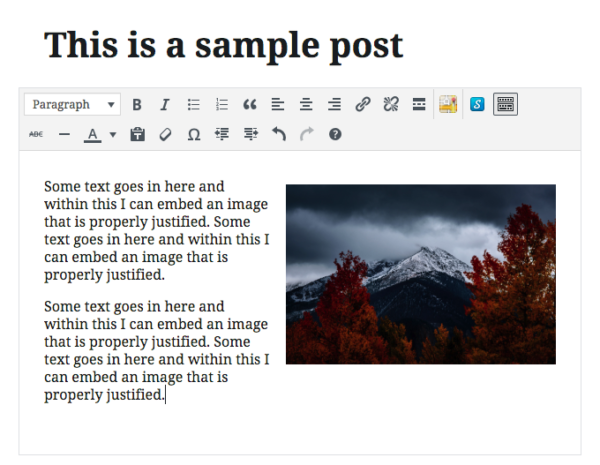
When looking at older posts imported to the Gutenberg builder, the new system converts those posts to a single text block set within a Classic Block. While this is convenient as it retains the original functionality, it negates the entire idea of having a new builder in the first place – and requires reliance on legacy systems that limit the ability to use new capabilities intended to replace the Classic builder.
Writer’s note: This was updated to reflect workaround functionality discovered after the original review.
Inline, Out of Options
Another shortcoming of the inline image placement is that when you use the new builder’s option for an inline image, it will put the image in, but the functionality stops there. You cannot adjust the justification. You cannot edit the alt text or description after placing. You cannot add a link.
You can, however, resize the image using the corner buttons when you click on the inset image. This helps make it fit a bit better to the space, but still does nothing about justification, wrapping or good SEO. Simply put, inline image placement – at least in its current capabilities – is more about what it can’t do than what it can.
It is worth noting that with the workaround mentioned in the last section, images can be manipulated more, including adding linking and alt text information. However, speaking strictly of the inline image tool, these functions are not included.
Writer’s note: This was updated to reflect workaround functionality discovered after the original review.
Colors – All or Nothing
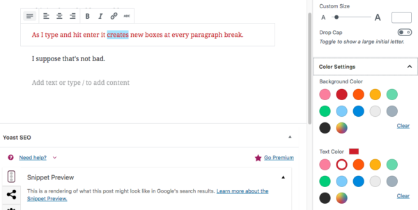
Another limiting feature of the Gutenberg builder becomes apparent when you decide to add a splash of color. As it turns out, there’s no splashes – color is applied by the gallon. When you select text – whether the whole block or just a few words that you want to make pop with an accentuating color – the color options only can apply globally to the block. No single spot color, no highlighting a line of copy – it’s all or nothing.
Strangely, this contrasts with styling within a block. For example, you can select the same text section and change it to be bold, italicized, linked or strikethrough formatted. So if you were hoping to use color to add extra emphasis, you may be out of luck in the current build.
Blocks Without Purpose
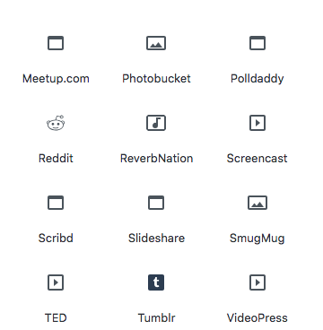
Another feature of the Gutenberg builder is that it offers an immense number of built-in block options, allowing you to choose from a slew of different custom applications to meet a variety of needs. But this may be excessive at points or, to paraphrase a famous fake mathematician in a certain movie about reviving dinosaurs, it seems as though developers were too preoccupied with whether or not they could to stop and think if they should.
Take, for instance, the embeds blocks. There are 34 distinctive and different styles of embed to use, ranging from common needs like Twitter or Facebook to the more obscure, niche use like VideoPress and Speaker. Other blocks, like Subheading, seem entirely out of place – the Heading block style exists already, while the Subheading cannot take an H-tag and offers little more than paragraph formatting.
Random Thoughts
- Seeing the ability to use a drop cap is nice. The former newspaper editor in me loves that, but I’m not sure who else on the web was clamoring for it.
- Easy-to-grab page elements like separator lines or buttons is a boon for the novice user, but many professional or even semi-professional sites with a visual builder will already include this.
- The ability to hot swap from blocks that are similar could be handy – for instance duplicating a quote in a paragraph for use as a pull quote block and changing it in the settings for more rapid formatting.
From an Account Manager’s Perspective
I also shared Gutenberg and a bit of information about it around the office to get some additional insights from other members of our team who routinely work with our site as well as client sites. The biggest takeaway was that the new system seemed to be nice at first glance, but the more you interact with it, the more it seems to needlessly complicate the process of adding content to a site and, in turn, muddies the process of adding new content or revising copy on a page.
Another concern was the way it makes adding things to a page or post more obtuse and how that may impact a client training session. Currently, when a client is being trained on WordPress, the majority of the controls to know are included within the TinyMCE builder – text manipulation, header tag implementation, inline image addition, etc.
For the run-of-the-mill end user, this can all be done in what will soon become the Classic block. To train a new user in Gutenberg, a user will need to be walked through what blocks are, the different types of blocks, how to manipulate those blocks and how to edit and revise content inside – plus a tutorial on Classic to handle some common needs that currently are handled obtusely in Gutenberg, like inline images. That’s before even considering any training to be done on a site theme or builder for styling and designing individual pages.
Get more thoughts on how Gutenberg works from a developer’s perspective in our follow-up post.
The LEGO Experience
In summation, I think Gutenberg is akin to how people feel about LEGO building blocks. They’re a wonderful toy, and many people enjoy connecting blocks together to create pretty amazing things, regardless of their level of building skill and knowledge. However, they also hurt immensely when they’re not where they should be and get stepped on in the dark, as any unexpecting parent can probably attest.
In this case, I worry more about the latter situation than the former. This functionality is poised to be foisted upon the WordPress community sometime in the next few months, if the dev team stays on the forecasted schedule, and as it stands, I have many concerns about how this implementation not only will be received by the broader WordPress audience as a whole, but how it will impact – and possibly take down – whole websites with theme incompatibilities, user unfamiliarity and plugin conflicts.
Time will tell, and obviously this iteration is still not the finalized cut of what will be released, but if the early access versions have been any indication, WordPress developers and site owners are in for a world of chaos whenever the launch switch is flipped.
This article was originally posted on the J. Fitzgerald Group blog.
Digital & Social Articles on Business 2 Community
(91)
Report Post
