You thought you were done when you wrote that last sentence of your blog post, but now you have to think about design too?
You might be avoiding design because it’s time consuming or you feel like you don’t really have the eye for it.
But there’s hard science that visuals boost engagement and retention. Research shows that people following directions with text and illustrations perform more than 300% better than people following directions with just text.
To drive up page views and read time, you’ll want to weave in some photos, illustrations, and color into your next blog post.
Here are some easy, painless ways to design an awesome blog post:
1) Spin The Color Wheel
Get the right color combinations every time.
If you’re trying to color your subheaders or build out slides in your blog post, a color wheel can help you find the best colors that pair together.
There are three main ways to use a color wheel:
You can find complimentary colors by picking any color on the wheel and then drawing a line across to find its opposite color which offsets and completes it.

Photo from Dimensions Thru Art
You can use analogous colors by picking any color and then using the two colors on either side of it. These combinations are great for highlighting your key color. So for example, below you would use yellow orange and yellow green to highlight the color yellow.
Photo from Dimensions Thru Art
Triad colors can help you find a scale of colors to make up a theme for your blog post. For example, if you were interested in using the color orange, you would go four colors down to find the three colors in between that form a color triangle. Now you’ve created a “safe spectrum” where you know you can pull various hues from and they will all generally work together.

Photo from Dimensions Thru Art
2) Half Empty or Half Full?
Packing more insights into a blog post can make it a more informative read, but sometimes less is more. Strategically use negative space to make your piece easy to skim.
At Bitly, we always add an extra space above and below each image to space out the post. This is especially useful in longer pieces where the length may potentially be overwhelming.

We embedded a variety of videos and images throughout our recent recap post about the Fyre Festival. It was a lengthy post at over 1,200 words, so spacing out the copy really helped keep readers engaged.
It’s also good to think about what falls above and below the fold in your blog post. The fold is the line at which users have to scroll to see more of your page.
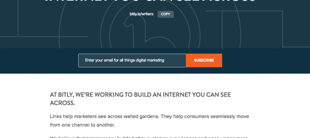
In this post calling for contributors, we made sure to fit the call-to-action right before the fold so that readers would be sure to catch it
3) If It Isn’t Broken, Don’t Fix It
There’s also something great about not reinventing the wheel. If there’s a standard format or a set of branded colors that you often use in your blog posts, keep using them.
Some consistency throughout your posts will help readers become familiarized with your branding. It also builds a sense of trust – every time someone lands on a post with our #EE6123 orange and #0E3042 blue, they think Bitly and know to expect thought leadership on link management and customer experience.
At Bitly, our Art Director Lauren Crowley put together a Brand Guidelines which includes all sorts of great visual tips from logo sizing to color pairings and how to use our mascot, Chauncey McPufferson.
This is a helpful reference for the extended team to use when we’re putting together a new blog post or any other type of content.
If you don’t already have one, schedule some time to sit down with your designer to put together some guidelines. Taking a few hours out of your day now can save a lot of back and forth later as you’re cranking out content.
4) Recruit Some Help
The content team at Bitly often helps design extras for blog posts, eBooks, webinars, and more. We have a fairly small design team, so it’s all hands on deck.
We’re not masters at using the Adobe Suite, so we stick to using tools that make it quick and easy for us to produce visuals. Some of our favorite tools include Canva, PicMonkey, Pexels, and Unsplash:
Canva has preset templates for us to plug-and-play whether we’re making social media cards, a presentation, or an infographic.
PicMonkey has a great free photo-editor tool that allows you to crop, filter, and add various effects to your photos.

Pexels and Unsplash are both free stock photography sites. They are a huge resource for us when we’re looking for inspirational landscape shots to use as header photos or more typical office shots to compliment an educational post.
Put Your Skills To The Test
The more you design, the more comfortable you’ll get with the process.
Find the right tools that fit your needs, whether it’s a color wheel, brand guidelines, or online software, and you’ll be on your way to building a design formula.
And once you feel like you’ve got a rhythm down, you can start testing and optimizing your creatives.
Curious to see if one color performs better than another? What about a static image versus a GIF? Simply put a Bitlink behind each call-to-action to test which types of design are more likely to drive people to click.
The real secret to designing an awesome blog post is consistency. Consistency in building out a process, in branding, and in refining your craft.
Digital & Social Articles on Business 2 Community(133)
Report Post