When it comes to email design, a lot of questions come up. How many colors should you use? What fonts or image formats are best? Should images be included in every email? There’s a lot to consider. That’s why we’ve created this handy guide with tips to create effective and well-designed emails.
In this guide, we cover the dos and don’ts of email design for commonly sent emails including email newsletters, sales emails, welcome emails, and event/invitation emails. And, at the end of the guide, you’ll find a toolkit with time-saving resources.
Email Newsletters
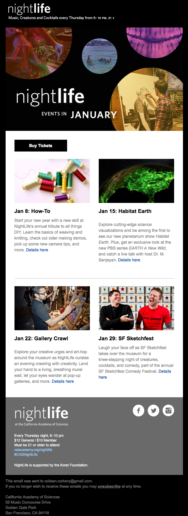
Email newsletters are a great way to engage with your audience. That’s probably why 74 percent of VerticalResponse customers send newsletters.
Email newsletter design should adjust to include more text than a typical email, so layout is vital. As you create your newsletter, keep these tips in mind:
Don’t:
- Write one long body of text.
- Use one big image or PDF for your entire newsletter.
- Use fonts that are hard to read (anything with symbols or heavy script letters).
- Crowd the design or text by adding too much.
- Use harsh or bold colors.
- Give away the farm. The purpose of your newsletter is to aim for a click that leads back to your website or blog with more info.
Do:
- Choose a color palette and stick to just one or two colors max. This creates a cleaner look. Use colors that relate to your company identity.
- Place your logo and business name at the top in a masthead. Separate the masthead and footer with a background color.
- Use more white space.
- Use PNG or JPG images.
- Save your images as 72 ppi or dpi.
- Use easy-to-read and email-friendly fonts (e.g., Arial, Tahoma, Trebuchet MS).
- Break your content into small sections.
- Use lines to break up those small sections.
- Prioritize your content, putting the most important information first.
- Keep things brief. Write a quick summary and include a call to action that takes readers to your site to read more.
- Use images to break up text.
- Include a table of contents at the top.
- Create columns and stack content in an organized fashion.
- Use no more than two readable fonts.
- Use headings and subheadings to keep the newsletter organized.
- Include at least one call to action. (Two or three links is common).
- Include social media buttons.
- Use “Isolation Effect” colors for your calls to action.
- A/B split test design changes.
- Add social media buttons.
- Use a responsive template so your newsletter will look great on all devices.
Sale Email
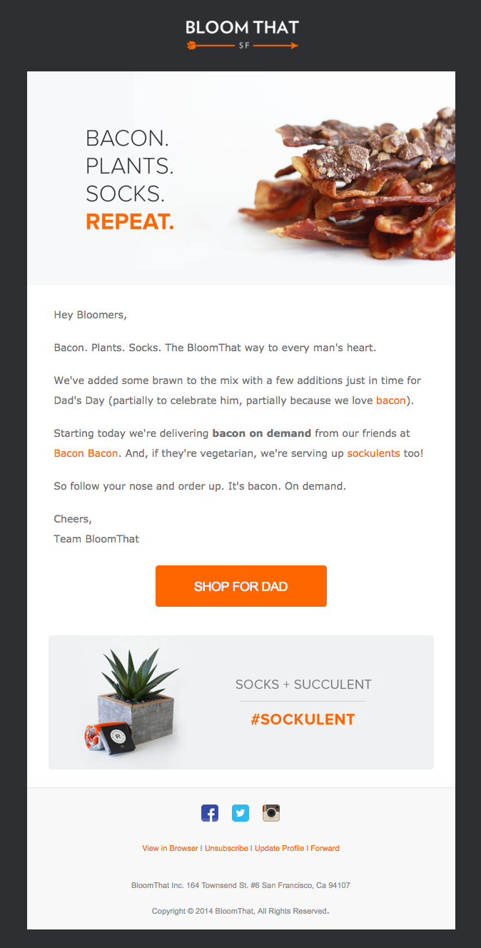
Every business hosts a sale or a promotion at some point, and email is a great way to spread the word. Designing this kind of email is a snap. Here are your design dos and don’ts:
Don’t:
- Write mountains of text.
- Include a dizzying amount of links or calls to action.
- Rely on text only.
- Use one giant image.
Do:
- Explain the sale or deal in a short sentence or two. Whether it’s 25 percent off, free shipping or a gift with purchase, explain how it works.
- Include one straightforward call to action.
- Use an image to convey what the deal is.
- Include social media buttons to encourage engagement.
- Use PNG or JPG images.
- Save your images as 72 ppi or dpi.
Welcome Email
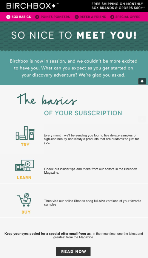
New contacts may need a little encouragement to go from interested bystander to paying customer or contributing donor. To help with this process, you can send lead-encouraging welcome emails. You’re making a first impression when you send an email like this, so a polished design is a must. Here are a few tips:
Don’t:
- Assume your contact knows everything about your business or non-profit – Include info about yourself or your business.
- Overwhelm contacts with too much text, or too many images and calls to action.
- Send an email that looks dry or stale. That’s not the first impression you want to make.
- Underestimate the power of images. Show people what you do or sell.
Do:
- Include your business name and logo.
- Include a brief description of your business, product, or service.
- Focus on one specific aspect that will convince prospects to act.
- Include images that represent your business.
- Include your contact information.
- Include one call to action.
- Use a clean layout. You don’t want text and images jumbled together.
- Use PNG or JPG images.
- Save your images as 72 ppi or dpi.
Event, Save The Date, Or Invitation Emails
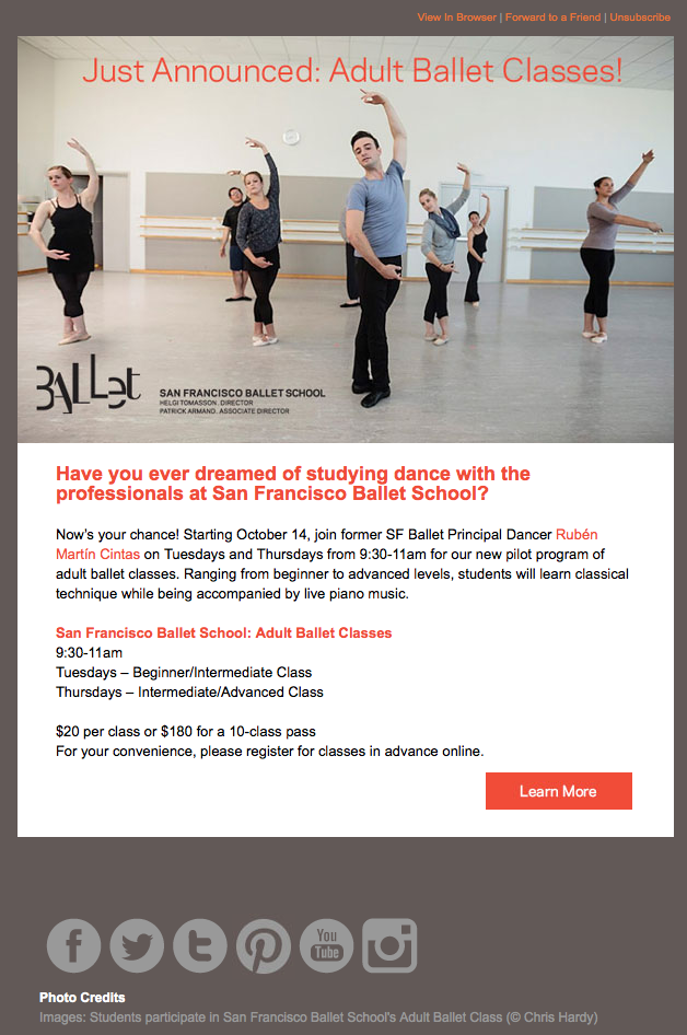
When your business or non-profit hosts an event, or you’re inviting people to try a new product, or service, email is an effective way to promote awareness and recruit guests. To design an email that boosts your guest list, here are some tips:
Don’t:
- Use the email to do anything other than invite guests to the event or new product/service. Focus the content on the event or invitation and its purpose.
- Overdo it on the text. Keep it simple.
Do:
- Create a short message that generates excitement about the event or invite.
- Include all of the specifics like date, time and place, or how the service works.
- Pick a simple color scheme. Again, use one main color and several accent colors. Use colors that match your logo and website.
- Use a call to action button that allows contacts to sign up for the event, learn more, or get started on your website.
- Personalize the email so it feels less like a “cold call” and more like an email from a friend.
- Use PNG or JPG images.
- Save your images as 72 ppi or dpi.
Design Toolkit
There will be overlapping design elements in every email that you send. Items like images and calls to action are needed in nearly every email. To help you incorporate these common elements with ease, we’ve created a quick list of tools:
Images
If you’re in need of images fast, check out stock sites like Thinkstock, iStock, or Shutterstock. Search for terms that represent your business to find the right image, suggests Mitch Dowell, founder of branding and design company Branding Experiences. These sites charge by the image, but you’ll have a picture ready to go within minutes.
If you take your own pictures, use editing software to make your shots look professional. PhotoShop Elements and PhoXo are two options.
Recommended formats: save all photos as PNG or JPG, 72 ppi/dpi, and less than 1 MB – These load more quickly, and look crisper in your subscribers’ inboxes.
Call to action
Hyperlink text as a call to action, and use buttons. They stand out and add a professional touch to your email. You can use our handy button maker to generate crisp, professional buttons in a snap.
Not sure what your call to action should say? This article on creating an effective call to action can help you zero in on the right wording.
Color palettes
If you’re not sure which colors go together, use ColourLovers.com to pick the right shades.
Fonts
Here are a few of the most common, web and email-friendly fonts you should consider using:
- Helvetica
- Times New Roman
- Georgia
- Arial
- Tahoma
- Trebuchet MS
Templates
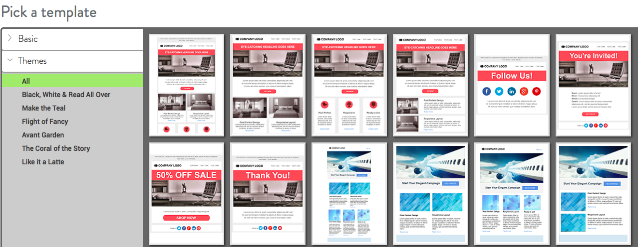
We have an array of adjustable, responsive templates to use. (A snapshot of a few templates is below.) These templates will help with your layout and design. All you have to do is add content and images.
Final thoughts
As you create emails, remember that the design is just as important as the text you write. Some might even argue that the design is more important because the look and feel of an email can encourage a subscriber to start reading.
So, keep this handy guide nearby when you’re ready to create a new email. In addition to using this guide as a resource, it’s a good idea to scan your own inbox for inspiration. See what others are doing and what formats and designs appeal to you.
If you have another design tip, feel free to share it in the comment section below. Tell us what’s worked for you, or what design elements you want to change in your next email.
(302)
Report Post